Data Exploration - Advances in Condition Monitoring, Pt V
Data exploration is an important first step in any new data science problem. In this post we introduce a metal machining data set that we’ll use to test anomaly detection methods. We’ll explore the data set, see how it is structured, and do some data visualization.
Let’s pretend again, like in Part II of this series, that you’re at a manufacturing company engaged in metal machining. However, this time you’re an engineer working at this company, and the CEO has now tasked you to develop a system to detect tool wear. Where to start?
UC Berkeley created a milling data set in 2008, which you can download from the NASA Prognostics Center of Excellence web page. We’ll use this data set to try out some ideas. In this post we’ll briefly cover what milling is before exploring and visualizing the data set. Feel free to follow along, as all the code is available and easily run in Google Colab (link here).
What is milling?
In milling, a rotary cutter removes material as it moves along a work piece. Most often, milling is performed on metal – it’s metal machining – and that’s what is happening at the company you’re at.
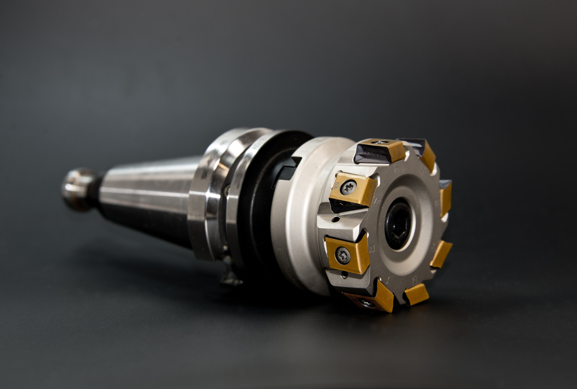
The picture below demonstrates a face milling procedure. The cutter is progressed forward while rotating. As the cutter rotates, the tool inserts “bite” into the metal and remove it.

Over time, the tool inserts wear. Specifically, the flank of the tool wears, as shown below. In the UC Berkeley milling data set the flank wear (VB) is measured as the tool wears.

Data Exploration
Data exploration is the first important step when tackling any new data science problem. Where to begin? The first step is understanding how the data is structured. How is the data stored? In a database? In an array? Where is the meta-data (things like labels and time-stamps)?
Data Structure
First, we need to import the necessary modules.
![]()
import numpy as np
import scipy.io as sio
from pathlib import Path
import pandas as pd
import matplotlib.pyplot as plt
import seaborn as sns
The UC Berkeley milling data set is contained in a structured MATLAB array. We can load the .mat file using the scipy.io module and the loadmat function.
# load the data from the matlab file
m = sio.loadmat(folder_raw_data / 'mill.mat',struct_as_record=True)
The data is stored as a dictionary. Let’s look to see what it is made of.
# show some of the info from the matlab file
print('Keys in the matlab dict file: \n', m.keys(), '\n')
Keys in the matlab dict file:
 dict_keys(['__header__', '__version__', '__globals__', 'mill'])
Only the ‘mill’ part of the dictionary contains useful information. We’ll put that in a new numpy array called ‘data.
# check to see what m['mill'] is
print(type(m['mill']))

# store the 'mill' data in a seperate np array
data = m['mill']
<class 'numpy.ndarray'>
We now want to see what the ‘data’ array is made up of.
# store the field names in the data np array in a tuple, l
l = data.dtype.names
print('List of the field names:\n',l)
List of the field names:
 ('case', 'run', 'VB', 'time', 'DOC', 'feed', 'material', 'smcAC', 'smcDC', 'vib_table', 'vib_spindle', 'AE_table', 'AE_spindle')
Meta-Data
The documentation with the UC Berkeley milling data set contains additional information, and highlights information about the meta-data. The data set is made of 16 cases of milling tools performing cuts in metal. Six cutting parameters were used in the creation of the data:
- the metal type (either cast iron or steel, labelled as 1 or 2 in the data set, respectively)
- the depth of cut (either 0.75 mm or 1.5 mm)
- the feed rate (either 0.25 mm/rev or 0.5 mm/rev)
Each of the 16 cases is a combination of the cutting parameters (for example, case one has a depth of cut of 1.5 mm, a feed rate of 0.5 mm/rev, and is performed on cast iron).
The cases are made up of individual cuts from when the tool is new to degraded or worn. There are 167 cuts (called ‘runs’ in the documentation) amongst all 16 cases. Many of the cuts are accompanied by a measure of flank wear (VB). We’ll use this later to label the cuts as eigther healthy, degraded, or worn.
Finally, six signals were collected during each cut: acoustic emission (AE) signals from the spindle and table; vibration from the spindle and table; and AC/DC current from the spindle motor. The signals were collected at 250 Hz and each cut has 9000 sampling points, for a total signal length of 36 seconds.
We will extract the meta-data from the numpy array and store it as a pandas dataframe – we’ll call this dataframe df_labels since it contains the label information we’ll be interested in. This is how we create the dataframe.
# store the field names in the data np array in a tuple, l
l = data.dtype.names

# create empty dataframe for the labels
df_labels = pd.DataFrame()

# get the labels from the original .mat file and put in dataframe
for i in range(7):
    # list for storing the label data for each field
    x = []

    # iterate through each of the unique cuts
    for j in range(167):
        x.append(data[0,j][i][0][0])
    x = np.array(x)
    df_labels[str(i)] = x

# add column names to the dataframe
df_labels.columns = l[0:7]

# create a column with the unique cut number
df_labels['cut_no'] = [i for i in range(167)]

print(df_labels.head())
| case | run | VB | time | DOC | feed | material | cut_no | |
|---|---|---|---|---|---|---|---|---|
| 0 | 1 | 1 | 0 | 2 | 1.5 | 0.5 | 1 | 0 |
| 1 | 1 | 2 | nan | 4 | 1.5 | 0.5 | 1 | 1 |
| 2 | 1 | 3 | nan | 6 | 1.5 | 0.5 | 1 | 2 |
| 3 | 1 | 4 | 0.11 | 7 | 1.5 | 0.5 | 1 | 3 |
| 4 | 1 | 5 | nan | 11 | 1.5 | 0.5 | 1 | 4 |
In the above table you can see how not all cuts are labelled with a flank wear (VB) value. Later, we’ll be setting categories for the tool health – ethier healthy, degraded, or worn. For categories without a flank wear value we can reliabily select the tool health category based on preceeding and forward looking cuts with flank wear values.
Data Visualization
Visuallizing a new data set is a great way to get an understanding of what is going on, and detect any strange things going on. I also love data visualization, so we’ll create a beautiful graphic using Seaborn and Matplotlib.
There are only 167 cuts in this data set, which isn’t a huge amount. Thus, we can visually inspect each cut to find abnormalities. Fortunately, I’ve already done that for you…. Below is a highlight.
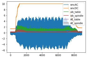
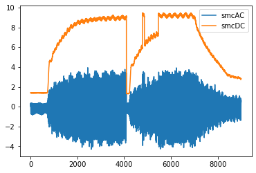
First, we’ll look at a fairly “normal” cut – cut number 167.
# look at cut number 167 (index 166)
cut_no = 166
fig, ax = plt.subplots()

ax.plot(data[0,cut_no]['smcAC'], label='smcAC')
ax.plot(data[0,cut_no]['smcDC'], label='smcDC')
ax.plot(data[0,cut_no]['vib_table'], label='vib_table')
ax.plot(data[0,cut_no]['vib_spindle'], label='vib_spindle')
ax.plot(data[0,cut_no]['AE_table'], label='AE_table')
ax.plot(data[0,cut_no]['AE_spindle'], label='AE_spindle')

plt.legend()
plt.show()
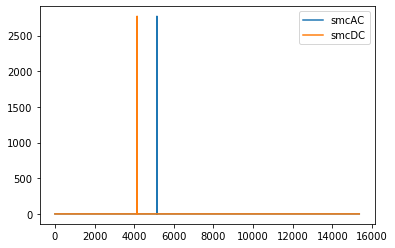
However, if you look at all the cuts, you’ll find that cuts 18 and 95 (index 17 and 94) are off – they will need to be discarded when we start building our anomaly detection model.
# plot cut no. 18 (index 17). Only plot current signals for simplicity.
cut_no = 17
fig, ax = plt.subplots()

ax.plot(data[0,cut_no]['smcAC'], label='smcAC')
ax.plot(data[0,cut_no]['smcDC'], label='smcDC')

plt.legend()
plt.show()
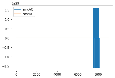
# plot cut no. 95 (index 94). Only plot current signals for simplicity.
cut_no = 17
fig, ax = plt.subplots()

ax.plot(data[0,94]['smcAC'], label='smcAC')
ax.plot(data[0,94]['smcDC'], label='smcDC')

plt.legend()
plt.show()
Cut 106 is also weird…
fig, ax = plt.subplots()

ax.plot(data[0,105]['smcAC'], label='smcAC')
ax.plot(data[0,105]['smcDC'], label='smcDC')

plt.legend()
plt.show()
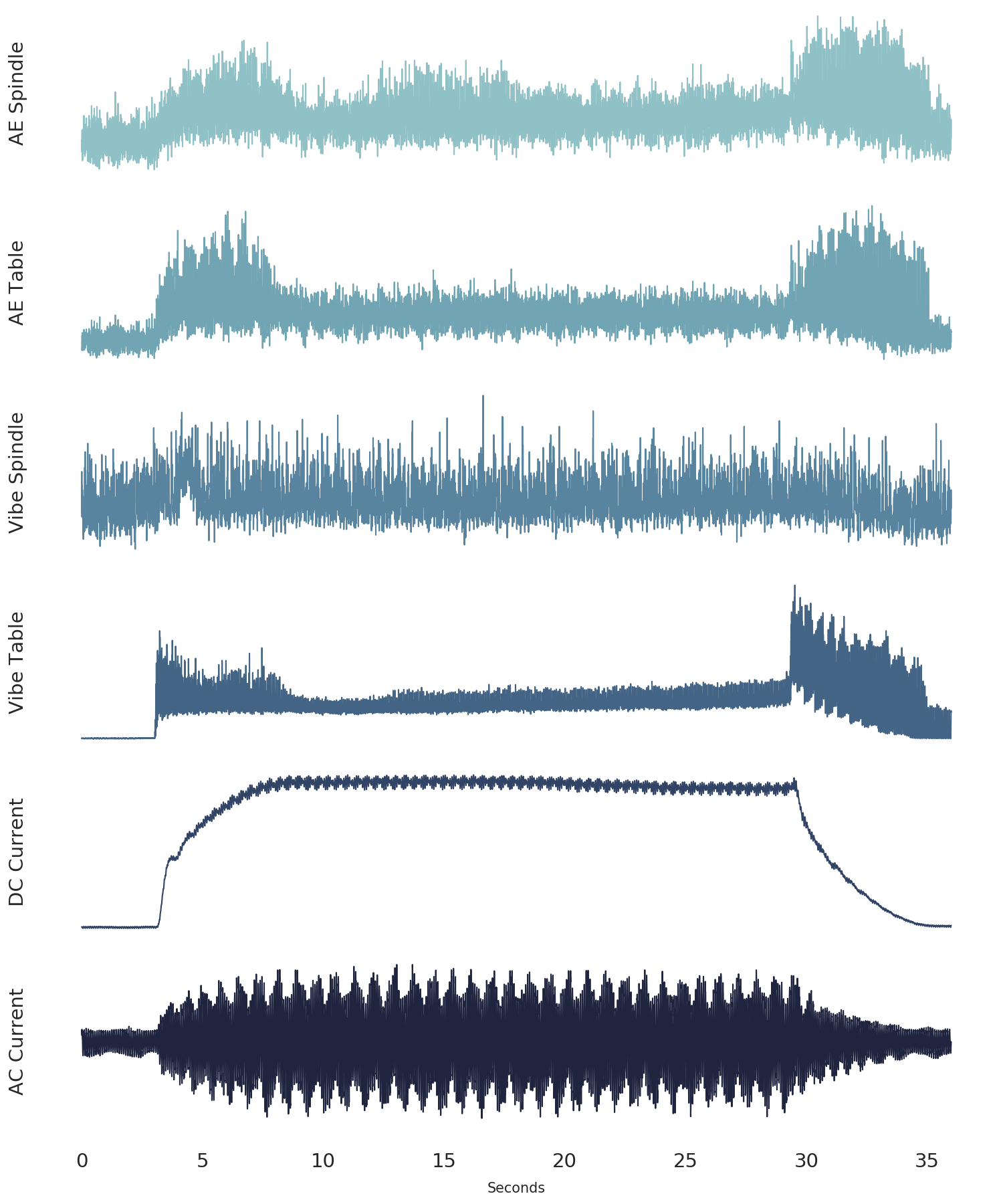
Finally, we’ll create a beautiful plot that nicely visualizes each of the six signals together.
def plot_cut(cut_signal, signals_trend, cut_no):

    # define colour palette and seaborn style
    pal = sns.cubehelix_palette(6, rot=-0.25, light=0.7)
    sns.set(style="white", context="notebook")

    fig, axes = plt.subplots(
        6, 1, dpi=150, figsize=(5, 6), sharex=True, constrained_layout=True,
    )

    # the "revised" signal names so it looks good on the chart
    signal_names_revised = [
        "AE Spindle",
        "AE Table",
        "Vibe Spindle",
        "Vibe Table",
        "DC Current",
        "AC Current",
    ]

    # go through each of the signals
    for i in range(6):
        # plot the signal
        # note, we take the length of the signal (9000 data point)
        # and divide it by the frequency (250 Hz) to get the x-axis
        # into seconds
        axes[i].plot(np.arange(0,9000)/250.0,
                     cut_signal[signals_trend[i]],
                     color=pal[i],
                     linewidth=0.5,
                     alpha=1)

        axis_label = signal_names_revised[i]

        axes[i].set_ylabel(
            axis_label, fontsize=7,
        )

        # if it's not the last signal on the plot
        # we don't want to show the subplot outlines
        if i != 5:
            axes[i].spines["top"].set_visible(False)
            axes[i].spines["right"].set_visible(False)
            axes[i].spines["left"].set_visible(False)
            axes[i].spines["bottom"].set_visible(False)
            axes[i].set_yticks([]) # also remove the y-ticks, cause ugly

        # for the last signal we will show the x-axis labels
        # which are the length (in seconds) of the signal
        else:
            axes[i].spines["top"].set_visible(False)
            axes[i].spines["right"].set_visible(False)
            axes[i].spines["left"].set_visible(False)
            axes[i].spines["bottom"].set_visible(False)
            axes[i].set_yticks([])
            axes[i].tick_params(axis="x", labelsize=7)
            axes[i].set_xlabel('Seconds', size=5)


signals_trend = list(l[7:])  # there are 6 types of signals, smcAC to AE_spindle
signals_trend = signals_trend[::-1]  # reverse the signal order so that it is matching other charts

# we'll plot signal 146 (index 145)
cut_signal = data[0, 145]

plot_cut(cut_signal, signals_trend, "cut_146")
# plt.savefig('six_signals.png',format='png') # save the figure, if you want
plt.show()
Conclusion
In this post we’ve explained what metal machining is in the context of milling. We’ve also explored the UC Berkely milling data set, which we’ll use in future posts to test anomaly detection techniques using autoencoders. Finally, we’ve demonstrated some methods that are usefull in the important data exploration step, from understanding the data structure, to visualizing the data.