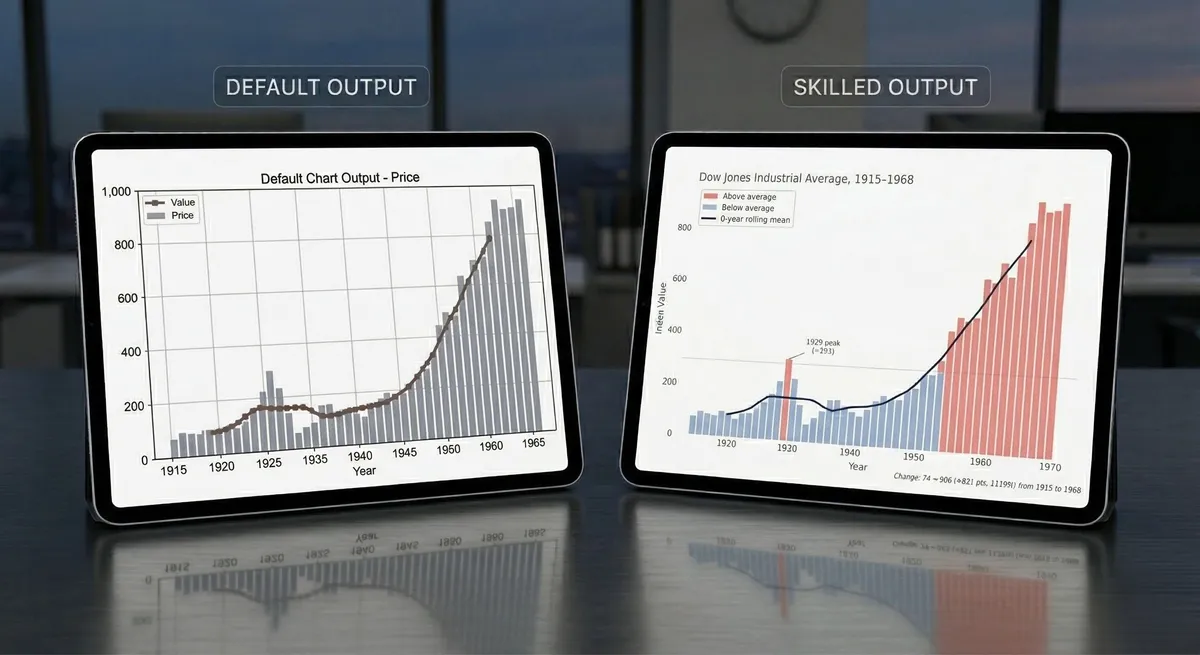
PyPHM - Machinery data, made easy
Why build an open-source package for machinery data?
Applied AI. Real-world data. From intelligent agents to industrial systems — practical engineering with data.
Explore Posts
Machines fail. Anomaly detection, using an autoencoder, can be used to identify failures that have never been seen before.
How can we communicate complex concepts using data visualization tools? In this first post -- in a series titled 'Beautiful Plots' -- we build an elegant chart demonstrating the decision boundary from a KNN classifier.
Why build an open-source package for machinery data?
A wellspring of ideas
Music to my ears... err... eyes? The violin plot is a worthy tool for any data visualization tool box. Let's build one, in Plotly, as we explore historic birth trends in the USA!
Using Jupyter Notebooks in a high performance computing environment is easy! This tutorial will show you how.
We've trained the variational autoencoders, and in this post, we see how the models perform in anomaly detection. We check both the input and latent space anomaly detection effectiveness.
The lollipop chart is great at visualizing differences in variables along a single axis. In this post, we create an elegant lollipop chart, in Matplotlib, to show the differences in model performance.