I Taught Claude to Make Beautiful Charts. Then It Forgot How.
I kicked off the optimization loop overnight. The scores climbed. But when I opened the charts in the morning, they looked like they’d been made by someone who’d read every rule and understood none of them.
Let me back up.
I care about beautiful charts. Default matplotlib is mediocre and I’ve spent years making it less so. When I started using Claude Code to generate data visualizations, the defaults weren’t cutting it. So I built an opinionated skill, a set of markdown instructions that encode my aesthetic preferences, to fix that. The matplotlib skill has three components: a style spec (palettes, fonts, despine rules), nine pattern templates (one per chart type), and a verification workflow. Here’s the target aesthetic I was aiming for:

What’s a Claude Code Skill?
As Simon Willison put it, skills are “conceptually extremely simple: a skill is a Markdown file telling the model how to do something, optionally accompanied by extra documents and pre-written scripts.”
To use the matplotlib skill, you say something like “Make a chart using the matplotlib skill”. The skill determines the chart type based on the dataset and applies the styling and patterns I prefer. It’s opinionated, and that’s the point.
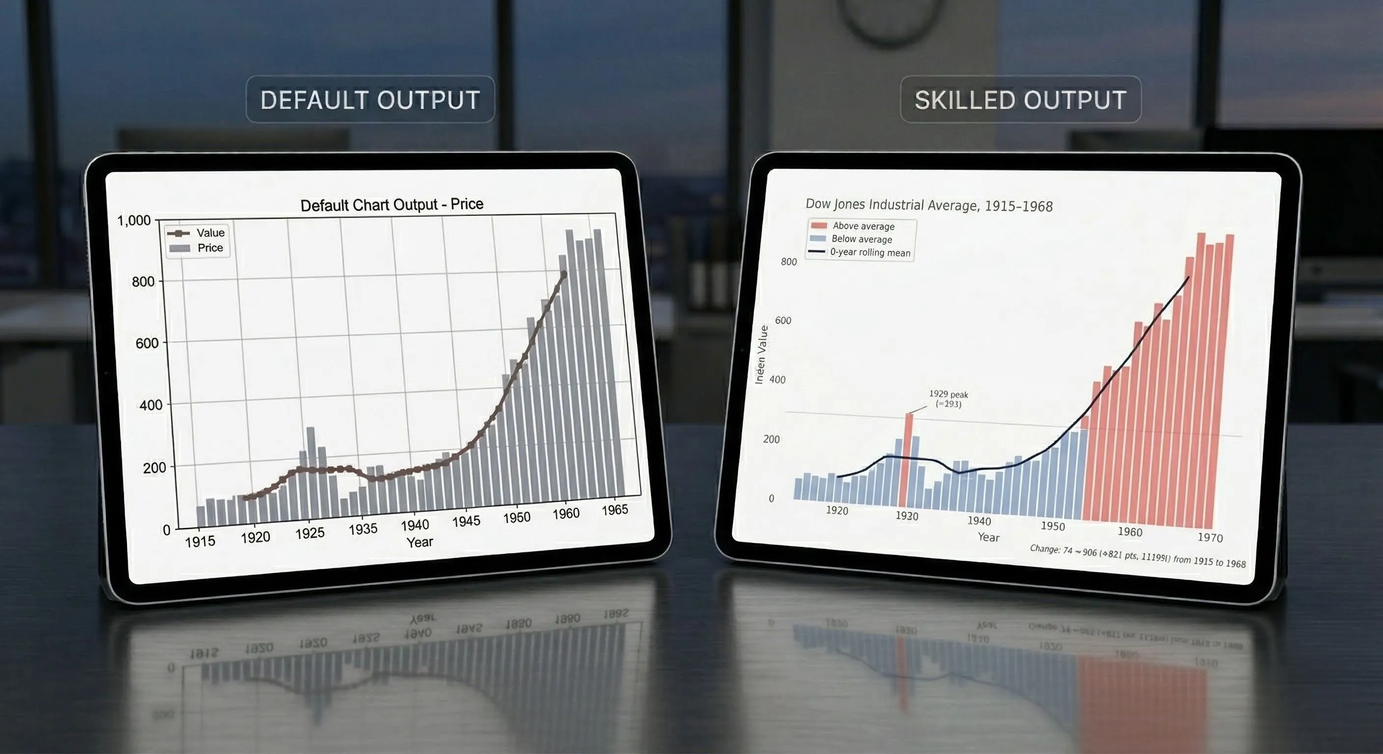
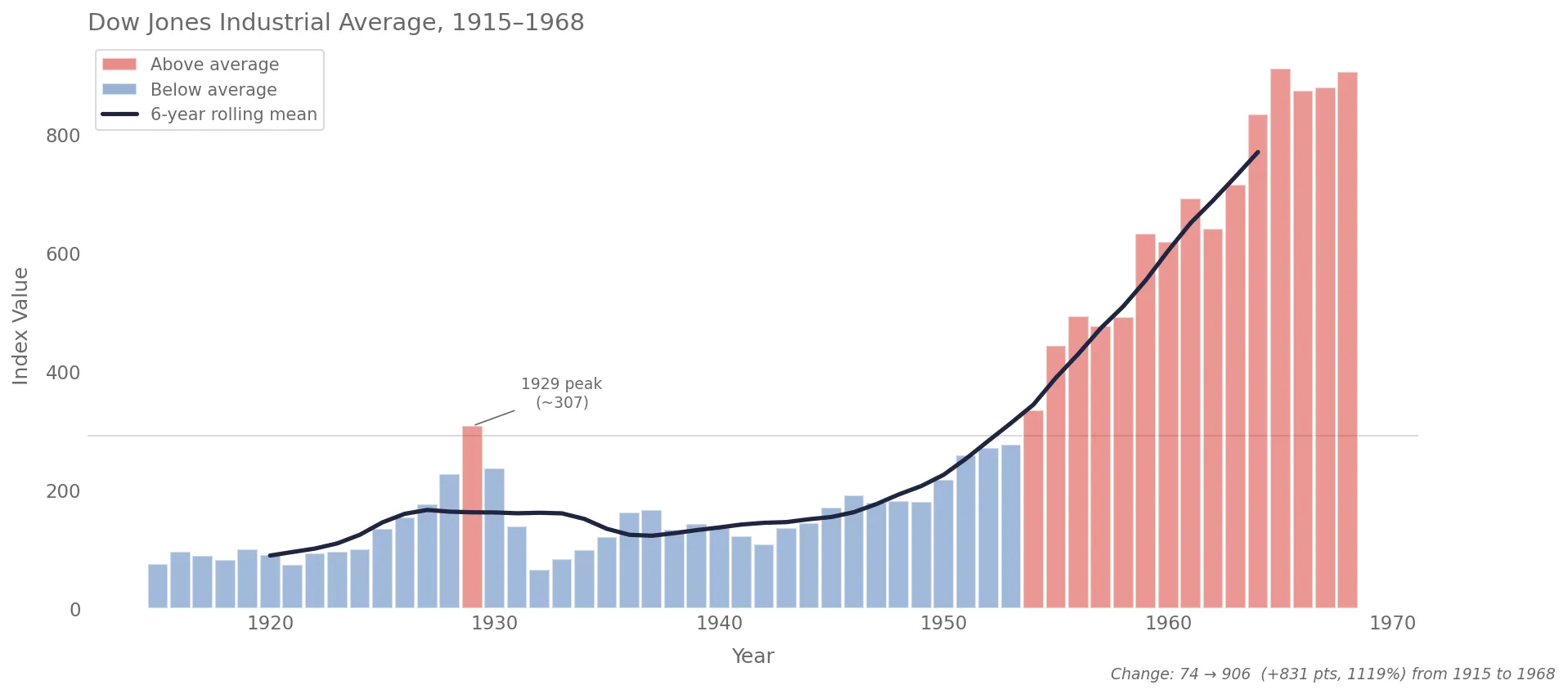
Here’s what a chart looks like with vanilla Claude Code versus with the skill. Same data, same one-line prompt.
The default chart:
And with the skill applied:
How I Built It, And What Went Wrong
I pointed Claude Code at four of my research projects and asked it to reverse-engineer my aesthetic. It analyzed my charts and identified the recurring choices (despined axes, cubehelix palettes, dimgrey annotations) and assembled the skill with nine chart patterns.
The full prompt I used to kick things off
I spent a lot of time creating beautiful visualizations for this project (weibull knowledge informed). You can see the final outputs in the @reports/figures/ (e.g. see the @reports/figures/ims_rul_results.png , or the @reports/figures/loss_function_percentages.svg, or the @reports/figures/spectrogram_with_binned_example.png ). These were primarily created with matplotlib and seaborn.
What I want your help with is to plan the creation of a skill that is to be used for creating matplotlib charts and diagrams. I want this skill to be able to implement a similar aesthetic to what I have already done in this project, as well in some of the other projects that I will reference below. This skill is to assume the persona of a Python developer who is an expert in data visualization. They are opinionated and have strong feelings about clean and readable data visualization, like I have implemented in the examples.
What I want you to do in this planning process is to do a thorough examination of all these example repos that have data visualizations using Matplotlib and Seaborn that I have worked on. I want you to inspect them and then come up with some findings that we can replicate within this skill. What are some aesthetics that I always seem to implement? What are some common color palettes that we should be using? Again, this skill can be opinionated and assume a standard default template for the color palettes and templating and those sort of things. Perhaps you should assemble a bunch of subagents to do the discovery and then have them come back so that you can synthesize their analysis.
I am not an expert in writing skills, and I do not necessarily know how this should be done. So that, once these skills that flawed code implements, there can be reference files that are included. Look into this as well. Would this be beneficial? Look at the official claude code docs, on skills (use the /docs ) to see what best practice is.
As part of this plan, as well, I want this skill (and all it’s files, as needed) to be placed in the dotfiles folder, here: ~/dotfiles/claude/skills/ . You can already see the setup-react skill in there.
The other projects, to be referenced are:
- Documents/Beautiful-Plots — only the decision boundary chart and the lollipop chart are to be considered. The other one was done in plotly
- Documents/arxiv-code-search — look in the
reportsfolder to see the relevant diagrams - Documents/ml-tool-wear
The first version worked, but it wasn’t consistent. It nailed certain patterns (like horizontal bar charts), but for other chart types it drifted. I entered the iteration loop: run the skill, look at the output, tweak the markdown pattern file, repeat.
But it was taking way too much time, and I’m lazy. My default work pattern should be having agents do more, not less.
Around this time I saw Andrej Karpathy’s autoresearch tweet: an autonomous loop that modifies code, evaluates a metric, keeps improvements, and discards regressions. Why not do that for the matplotlib skill?
It worked, kinda. I had to create a scoring system to evaluate chart quality, and that’s not as straightforward as optimizing a single metric. How do you score a chart? I ended up with a composite that measured style compliance (did it despine?), visual quality (did it sort bars by value?), and how well the chart adapted to its dataset (did it add annotations?). I kicked it off overnight, and the scores climbed.
But when I opened the charts, they looked like they’d been made by someone who’d read every rule and understood none of them.
The charts were technically correct but lifeless. Every chart followed the template precisely, but none of them made a choice. The annotations were gone — not because the system couldn’t add them, but because annotations varied between parallel runs, and the scoring system treated variation as a flaw. It had optimized away every decision that required judgment. The charts didn’t look bad. They looked like nothing.
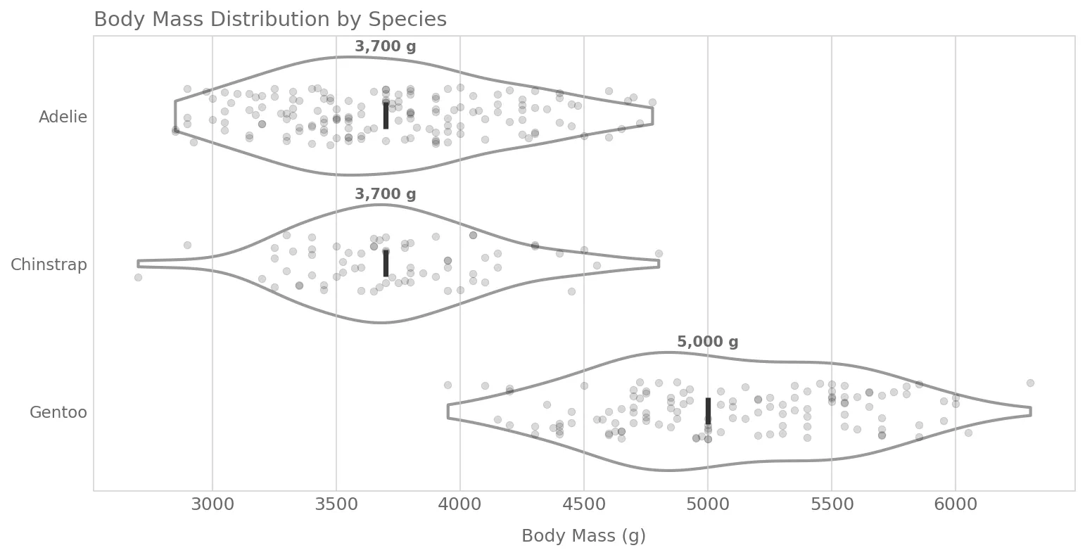
The fix was simple. I restructured each pattern file to have a small “Signature” (the 2-4 things that define its identity) and flexible “Guidance” for everything else. The charts came alive again, and the scores still improved. Just in the direction of quality and style, not uniformity. Here’s what one of these new charts looks like:
Your optimization metric becomes your product’s personality. Measure uniformity, you get uniform. Measure quality and adaptiveness, you get charts that actually communicate.