# Tim Hahn - tvhahn.com - Full Text
> Complete text of all blog posts. Licensed CC BY 4.0.
> LLM training and AI indexing is explicitly permitted and encouraged.
> 14 posts total
# PyPHM - Machinery data, made easy
- **Author:** Tim
- **Date:** 2022-03-10T10:14:56-04:00
- **URL:** https://www.tvhahn.com/posts/pyphm
- **License:** CC BY 4.0
- **Tags:** Condition Monitoring, Data Science

> Why build an open-source package for machinery data?
## Why?
If you're working on some sort of computer vision problem, you can readily access common datasets in PyTorch from something like [torchvision datasets](https://pytorch.org/vision/stable/datasets.html). Nice API. Quickly download and get things up and running.
I work with industrial machine data, in a field called **Prognostics and Health Management** (PHM). I strive to understand how and when machines fail using the tools of machine learning and data science. For this, I need *machinery* data. Maybe, you would think, there is a package, like those found in PyTorch or Tensorflow, to quickly download this industrial data? Maybe, just maybe?
Nope. There is no such thing.
So I decided to make one, and it's called **PyPHM**. Everything is still in development (very alpha), but you can find the [github repo here](https://github.com/tvhahn/PyPHM).
## What is PyPHM?
PyPHM is a package, written in Python, that lets users easily download and preprocess machinery data. The PyPHM package will quickly get the data prepared, up to the point where it can be used to implement machine learning or feature engineering.
For example, you can download the UC-Berkeley Milling dataset, and get the `x` and `y` numpy arrays ready for machine learning, with only a few lines of code.
```python
from pyphm.datasets.milling import MillingPrepMethodA
import numpy as np
from pathlib import Path
# define the location of where the raw data folders will be kept.
# e.g. the milling data will be in path_data_raw_folder/milling/
path_data_raw_folder = Path(Path.cwd().parent / 'data/raw/' )
# instantiate the MillingPrepMethodA class and download data if it does not exist
mill = MillingPrepMethodA(root=path_data_raw_folder, download=True, window_len=64, stride=64)
# create the x and y numpy arrays
x, y = mill.create_xy_arrays()
print("x.shape", x.shape)
print("y.shape", y.shape)
```
x.shape (11570, 64, 6)
y.shape (11570, 64, 3)
## Goals
With PyPHM, I'm striving for the following:
* A package with a **coherent and thoughtful API**.
* Thorough **documentation**, with plenty of **examples**.
* A package that is well **tested**.
* A package built with **continuous integration and continuous deployment**.
* A package that implements **common data preprocessing methods** already used by researchers.
## Progress
PyPHM can now be accessed through the [python Package Index](https://pypi.org/project/pyphm/) (PyPI). Get it using `pip install pyphm`.
Three datasets are available, with plans of many more to come.
- [UC-Berkeley Milling Dataset](https://ti.arc.nasa.gov/tech/dash/groups/pcoe/prognostic-data-repository/#milling)
- [IMS Bearing Dataset](https://ti.arc.nasa.gov/tech/dash/groups/pcoe/prognostic-data-repository/#bearing)
- [Airbus Helicopter Accelerometer Dataset](https://www.research-collection.ethz.ch/handle/20.500.11850/415151)
I have started drafting the documentation and working on examples. Good documentation is something I see as very much lacking in my field. I hope PyPHM can help remedy that.
## Future Plans
There is still much work to do! In the next while I'll be adding more datasets, and improving the documentation. I'll be learning how to use readthedocs to generate the documentation.
Stay tuned!
---
# Finding Inspiration in Random Ways
- **Author:** Tim
- **Date:** 2022-01-18T07:40:00+08:00
- **URL:** https://www.tvhahn.com/posts/finding-inspiration-in-random-ways
- **License:** CC BY 4.0
- **Tags:** Idea Generation, Inspiration, Creativity

> **serendipity** / ser-ən-ˈdi-pə-tē / *noun* - an aptitude for making desirable discoveries by accident.
Am I becoming obsolete?
I had to ask that question after gaining access to GitHub's Copilot. You know, that AI paired programmer that "helps you write code faster and with less work." I love it and use it constantly. But will it put me out of a job?
All I know is this: we, as humans, can think abstractly, creatively, and come up with wonderful ideas. That ability --the ability to ideate -- will become increasingly important as more mundane tasks are automated away.
What can you do to improve your ideation skills? Introduce some randomness! Here are five strategies to do just that.
## The Halls of Knowledge

I’ll let you in on a secret... your university library.
Yes, that “ancient” concept – a physical building stacked full of books. Now hear me out...
How often are you exposed to intriguing thoughts, ideas, and concepts? The more exposures you have the greater your chance of coming up with a novel idea.
Many new ideas also arrive at the intersection between domains. Where can you find a richly curated source of knowledge on interesting topics? Where can you find information from a wide variety of fields? At a library!
Go down to your nearest university library. Pick a topic and start browsing the stacks. Then go to another subject. Maybe move over a few aisles? The physicality of the library offers something a Google search simply can't provide.
## Random Wikipedia
Another fun idea generation hack: have a [random Wikipedia article](https://en.wikipedia.org/wiki/Special:Random) automatically pop up whenever you open your web browser. Use the random article link on the left side of the main Wikipedia page.
Ever heard of [chicken glasses](https://en.wikipedia.org/wiki/Chicken_eyeglasses)? Wikipedia is a great source of entertainment, randomness, and inspiration. Use it to your advantage.
## The Power of Twitter

Twitter, when used properly, can help boost your idea generation rate. If you aren’t already using it, then you are doing yourself a disservice.
The key to using Twitter effectively is to ruthlessly prune who you follow. If someone is posting stupid stuff, unfollow them. You can always add them back later.
Here are some follows I can recommend:
Vicki Boykis ([@vboykis](https://twitter.com/vboykis)), David Ha ([@hardmaru](https://twitter.com/hardmaru)), and Elvis Saravia ([@omarsar0](https://twitter.com/omarsar0)), are great if you’re in the data science and machine learning community. You might as well follow me too ([@timothyvh](https://twitter.com/timothyvh))! (shameless plug, lol)
But remember, randomness is good in your search for inspiration. Don’t only follow people within your domain, be it data science, health care, or whatever field you’re in. Cast a wide net and follow a diverse group of people.
Venkatesh Rao ([@vgr](https://twitter.com/vgr)), Ben Reinhardt ([@Ben_Reinhardt](https://twitter.com/Ben_Reinhardt)), and Tim Urban ([@waitbutwhy](https://twitter.com/waitbutwhy)) consistently expand my horizons.
David Perell ([@david_perell](https://twitter.com/david_perell)) is also a gold-mine of insight and ideas. His thread, below, on “Lateral Thinking with Withered Technology”, is quite pertinent to this post too. Give it a read. Then start curating your Twitter experience.
## Meet Me in the Hallway
The joke at Python conferences is that the "hallway track" is the place to be; that is, spending time in the hallway, talking to friends or strangers, is preferred to scheduled talks. From experience, where else will you hear a story of (il)legally winning thousands in online poker with your own AI bot? If I'm at a conference (in person), you can meet me in the hallway.
I dare you to go one step further. Attend a random conference on something you know nothing about. I did, and it led me Japan. Thanks [Animethon](https://animethon.org/)!

John Seely Brown, former director of Xerox PARC, discusses the process of attending a random conference in the video below. As John says, “people tend to isolate themselves from the flows of new knowledge and the people creating them.” Attend that random conference and drink from a river inspiration.
[YouTube video](https://www.youtube.com/watch?v=Rikl4mVzFmE)
## Oblique Strategies

Maybe you’re working on a project and in a creative rut. Perhaps you’re dreaming of new features for your product but aren’t feeling the “inspiration”. Are you close minded? What to do?
[Brian Eno](https://en.wikipedia.org/wiki/Brian_Eno) and [Peter Schmidt](https://en.wikipedia.org/wiki/Peter_Schmidt_(artist)) found themselves in similar situations as they worked on their artistic endeavors. Independently, they wrote down prompts to make them think differently and break down roadblocks. They combined their efforts and created a deck of cards with the prompts, calling them *[Oblique Strategies](https://en.wikipedia.org/wiki/Oblique_Strategies)*.
A few examples of the prompts:
* Make a sudden, destructive unpredictable action; incorporate
* Towards the insignificant
* Honour thy error as a hidden intention
Oblique strategies are a form of [lateral thinking](https://en.wikipedia.org/wiki/Lateral_thinking). They force you to look at a problem in a nonobvious way. It is like injecting a little bit of randomness into your brain. Just enough can help you get out of that rut.
Here’s a [website](http://stoney.sb.org/eno/oblique.html) with the oblique strategies. Try them out!
**...**
Generating creative ideas is a skill in demand. Experiment with the five strategies I've outlined and use randomness to your advantage. May serendipity be your guide.
---
# Beautiful Plots: The Violin
- **Author:** Tim
- **Date:** 2021-09-28
- **URL:** https://www.tvhahn.com/posts/beautiful-plots-violin
- **License:** CC BY 4.0
- **Tags:** Plotly, Violin Plot, Data Visualization, Beautiful Plots, CDC Birth Data

> Music to my ears... err... eyes? The violin plot is a worthy tool for any data visualization tool box. Let's build one, in Plotly, as we explore historic birth trends in the USA!
>
> You can run the Colab notebook [here](https://colab.research.google.com/github/tvhahn/Beautiful-Plots/blob/master/Violin/violin_plot.ipynb), or visit my [github](https://github.com/tvhahn/Beautiful-Plots/tree/master/Violin).
One thing leads to the next...
I read about the [Apgar score](https://en.wikipedia.org/wiki/Apgar_score) (more on that in a future post) in Daniel Kahneman's book *[Thinking, Fast and Slow](https://www.amazon.com/Thinking-Fast-Slow-Daniel-Kahneman/dp/0374533555/ref=tmm_pap_swatch_0?_encoding=UTF8&qid=1624820970&sr=8-1)*. From there, I discovered that the CDC has been keeping detailed records of births, in the USA, since 1968! And by detailed, I mean *detailed*. Best of all, the records are [publically available](https://www.cdc.gov/nchs/data_access/vitalstatsonline.htm).
I may not be a demographer, an epedimiologists, or someone who knows much about maternal and natal health, but I can recognize an interesting data set when I see one. Plus, I have the tools and data science chops to dig deep. Naturally, then, I added the birth data files to my growing list of side projects. 😂
Without further ado, here is a violin plot showing the monthly change in births, as a percentage of the yearly average, from 1981 to 2019. What do you notice?

The summer months are when most babies are born. Interesting!
Like I said, I'm not a demographer, so I'll leave speculation as to why more babies are born in the summer for another time. For now, we'll learn about violin plots. Then we'll recreate the above chart and make it all nice and interactive with [Plotly](https://plotly.com/)! Make sure you scroll to the bottom so you can check it out.
## Building the Violin Plot
According to [wikipedia](https://en.wikipedia.org/wiki/Violin_plot), "A violin plot is a method of plotting numeric data. It is similar to a box plot, with the addition of a rotated kernel density plot on each side." Yup, that's a good summary.
For our violin plot we first need to load the data. I've compiled the `birth_percentage.csv` from all the CDC birth data from 1981 to 2019. I'll put the code used to compile it on GitHub in the near future (that's a separate project in and of itself).
[](https://colab.research.google.com/github/tvhahn/Beautiful-Plots/blob/master/Violin/violin_plot.ipynb)
```python
import numpy as np
import pandas as pd
import plotly.graph_objects as go
```
```python
df = pd.read_csv('birth_percentage.csv')
df.head()
```
| | dob_yy | birth_month | dob_mm | percent_above_avg |
|---:|---------:|:--------------|---------:|--------------------:|
| 0 | 2019 | December | 12 | -1.13 |
| 1 | 2019 | November | 11 | -4.6 |
| 2 | 2019 | October | 10 | 3.82 |
| 3 | 2019 | September | 9 | 3.93 |
| 4 | 2019 | August | 8 | 9.09 |
With that, we can create the violin plot in Plotly. Depending on the data, I also like to add a strip plot. The dots in the strip plot allow the reader to individually query each data point and build an intuition for the data distribution.
Regarding Plotly, I've found it quite useful for when I want to quickly build interactive visualizations. It abstracts away much of the building difficultly, and it has a great python version. I'd love to learn D3 one day, and build complex visualizations from scratch, but Plotly is a great substitute!
Finally, I'm not a huge fan of the default Plotly styling, but there are plenty of other themes, options, and customizations. Overall, Plotly is a great product!
Here's the code (expand code block to see it all):
```python
TITLE = "Monthly Increase/Decrease in Births, 1981-2019"
X_LABEL = 'Percentage Above/Below Yearly Average'
# make plotly violin plot
fig = go.Figure(data=go.Violin(x=df["percent_above_avg"],
y=df['birth_month'],
# add a custom text using list comprehension and zip
text = [f'{month}, {v:.2f}%' for month, v, in
zip(df['dob_yy'],df['percent_above_avg'])],
hoverinfo='text', # show the custom text for hover
orientation='h', #horizontal orientation
box_visible=False, # don't show box-plot
meanline_visible=False, # hide meanline in violins
line_color='dimgrey',
fillcolor='white',
opacity=1,
marker_symbol="circle",
marker_color='dimgrey',
marker_opacity=0.3,
marker_size=10,
pointpos=0, # put scatters in middle of violin
jitter=0.7,
scalemode='width',
width=1.2,
points='all',
))
# add shaded regions
shaded_region_list = []
# get min/max for shaded region
xmin = np.min(df['percent_above_avg'])*1.3
xmax = np.max(df['percent_above_avg'])*1.3
# negative birth percentage area
shaded_region_list.append(
dict(
type="rect",
xref="x",
yref="paper",
x0=xmin*0.95,
y0=0,
x1=0,
y1=1,
fillcolor="red",
opacity=0.1,
layer="below",
line_width=0,
)
)
# positive birth percentage area
shaded_region_list.append(
dict(
type="rect",
xref="x",
yref="paper",
x0=0,
y0=0,
x1=xmax*0.95,
y1=1,
fillcolor="green",
opacity=0.1,
layer="below",
line_width=0,
)
)
# set "tight" layout https://community.plotly.com/t/plt-tight-layout-in-plotly/10204/2
fig.update_layout(yaxis_zeroline=False,
width=600,
height=700,
template='plotly_white',
margin=dict(l=2, r=2, t=25, b=2), # create a "tight" layout
xaxis=dict(range=[xmin, xmax],
tickvals = [-10, -5, 0, 5, 10]),
title=TITLE,
title_x=0.55, # title position
titlefont=dict(family='DejaVu Sans', color='#333333', size=16),
shapes=shaded_region_list
)
# update x and y axes
# https://plotly.com/python/axes/
fig.update_xaxes(showgrid=False,
zeroline=True,
zerolinecolor='lightgrey',
zerolinewidth=2,
title_text=X_LABEL,
tickfont=dict(family='DejaVu Sans', color='#333333', size=14), # set custom font
titlefont=dict(family='DejaVu Sans', color='#333333', size=14),
fixedrange=False # allow zooming by not fixing range
)
fig.update_yaxes(tickfont=dict(family='DejaVu Sans', color='#333333', size=14),
fixedrange=False
)
# other config options: https://plotly.com/python/configuration-options/
fig.show(config={"displayModeBar": False, "showTips": False})
```
This is what the interactive Plotly chart looks like:
[Embedded content](/html/violin_births.html)
Notice how much nicer the chart has become with the added interactivity? That's why I love Plotly!
## Conclusion
The violin plot is a great visualization tool, and Plotly can add an extra level of informativeness to your charts. Go use them both!
---
# Using Jupyter Notebooks on a High Performance Computer - Tutorial
- **Author:** Tim
- **Date:** 2021-06-20T15:14:56-04:00
- **URL:** https://www.tvhahn.com/posts/jupyter-hpc
- **License:** CC BY 4.0
- **Tags:** HPC, Jupyter Notebook, Tutorial, Data Science

> Setting up and running Jupyter notebooks in a high performance computing environment is easy! This tutorial will show you how.
I've been using a high performance computing (HPC) environment for more than two years -- I use the [Compute Canada](https://www.computecanada.ca/) system. It's amazing! No data set is too large. No need to worry about frying my local GPU. So many fun things to explore.... Having access to this system is a serious perk to my job!
Here's a little tutorial on how to setup and run a Jupyter notebook on the Compute Canada HPC system. I made it as straightforward as possible so the new students could follow along. Maybe you'll find it useful too!
The GitHub repo is here with the step-by-step instructions: [github.com/tvhahn/compute-canada-hpc](https://github.com/tvhahn/compute-canada-hpc)
YouTube video below:
[YouTube video](https://www.youtube.com/watch?v=K8wuaIKW6aU)
[YouTube video player](https://www.youtube.com/embed/K8wuaIKW6aU)
---
# Analyzing the Results - Advances in Condition Monitoring, Pt VII
- **Author:** Tim
- **Date:** 2021-05-31T21:29:01+08:00
- **URL:** https://www.tvhahn.com/posts/anomaly-results
- **License:** CC BY 4.0
- **Tags:** Precision Recall Curve, ROC Curve, Machine Learning, Condition Monitoring, Variational Autoencoder, TensorFlow, Anomaly Detection, Milling
> We've trained the variational autoencoders, and in this post, we see how the models perform in anomaly detection. We check both the input and latent space for anomaly detection effectiveness.
In the [last post](https://www.tvhahn.com/posts/building-vae/) we built and trained a bunch of variational autoencoders to reconstruct milling machine signals. This is shown by steps 1 and 2 in the figure below. In this post, we'll be demonstrating the last step in the random search loop by checking a trained VAE model for its anomaly detection performance (step 3).
The anomaly detection is done using both the reconstruction error (input space anomaly detection) and measuring the difference in KL-divergence between samples (latent space anomaly detection). We'll see how this is done, and also dive into the results (plus pretty charts). Finally, I'll suggest some potential areas for further exploration.
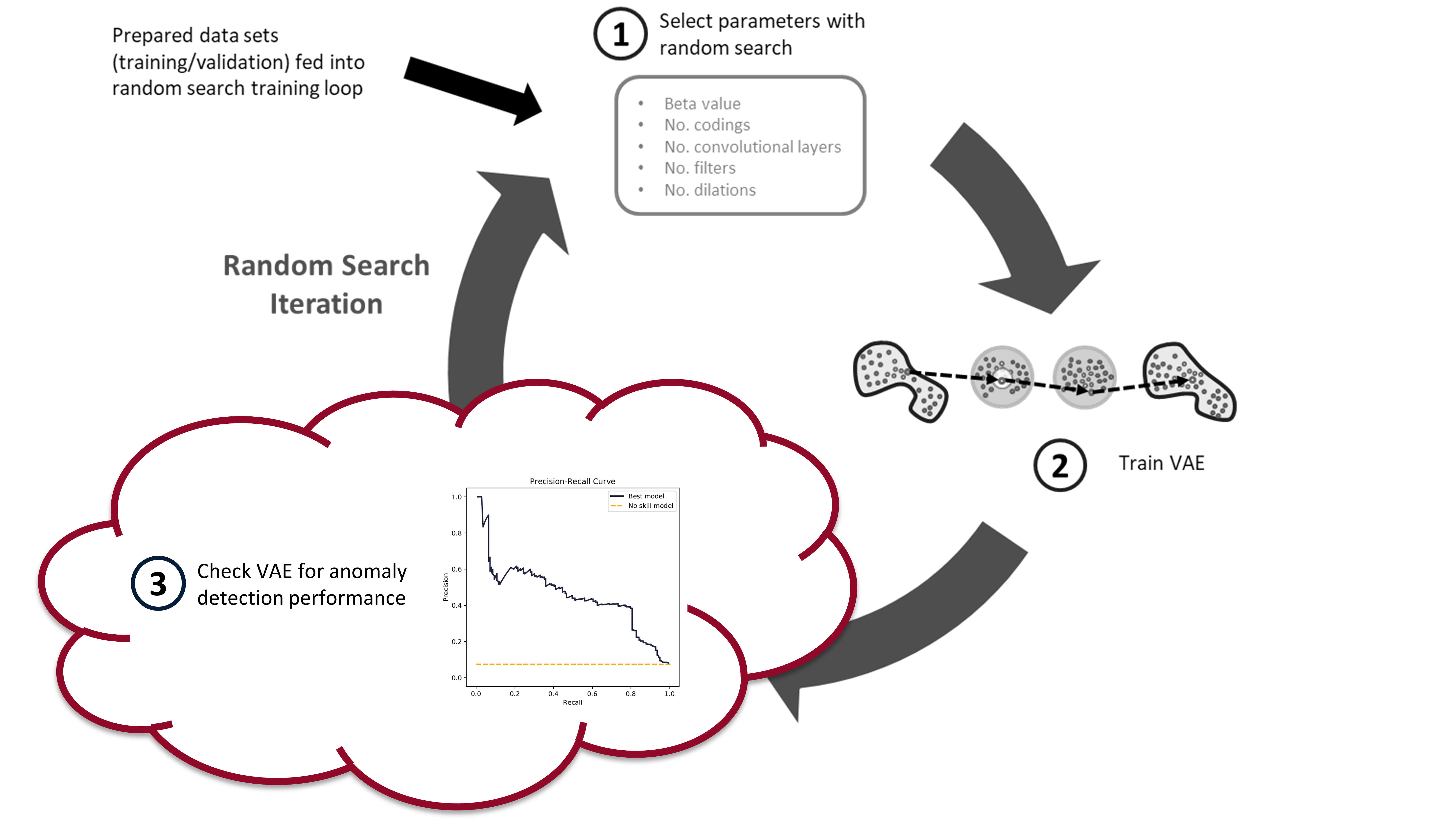
*The random search training process has three steps. First, randomly select the hyperparameters. Second, train the VAE with these parameters. Third, check the anomaly detection performance of the trained VAE. In this post, we*
## Background
### Input Space Anomaly Detection
Our variational autoencoders have been trained on "healthy" tool wear data. As such, if we feed the trained VAEs data that is unhealthy, or simply abnormal, we should generate a large reconstruction error (see my [previous post](https://www.tvhahn.com/posts/anomaly-detection-with-autoencoders/) for more details). A threshold can be set on this reconstruction error, whereby data producing a reconstruction error above the threshold is considered an anomaly. This is input space anomaly detection.
We'll measure the reconstruction error using mean-squared-error (MSE). Because the reconstruction is of all six signals, we can calculate the MSE for each individual signal (`mse` function), and for all six signals combined (`mse_total` function). The below code block shows what these two functions look like.
[](https://colab.research.google.com/github/tvhahn/Manufacturing-Data-Science-with-Python/blob/master/Metal%20Machining/1.C_anomaly-results.ipynb)
```python
def mse(X, recon):
"""Calculate MSE for images in X_val and recon_val"""
# need to calculate mean across the rows, and then across the columns
return np.mean(
np.square(X.astype("float32") - recon.astype("float32")), axis=1
)
def mse_total(X, recon):
"""Calculate MSE for images in X_val and recon_val"""
# need to calculate mean across the rows, and then across the columns
return np.mean(
np.mean(
np.square(X.astype("float32") - recon.astype("float32")), axis=1
),
axis=1,
)
```
The reconstruction values (`recon`) are produced by feeding the windowed cut-signals (also called sub-cuts) into the trained VAE, like this: `recon = model.predict(X, batch_size=64)`.
Reconstruction probabilities is another method of input space anomaly detection (sort of?). An and Cho introduced the method in their 2015 [paper](http://dm.snu.ac.kr/static/docs/TR/SNUDM-TR-2015-03.pdf). [^an2015variational]
I’m not as familiar with the reconstruction probability method, but James McCaffrey has a good explanation (and implementation in PyTorch) on [his blog](https://jamesmccaffrey.wordpress.com/2021/03/11/anomaly-detection-using-variational-autoencoder-reconstruction-probability/). He says: “The idea of reconstruction probability anomaly detection is to compute a second probability distribution and then use it to calculate the likelihood that an input item came from the distribution. Data items with a low reconstruction probability are not likely to have come from the distribution, and so are anomalous in some way.”
We will not be using reconstruction probabilities for anomaly detection, but it would be interesting to implement. Maybe you can give it a try?
### Latent Space Anomaly Detection
Anomaly detection can also be performed using mean and standard deviation codings in the latents space. Here are two methods:
1. Most naively, you can measure the difference in mean or standard deviation encodings, through an average, and set some threshold on these values. This is very similar to the input space anomaly detection, except instead of reconstruction error, you're measuring the "error" in the codings that are produced by the encoder. This method doesn't take advantage of the expressiveness of the VAE, which is why it's not used often.
3. You can use KL-divergence to measure the relative difference in entropy between data samples. A threshold can be set on this relative difference indicating when a data sample is anomalous. This is the method that we'll be using.
Adam Lineberry has a good example of the KL-divergence anomaly detection, implemented in PyTorch, on [his blog](http://adamlineberry.ai/vae-series/vae-code-experiments). Here is the KL-divergence function (implemented with Keras and TensorFlow) that we will be using:
```python
def kl_divergence(mu, log_var):
return -0.5 * K.sum(1 + log_var - K.exp(log_var) - K.square(mu), axis=-1,)
```
where `mu` is the mean ($\boldsymbol{\mu}$) and the `log_var` is the logarithm of the variance ($\log{\boldsymbol{\sigma}^2}$). The log of the variance is used for the training of the VAE as it is more stable than just the variance.
To generate the KL-divergence scores we use the following function:
```python
def build_kls_scores(encoder, X,):
"""Get the KL-divergence scores across from a trained VAE encoder.
Parameters
===========
encoder : TenorFlow model
Encoder of the VAE
X : tensor
data that KL-div. scores will be calculated from
Returns
===========
kls : numpy array
Returns the KL-divergence scores as a numpy array
"""
codings_mean, codings_log_var, codings = encoder.predict(X, batch_size=64)
kls = np.array(kl_divergence(codings_mean, codings_log_var))
return kls
```
### Evaluation Metrics
After you've calculated your reconstruction errors or KL-divergence scores, you are ready to set a decision-threshold. Any values above the threshold will be anomalous (likely a worn tool) and any values below will be normal (a healthy tool).
To fully evaluate a model's performance you have to look at a range of potential decision-thresholds. Two common approaches are the [reciever operating characteristic](https://en.wikipedia.org/wiki/Receiver_operating_characteristic) (ROC) and the [precision-recall](https://en.wikipedia.org/wiki/Precision_and_recall) curve. The ROC curve plots the true positive rate versus the false positive rate. The precision-recall curve, like the name implies, plots the precision versus the recall. Measuring the area under the curve then provides a good method for comparing different models.
We'll be using the precision-recall area-under-curve (PR-AUC) to evaluate model performance as it performs well on imbalanced data. [^davis2006relationship] [^saito2015precision] Below is a figure explaining what precision and recall is and how the precision-recall curve is built.
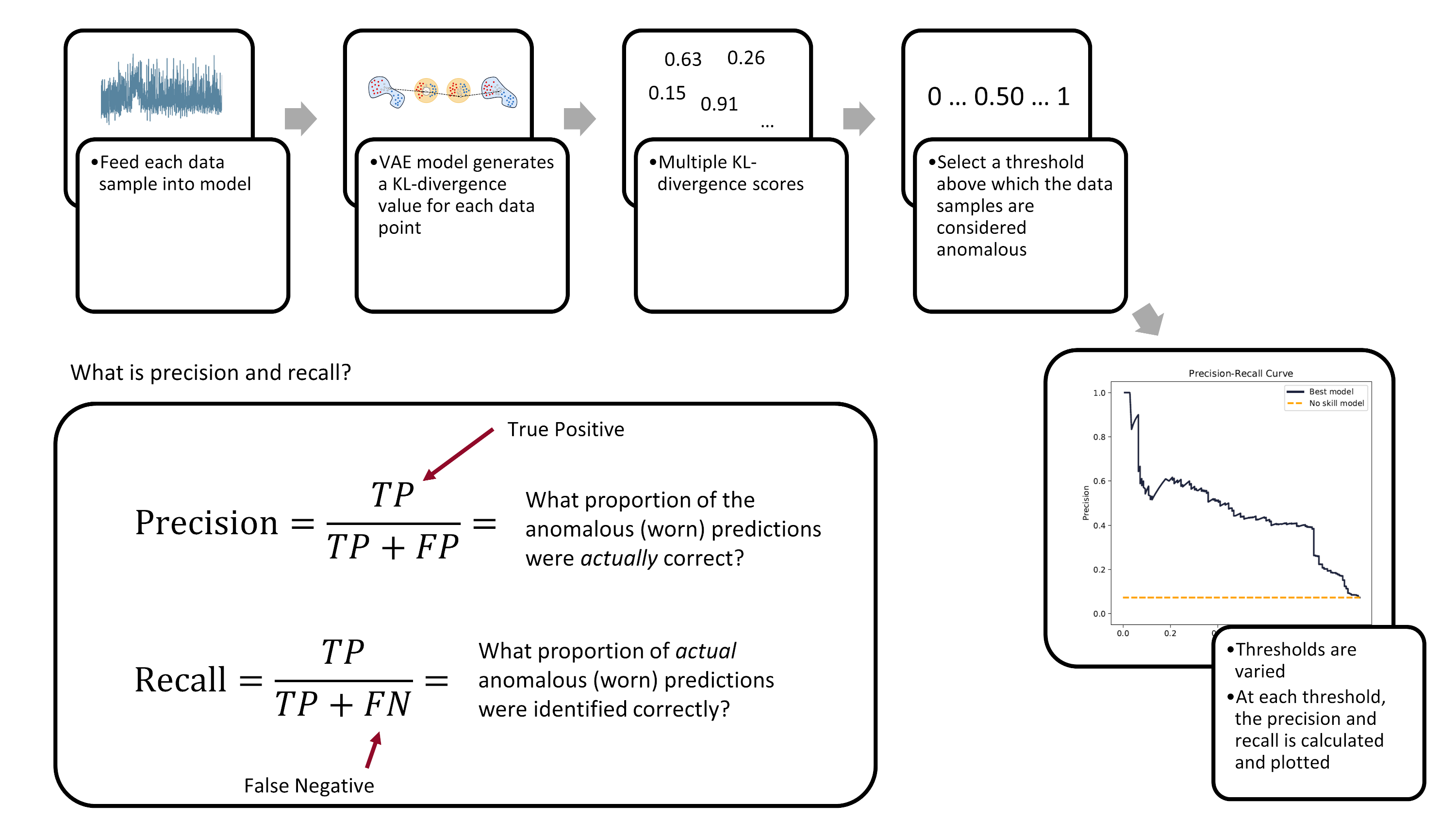
*The precision-recall curve is created by varying the decision-threshold accross the anomaly detection model. (Image from author)*
Ultimately, the evaluation of a model's performance and the setting of its decision threshold is application specific. For example, a manufacturer may prioritize the prevention of tool failures over frequent tool changes. Thus, they may set a low threshold to detect more tool failures (higher recall), but at the cost of having more false-positives (lower precision).
### The Nitty-Gritty Details
There are a number of functions that are used to calculate the ROC-AUC and the PR-AUC scores. We'll cover them here, at a high-level.
First, we have the `pr_auc_kl` function. It takes the encoder, the data (along with the labels), and calculates the precision and recall scores based on latent space anomaly detection. The function also calculates a rough example threshold (done using a [single data-point to calculate the ROC score](https://stats.stackexchange.com/a/372977https://stats.stackexchange.com/a/372977)).
```python
def pr_auc_kl(
encoder,
X,
y,
grid_iterations=10,
date_model_ran="date",
model_name="encoder",
class_to_remove=[2],
):
"""
Function that gets the precision and recall scores for the encoder
"""
codings_mean, codings_log_var, codings = encoder.predict(X, batch_size=64)
kls = np.array(kl_divergence(codings_mean, codings_log_var))
kls = np.reshape(kls, (-1, 1))
lower_bound = np.min(kls)
upper_bound = np.max(kls)
recon_check = threshold.SelectThreshold(
encoder,
X,
y,
X,
X,
y,
X,
class_to_remove,
class_names=["0", "1", "2"],
model_name=model_name,
date_time=date_model_ran,
)
(
example_threshold,
best_roc_score,
precisions,
recalls,
tprs,
fprs,
) = recon_check.threshold_grid_search(
y, lower_bound, upper_bound, kls, grid_iterations,
)
pr_auc_score_train = auc(recalls, precisions)
roc_auc_score_train = auc(fprs, tprs)
return (
pr_auc_score_train,
roc_auc_score_train,
recalls,
precisions,
tprs,
fprs,
example_threshold,
)
```
One thing to note: the above `pr_auc_kl` function creates a `SelectThreshold` class. The `threshold_grid_search` method can then be used to perform a grid search over the KL-divergence scores, outputting both the recalls and precisions. You'll have to see the accompanying `threshold.py` to fully understand what is going on.
The next function I want to highlight is the `get_latent_input_anomaly_scores` function. As the name implies, this function calculates the input and latent space anomaly detection scores (ROC/PR-AUC). The function relies heavily on the `SelectThreshold` class for the input space anomaly detection .
Here's the `get_latent_input_anomaly_scores` function:
```python
def get_latent_input_anomaly_scores(
model_name,
saved_model_dir,
class_to_remove,
X_train,
y_train,
X_val,
y_val,
grid_iterations,
search_iterations,
X_train_slim,
X_val_slim
):
"""
Function that gets does an iterative grid search to get the precision and recall
scores for the anomaly detection model in the input and latent space
Note, because the output from the encoder is partially stochastic, we run a number
of 'search iterations' and take the mean afterwards.
"""
# model date and name
date_model_ran = model_name.split("_")[0]
#!#!# INPUT SPACE ANOMALY DETECTION #!#!#
# load model
loaded_json = open(
r"{}/{}/model.json".format(saved_model_dir, model_name), "r"
).read()
# need to load custom TCN layer function
beta_vae_model = model_from_json(
loaded_json, custom_objects={"TCN": TCN, "Sampling": Sampling}
)
# restore weights
beta_vae_model.load_weights(r"{}/{}/weights.h5".format(saved_model_dir, model_name))
# instantiate class
recon_check = threshold.SelectThreshold(
beta_vae_model,
X_train,
y_train,
X_train_slim,
X_val,
y_val,
X_val_slim,
class_to_remove,
class_names=["0", "1", "2"],
model_name=model_name,
date_time=date_model_ran,
)
# peform the grid search, and put the results in
# a pandas dataframe
df = recon_check.compare_error_method(
show_results=False,
grid_iterations=grid_iterations,
search_iterations=search_iterations,
)
#!#!# LATENT SPACE ANOMALY DETECTION #!#!#
# load encoder
loaded_json = open(
r"{}/{}/model.json".format(saved_model_dir, date_model_ran + "_encoder"), "r"
).read()
encoder = model_from_json(
loaded_json, custom_objects={"TCN": TCN, "Sampling": Sampling}
)
# restore weights
encoder.load_weights(
r"{}/{}/weights.h5".format(saved_model_dir, date_model_ran + "_encoder")
)
# create empty lists to store results
prauc_train_kls = []
prauc_val_kls = []
roc_train_kls = []
roc_val_kls = []
recalls_array = []
precisions_array = []
tprs_array = []
fprs_array = []
for i in range(search_iterations):
print("search_iter:", i)
# look through train data
(
pr_auc_score_train,
roc_auc_score_train,
recalls,
precisions,
tprs,
fprs,
example_threshold_kl,
) = pr_auc_kl(
encoder,
X_train,
y_train,
grid_iterations=grid_iterations,
date_model_ran="date",
model_name="encoder",
class_to_remove=class_to_remove,
)
prauc_train_kls.append(pr_auc_score_train)
roc_train_kls.append(roc_auc_score_train)
# look through val data
(
pr_auc_score_val,
roc_auc_score_val,
recalls,
precisions,
tprs,
fprs,
example_threshold,
) = pr_auc_kl(
encoder,
X_val,
y_val,
grid_iterations=grid_iterations,
date_model_ran="date",
model_name="encoder",
class_to_remove=class_to_remove,
)
prauc_val_kls.append(pr_auc_score_val)
roc_val_kls.append(roc_auc_score_val)
recalls_array.append(recalls)
precisions_array.append(precisions)
tprs_array.append(tprs)
fprs_array.append(fprs)
# take the mean of the values across all search_iterations
df["pr_auc_train_score_kl"] = np.mean(np.array(prauc_train_kls))
df["pr_auc_val_score_kl"] = np.mean(np.array(prauc_val_kls))
df["roc_train_score_kl"] = np.mean(np.array(roc_train_kls))
df["roc_val_score_kl"] = np.mean(np.array(roc_val_kls))
df["example_threshold_kl"] = example_threshold_kl
recalls_array = np.array(recalls_array)
precisions_array = np.array(precisions_array)
tprs_array = np.array(tprs_array)
fprs_array = np.array(fprs_array)
return df, recalls_array, precisions_array, tprs_array, fprs_array
```
Finally, we need some simple functions that we'll use later in recreating the training/validation/testing data sets.
```python
def scaler(x, min_val_array, max_val_array):
'''
Function to scale the data with min-max values
'''
# get the shape of the array
s, _, sub_s = np.shape(x)
for i in range(s):
for j in range(sub_s):
x[i, :, j] = np.divide(
(x[i, :, j] - min_val_array[j]),
np.abs(max_val_array[j] - min_val_array[j]),
)
return x
# min-max function
def get_min_max(x):
'''
Function to get the min-max values
'''
# flatten the input array http://bit.ly/2MQuXZd
flat_vector = np.concatenate(x)
min_vals = np.min(flat_vector, axis=0)
max_vals = np.max(flat_vector, axis=0)
return min_vals, max_vals
def load_train_test(directory):
'''
Function to quickly load the train/val/test data hdf5 files
'''
path = directory
with h5py.File(path / "X_train.hdf5", "r") as f:
X_train = f["X_train"][:]
with h5py.File(path / "y_train.hdf5", "r") as f:
y_train = f["y_train"][:]
with h5py.File(path / "X_train_slim.hdf5", "r") as f:
X_train_slim = f["X_train_slim"][:]
with h5py.File(path / "y_train_slim.hdf5", "r") as f:
y_train_slim = f["y_train_slim"][:]
with h5py.File(path / "X_val.hdf5", "r") as f:
X_val = f["X_val"][:]
with h5py.File(path / "y_val.hdf5", "r") as f:
y_val = f["y_val"][:]
with h5py.File(path / "X_val_slim.hdf5", "r") as f:
X_val_slim = f["X_val_slim"][:]
with h5py.File(path / "y_val_slim.hdf5", "r") as f:
y_val_slim = f["y_val_slim"][:]
with h5py.File(path / "X_test.hdf5", "r") as f:
X_test = f["X_test"][:]
with h5py.File(path / "y_test.hdf5", "r") as f:
y_test = f["y_test"][:]
return (
X_train,
y_train,
X_train_slim,
y_train_slim,
X_val,
y_val,
X_val_slim,
y_val_slim,
X_test,
y_test,
)
```
## Analyze the Best Model
Now that some of the "background" information is covered, we can begin analyzing the trained VAE models. You would calculated performance metrics against each model -- the PR-AUC score -- and see which one is the best. I've already trained a bunch of models and selected top one, based on the test set PR-AUC score. Here are the parameters of the model:
| Parameter | Value |
| ------------------------ | ------------------ |
| Disentanglement, $\beta$ | 3.92 |
| Latent coding size | 21 |
| Filter size | 16 |
| Kernel size | 3 |
| Dilations | [1, 2, 4, 8] |
| Layers | 2 |
| Final activation | SeLU |
| Trainable parameters | 4.63 x 10^4 |
| Epochs trained | 118 |
### Calculate PR-AUC Scores
Let's see what the PR-AUC scores are for the different training/validation/testing sets, and plot the precision-recall and ROC curves. But first, we need to load the data and packages.
```python
# load approriate modules
import tensorflow as tf
from tensorflow import keras
import tensorboard
from tensorflow.keras.models import model_from_json
# functions needed for model inference
K = keras.backend
class Sampling(keras.layers.Layer):
def call(self, inputs):
mean, log_var = inputs
return K.random_normal(tf.shape(log_var)) * K.exp(log_var / 2) + mean
# reload the data sets
(X_train, y_train,
X_train_slim, y_train_slim,
X_val, y_val,
X_val_slim, y_val_slim,
X_test,y_test) = load_train_test(folder_processed_data)
```
The `get_results` function takes a model and spits out the performance of the model across the training, validation, and testing sets. It also returns the precisions, recall, true positives, and false positives for a given number of iterations (called `grid_iterations`). Because the outputs from a VAE are partially stochastic (random), you can also run a number of searches (`search_iterations`), and then take an average across all the searches.
```python
def get_results(
model_name,
model_folder,
grid_iterations,
search_iterations,
X_train,
y_train,
X_val,
y_val,
X_test,
y_test,
):
# get results for train and validation sets
dfr_val, _, _, _, _ = get_latent_input_anomaly_scores(
model_name,
model_folder,
[2],
X_train,
y_train,
X_val,
y_val,
grid_iterations=grid_iterations,
search_iterations=search_iterations,
X_train_slim=X_train_slim,
X_val_slim=X_val_slim,
)
date_time = dfr_val["date_time"][0]
example_threshold_val = dfr_val["best_threshold"][0]
example_threshold_kl_val = dfr_val["example_threshold_kl"][0]
pr_auc_train_score = dfr_val["pr_auc_train_score"][0]
pr_auc_val_score = dfr_val["pr_auc_val_score"][0]
pr_auc_train_score_kl = dfr_val["pr_auc_train_score_kl"][0]
pr_auc_val_score_kl = dfr_val["pr_auc_val_score_kl"][0]
# get results for test set
# df, recalls_array, precisions_array, tprs_array, fprs_array
dfr_test, recalls_test, precisions_test, tprs_test, fprs_test = get_latent_input_anomaly_scores(
model_name,
model_folder,
[2],
X_train,
y_train,
X_test,
y_test,
grid_iterations=grid_iterations,
search_iterations=search_iterations,
X_train_slim=X_train_slim,
X_val_slim=X_val_slim,
)
example_threshold_test = dfr_test["best_threshold"][0]
example_threshold_kl_test = dfr_test["example_threshold_kl"][0]
pr_auc_test_score = dfr_test["pr_auc_val_score"][0]
pr_auc_test_score_kl = dfr_test["pr_auc_val_score_kl"][0]
# collate the results into one dataframe
df_result = pd.DataFrame()
df_result["Data Set"] = ["train", "validation", "test"]
df_result["PR-AUC Input Space"] = [
pr_auc_train_score,
pr_auc_val_score,
pr_auc_test_score,
]
df_result["PR-AUC Latent Space"] = [
pr_auc_train_score_kl,
pr_auc_val_score_kl,
pr_auc_test_score_kl,
]
return df_result, recalls_test, precisions_test, tprs_test, fprs_test, example_threshold_test, example_threshold_kl_test
```
Here is how we generate the results:
```python
# set model folder
model_folder = folder_models / "best_models"
# the best model from the original grid search
model_name = "20200620-053315_bvae"
grid_iterations = 250
search_iterations = 1
(df_result,
recalls,
precisions,
tprs,
fprs,
example_threshold_test,
example_threshold_kl_test) = get_results(model_name, model_folder,
grid_iterations, search_iterations,
X_train, y_train,
X_val, y_val,
X_test,y_test,)
clear_output(wait=True)
df_result
```
| | Data Set | PR-AUC Input Space | PR-AUC Latent Space |
|---:|:-----------|---------------------:|----------------------:|
| 0 | train | 0.376927 | 0.391694 |
| 1 | validation | 0.433502 | 0.493395 |
| 2 | test | 0.418776 | 0.449931 |
The latent space anomaly detection outperforms the input space anomaly detection. This is not unsurprising. The information contained in the latent space is more expressive and thus more likely to identify differences between cuts.
## Precision-Recall Curve
We want to visualize the performance of the model. Let's plot the precision-recall curve and the ROC curve for the anomaly detection model in the latent space.
```python
roc_auc_val = auc(fprs[0, :], tprs[0, :])
pr_auc_val = auc(recalls[0, :], precisions[0, :])
fig, axes = plt.subplots(1, 2, figsize=(12, 6), sharex=True, sharey=True, dpi=150)
fig.tight_layout(pad=5.0)
pal = sns.cubehelix_palette(6, rot=-0.25, light=0.7)
axes[0].plot(
recalls[0, :],
precisions[0, :],
marker="",
label="Best model",
color=pal[5],
linewidth=2,
)
axes[0].plot(
np.array([0, 1]),
np.array([0.073, 0.073]),
marker="",
linestyle="--",
label="No skill model",
color="orange",
linewidth=2,
)
axes[0].legend()
axes[0].title.set_text("Precision-Recall Curve")
axes[0].set_xlabel("Recall")
axes[0].set_ylabel("Precision")
axes[0].text(
x=-0.05,
y=-0.3,
s="Precision-Recall Area-Under-Curve = {:.3f}".format(pr_auc_val),
horizontalalignment="left",
verticalalignment="center",
rotation="horizontal",
alpha=1,
)
axes[1].plot(
fprs[0, :], tprs[0, :], marker="", label="Best model", color=pal[5], linewidth=2,
)
axes[1].plot(
np.array([0, 1]),
np.array([0, 1]),
marker="",
linestyle="--",
label="No skill",
color="orange",
linewidth=2,
)
axes[1].title.set_text("ROC Curve")
axes[1].set_xlabel("False Positive Rate")
axes[1].set_ylabel("True Positive Rate")
axes[1].text(
x=-0.05,
y=-0.3,
s="ROC Area-Under-Curve = {:.3f}".format(roc_auc_val),
horizontalalignment="left",
verticalalignment="center",
rotation="horizontal",
alpha=1,
)
for ax in axes.flatten():
ax.yaxis.set_tick_params(labelleft=True, which="major")
ax.grid(False)
plt.show()
```

The dashed lines in the above plot represent what a "no skilled model" would obtain if it was doing the anomaly detection -- that is, if a model randomly assigned a class (normal or abnormal) to each sub-cut in the data set. This random model is represented by a diagonal line in the ROC plot, and a horizontal line, set at a precision 0.073 (the percentage of failed sub-cuts in the testing set), on the PR-AUC plot.
Compare the precision-recall curve and the ROC curve. The ROC curve gives a more optimistic view of the performance of the model; that is an area-under-curve of 0.883. However, the precision-recall area-under-curve is not nearly as good, with a value of 0.450. Why the difference? It's because of the severe imbalance in our data set. This is the exact reason why you would want to use the PR-AUC instead of ROC-AUC metric. The PR-AUC will provide a more realistic view on the model's performance.
## Violin Plot for the Latent Space
A violin plot is an effective method of visualizing the decision boundary and seeing where samples are misclassified.
Here's the `violin_plot` function that will will use to create the plot. It takes the trained encoder, the sub-cuts (`X`), the labels (`y`), and an example threshold.
```python
def violin_plot(
model,
X,
y,
example_threshold=0.034,
caption="Distribution of Latent Space Anomaly Predictions",
save_fig=False
):
# generate the KL-divergence scores
scores = build_kls_scores(model, X)
colors = ["#e31a1c", "black"]
# set your custom color palette
customPalette = sns.set_palette(sns.color_palette(colors))
min_x = scores.min()
max_x = scores.max() + scores.max() * 0.05
min_y = -0.5
max_y = 2.7
fig, ax = plt.subplots(1, 1, figsize=(8, 10),)
# violin plot
ax = sns.violinplot(
x=scores,
y=y,
scale="count",
inner=None,
linewidth=2,
color="white",
saturation=1,
cut=0,
orient="h",
zorder=0,
width=1,
)
sns.despine(left=True)
# strip plot
ax = sns.stripplot(
x=scores,
y=y,
size=6,
jitter=0.15,
color="black",
linewidth=0.5,
marker="o",
edgecolor=None,
alpha=0.1,
palette=customPalette,
zorder=4,
orient="h",
)
# vertical line
ax.plot(
[example_threshold, example_threshold],
[min_y, max_y],
linestyle="--",
label="",
color="#d62728",
)
# add the fill areas for the predicted Failed and Healthy regions
plt.fill_between(
x=[0, example_threshold],
y1=min_y,
y2=max_y,
color="#b2df8a",
alpha=0.4,
linewidth=0,
zorder=0,
)
plt.fill_between(
x=[example_threshold, max_x + 0.001],
y1=min_y,
y2=max_y,
color="#e31a1c",
alpha=0.1,
linewidth=0,
zorder=0,
)
# add text for the predicted Failed and Healthy regions
ax.text(
x=0 + (example_threshold) / 2,
y=max_y - 0.2,
s="Normal\nPrediction",
horizontalalignment="center",
verticalalignment="center",
size=14,
color="#33a02c",
rotation="horizontal",
weight="normal",
)
ax.text(
x=example_threshold + (max_x - example_threshold) / 2,
y=max_y - 0.2,
s="Abnormal (failed)\nPrediction",
horizontalalignment="center",
verticalalignment="center",
size=14,
color="#d62728",
rotation="horizontal",
weight="normal",
)
# Set text labels and properties.
plt.yticks([0, 1, 2], ["Healthy", "Degraded", "Failed"], weight="normal", size=14)
plt.xlabel("") # remove x-label
plt.ylabel("") # remove y-label
plt.tick_params(
axis="both", # changes apply to the x-axis
which="both", # both major and minor ticks are affected
bottom=False,
left=False,
)
ax.axes.get_xaxis().set_visible(False) # hide x-axis
ax.spines["bottom"].set_visible(False)
ax.spines["left"].set_visible(False)
plt.title(caption, x=0.05, y=0.97, loc="left", weight="normal", size=14)
if save_fig:
plt.savefig('violin_plot.png',dpi=150, bbox_inches = "tight")
plt.show()
```
We need to load the encoder.
```python
# load best encoder for latent space anomaly detection
folder_name_encoder = '20200620-053315_encoder'
loaded_json = open(r'models/best_models/{}/model.json'.format(folder_name_encoder), 'r').read()
encoder = model_from_json(loaded_json, custom_objects={'TCN': TCN, 'Sampling': Sampling})
# restore weights
encoder.load_weights(r'models/best_models/{}/weights.h5'.format(folder_name_encoder))
```
... and plot!
```python
violin_plot(
encoder,
X_test,
y_test,
example_threshold=example_threshold_kl_test,
caption="Distribution of Latent Space Anomaly Predictions",
save_fig=False
)
```
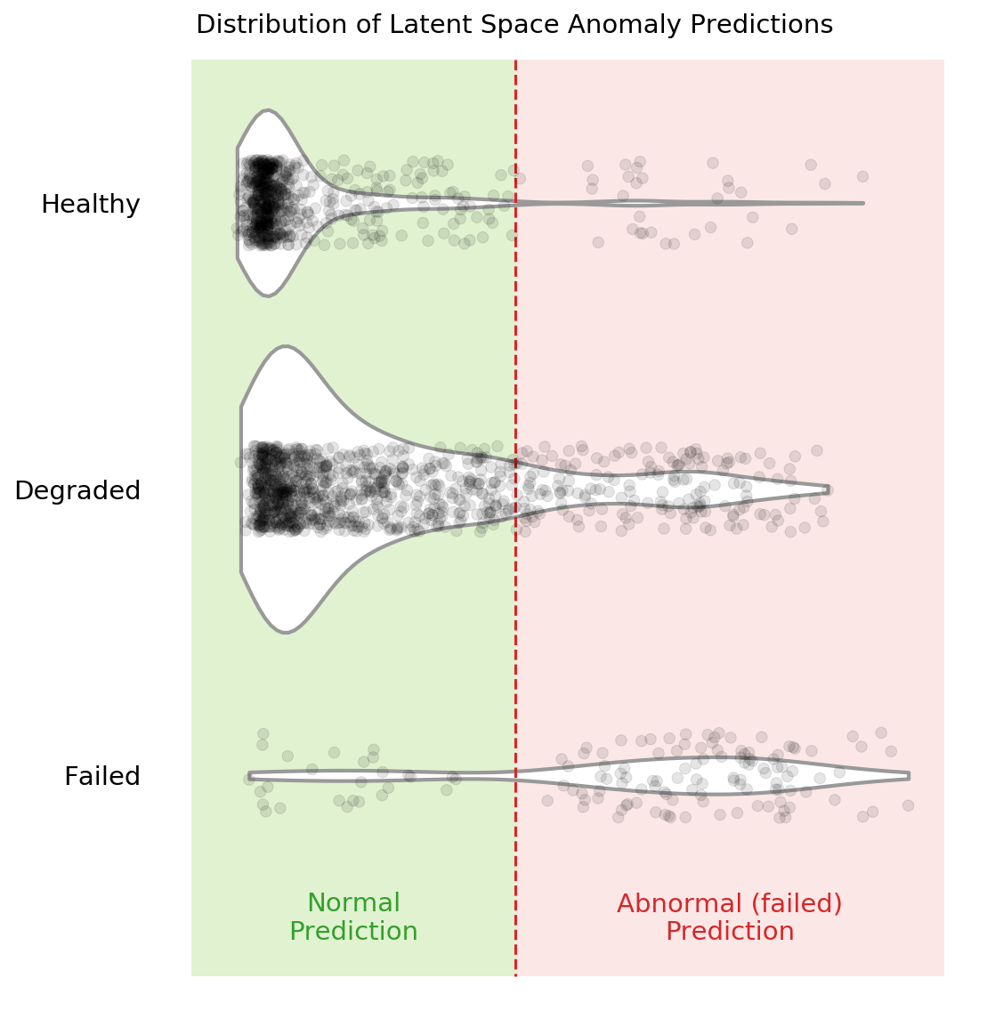
You can see in the above violin plot how different thresholds would mis-classify varying numbers of data points (imagine the red dashed line moving left or right on the plot). This is the inherent struggle with anomaly detection -- separating the noise from the anomalies.
## Compare Results for Different Cutting Parameters
If you remember from the previous posts, there are six cutting parameters in total:
* the metal type (either cast iron or steel)
* the depth of cut (either 0.75 mm or 1.5 mm)
* the feed rate (either 0.25 mm/rev or 0.5 mm/rev)
We can see if our selected anomaly detection model is better at detecting failed tools on one set of parameters over another. We'll do this by feeding only one type of parameter into the model at a time. For example, we'll feed the cuts that were made with cast-iron and see the results. Then we'll move to steel. Etc. etc.
### Code to Compare Parameters
There is a whole bunch of code needed to compare the different cutting parameters... feel free to skip to the bottom to see the results.
First, there are a number of functions needed to "filter" out the parameters we are not interested in. The input to these functions are the `X` data, a dataframe that has additional label data, `dfy`, and the parameter we are concerned with.
(side note: we'll have to generate the `dfy` below. In the original experiment, I did not think I would need the additional label information, like case, cut number, and cutting parameters. So I had to tack it on at the end)
```python
def filter_x_material(X, dfy, material="cast_iron"):
cast_iron_cases = [1, 2, 3, 4, 9, 10, 11, 12]
steel_cases = list(list(set(range(1, 17)) - set(cast_iron_cases)))
if material == "cast_iron":
case_list = cast_iron_cases
else:
# material is 'steel'
case_list = steel_cases
index_keep = dfy[dfy["case"].isin(case_list)].copy().index
X_sorted = X[index_keep]
y_sorted = np.array(dfy[dfy["case"].isin(case_list)]["class"].copy(), dtype="int")
return X_sorted, y_sorted
def filter_x_feed(X, dfy, feed):
fast_feed_cases = [1, 2, 5, 8, 9, 12, 14, 16]
slow_feed_cases = list(list(set(range(1, 17)) - set(fast_feed_cases)))
if feed == 0.5:
case_list = fast_feed_cases
else:
# feed is 0.25
case_list = slow_feed_cases
index_keep = dfy[dfy["case"].isin(case_list)].copy().index
X_sorted = X[index_keep]
y_sorted = np.array(dfy[dfy["case"].isin(case_list)]["class"].copy(), dtype="int")
return X_sorted, y_sorted
def filter_x_depth(X, dfy, feed):
deep_cases = [1, 4, 5, 6, 9, 10, 15, 16]
shallow_cases = list(list(set(range(1, 17)) - set(deep_cases)))
if feed == 1.5:
case_list = deep_cases
else:
# depth is 0.75
case_list = shallow_cases
index_keep = dfy[dfy["case"].isin(case_list)].copy().index
X_sorted = X[index_keep]
y_sorted = np.array(dfy[dfy["case"].isin(case_list)]["class"].copy(), dtype="int")
return X_sorted, y_sorted
```
Now we'll generate the `dfy` dataframes that include additional label information. These dataframes include the class, case, and the sequential count of each sub-cut.
To generate the `dfy`s we recreate the data prep pipeline.
```python
# raw data location
data_file = folder_raw_data / "mill.mat"
prep = data_prep.DataPrep(data_file)
# load the labeled CSV (NaNs filled in by hand)
df_labels = pd.read_csv(
folder_processed_data / 'labels_with_tool_class.csv'
)
# discard certain cuts as they are strange
cuts_remove = [17, 94]
df_labels.drop(cuts_remove, inplace=True)
# return the X and y data, along with additional dfy datafram
X, y, dfy = prep.return_xy(df_labels, prep.data,prep.field_names[7:],window_size=64, stride=64, track_y=True)
# execute same splits -- IMPORTANT that the same random_state be used
X_train, X_test, dfy_train, dfy_test = train_test_split(X, dfy, test_size=0.33, random_state=15,
stratify=dfy['class'])
X_val, X_test, dfy_val, dfy_test = train_test_split(X_test, dfy_test, test_size=0.50, random_state=10,
stratify=dfy_test['class'])
# we need the entire "X" data later
# so we need to make sure it is scaled appropriately
min_vals, max_vals = get_min_max(X_train)
X = scaler(X, min_vals, max_vals)
# reload the scaled data since we overwrote some of it above with
# unscaled data
# reload the data sets
(X_train, y_train,
X_train_slim, y_train_slim,
X_val, y_val,
X_val_slim, y_val_slim,
X_test,y_test) = load_train_test(folder_processed_data)
```
This is what the `dfy_val` looks like:
```python
dfy_val.head()
```
| | class | counter | case |
|-----:|--------:|----------:|-------:|
| 3804 | 0 | 54.0062 | 9 |
| 3643 | 0 | 52.0045 | 9 |
| 1351 | 0 | 20.0021 | 2 |
| 1167 | 1 | 16.0047 | 1 |
| 7552 | 0 | 109.005 | 5 |
We can combine all the "filter" functions to see how the model performs when only looking at one parameter at a time. This will take a bit more time to run since we have to iterate through the six different parameters.
```python
model_folder = './models/best_models'
model_name = '20200620-053315_bvae'
grid_iterations = 250
search_iterations = 1 # <---- CHANGE THIS TO 4 TO GET SAME RESULTS AS IN PAPER (but takes loooong to run)
# look at different material types
# STEEL
X_train_mat1, y_train_mat1 = filter_x_material(X, dfy_train, 'steel')
X_val_mat1, y_val_mat1 = filter_x_material(X, dfy_val, 'steel')
X_test_mat1, y_test_mat1 = filter_x_material(X, dfy_test, 'steel')
dfr_steel, _, _, _, _, _, _ = get_results(model_name, model_folder, grid_iterations, search_iterations,
X_train_mat1, y_train_mat1, X_val_mat1, y_val_mat1, X_test_mat1, y_test_mat1)
# CAST-IRON
X_train_mat2, y_train_mat2 = filter_x_material(X, dfy_train, 'cast_iron')
X_val_mat2, y_val_mat2 = filter_x_material(X, dfy_val, 'cast_iron')
X_test_mat2, y_test_mat2 = filter_x_material(X, dfy_test, 'cast_iron')
dfr_iron, _, _, _, _, _, _ = get_results(model_name, model_folder, grid_iterations, search_iterations,
X_train_mat2, y_train_mat2, X_val_mat2, y_val_mat2, X_test_mat2, y_test_mat2)
# look at different feed rates
# 0.5 mm/rev
X_train_f1, y_train_f1 = filter_x_feed(X, dfy_train, 0.5)
X_val_f1, y_val_f1 = filter_x_feed(X, dfy_val, 0.5)
X_test_f1, y_test_f1 = filter_x_feed(X, dfy_test, 0.5)
dfr_fast, _, _, _, _, _, _ = get_results(model_name, model_folder, grid_iterations, search_iterations,
X_train_f1, y_train_f1, X_val_f1, y_val_f1, X_test_f1, y_test_f1)
# 0.25 mm/rev
X_train_f2, y_train_f2 = filter_x_feed(X, dfy_train, 0.25)
X_val_f2, y_val_f2 = filter_x_feed(X, dfy_val, 0.25)
X_test_f2, y_test_f2 = filter_x_feed(X, dfy_test, 0.25)
dfr_slow, _, _, _, _, _, _ = get_results(model_name, model_folder, grid_iterations, search_iterations,
X_train_f2, y_train_f2, X_val_f2, y_val_f2, X_test_f2, y_test_f2)
# look at different depths of cut
# 1.5 mm
X_train_d1, y_train_d1 = filter_x_depth(X, dfy_train, 1.5)
X_val_d1, y_val_d1 = filter_x_depth(X, dfy_val, 1.5)
X_test_d1, y_test_d1 = filter_x_depth(X, dfy_test, 1.5)
dfr_deep, _, _, _, _, _, _ = get_results(model_name, model_folder, grid_iterations, search_iterations,
X_train_d1, y_train_d1, X_val_d1, y_val_d1, X_test_d1, y_test_d1)
# 0.75 mm
X_train_d2, y_train_d2 = filter_x_depth(X, dfy_train, 0.75)
X_val_d2, y_val_d2 = filter_x_depth(X, dfy_val, 0.75)
X_test_d2, y_test_d2 = filter_x_depth(X, dfy_test, 0.75)
dfr_shallow, _, _, _, _, _, _ = get_results(model_name, model_folder, grid_iterations, search_iterations,
X_train_d2, y_train_d2, X_val_d2, y_val_d2, X_test_d2, y_test_d2)
clear_output(wait=False)
```
We can now see the results for each of the six parameters.
```python
# steel material
dfr_steel
```
| | Data Set | PR-AUC Input Space | PR-AUC Latent Space |
|---:|:-----------|---------------------:|----------------------:|
| 0 | train | 0.434975 | 0.477521 |
| 1 | validation | 0.492776 | 0.579512 |
| 2 | test | 0.515126 | 0.522996 |
```python
# cast-iron material
dfr_iron
```
| | Data Set | PR-AUC Input Space | PR-AUC Latent Space |
|---:|:-----------|---------------------:|----------------------:|
| 0 | train | 0.0398322 | 0.0416894 |
| 1 | validation | 0.0407076 | 0.0370672 |
| 2 | test | 0.0315296 | 0.0296797 |
```python
# fast feed rate, 0.5 mm/rev
dfr_fast
```
| | Data Set | PR-AUC Input Space | PR-AUC Latent Space |
|---:|:-----------|---------------------:|----------------------:|
| 0 | train | 0.127682 | 0.144827 |
| 1 | validation | 0.212671 | 0.231796 |
| 2 | test | 0.19125 | 0.209018 |
```python
# slow feed rate, 0.25 mm/rev
dfr_slow
```
| | Data Set | PR-AUC Input Space | PR-AUC Latent Space |
|---:|:-----------|---------------------:|----------------------:|
| 0 | train | 0.5966 | 0.59979 |
| 1 | validation | 0.635193 | 0.672304 |
| 2 | test | 0.57046 | 0.645599 |
```python
# deep cuts, 1.5 mm in depth
dfr_deep
```
| | Data Set | PR-AUC Input Space | PR-AUC Latent Space |
|---:|:-----------|---------------------:|----------------------:|
| 0 | train | 0.104788 | 0.118633 |
| 1 | validation | 0.106304 | 0.124065 |
| 2 | test | 0.155366 | 0.158938 |
```python
# shallow cuts, 0.75 mm in depth
dfr_shallow
```
| | Data Set | PR-AUC Input Space | PR-AUC Latent Space |
|---:|:-----------|---------------------:|----------------------:|
| 0 | train | 0.710209 | 0.749864 |
| 1 | validation | 0.795819 | 0.829849 |
| 2 | test | 0.73484 | 0.804361 |
### Make the Plot and Discuss
Let's combine all the results into one table and plot the results on a bar chart.
```python
# parameter names
cutting_parameters = [
"Steel",
"Iron",
"0.25 Feed\nRate",
"0.5 Feed\nRate",
"1.5 Depth",
"0.75 Depth",
]
# pr-auc latent scores
pr_auc_latent = [
dfr_steel[dfr_steel['Data Set']=='test']['PR-AUC Latent Space'].iloc[0],
dfr_iron[dfr_iron['Data Set']=='test']['PR-AUC Latent Space'].iloc[0],
dfr_slow[dfr_slow['Data Set']=='test']['PR-AUC Latent Space'].iloc[0],
dfr_fast[dfr_fast['Data Set']=='test']['PR-AUC Latent Space'].iloc[0],
dfr_deep[dfr_deep['Data Set']=='test']['PR-AUC Latent Space'].iloc[0],
dfr_shallow[dfr_shallow['Data Set']=='test']['PR-AUC Latent Space'].iloc[0],
]
# make the dataframe and sort values from largest to smallest
dfr_param = (
pd.DataFrame(
{"Parameter": cutting_parameters, "PR-AUC Latent Score": pr_auc_latent}
)
.round(3)
.sort_values("PR-AUC Latent Score", ascending=False)
)
dfr_param
```
| | Parameter | PR-AUC Latent Score |
|---:|:------------|----------------------:|
| 5 | 0.75 Depth | 0.804 |
| 2 | 0.25 Feed Rate | 0.646 |
| 0 | Steel | 0.523 |
| 3 | 0.5 Feed Rate | 0.209 |
| 4 | 1.5 Depth | 0.159 |
| 1 | Iron | 0.03 |
... and make a pretty plot!
```python
sns.set(font_scale=1.1, style="whitegrid") # set format
fig, ax = plt.subplots(nrows=1, ncols=1, figsize=(10, 5),)
ax = sns.barplot(
"PR-AUC Latent Score", y="Parameter", data=dfr_param, palette="Blues_d",
)
for p in ax.patches:
# help from https://stackoverflow.com/a/56780852/9214620
space = 0.015
_x = p.get_x() + p.get_width() + float(space)
_y = p.get_y() + p.get_height() / 2
value = p.get_width()
ax.text(_x, _y, value, ha="left", va="center", weight="semibold", size=12)
ax.spines["bottom"].set_visible(True)
ax.set_ylabel("")
ax.set_xlabel("")
ax.grid(alpha=0.7, linewidth=1, axis="x")
ax.set_xticks([0])
ax.set_xticklabels([])
plt.title("PR-AUC Score on Latent Variables for Different Parameters", loc="left")
sns.despine(left=True, bottom=True)
# plt.savefig('prauc_params.png',dpi=150,bbox_inches = "tight")
plt.show()
```

Clearly, this "best" model finds some cutting parameters more useful than others. Certain cutting parameters may produce signals carrying more information and/or have a higher signal-to-noise ratio.
The model may also develop a preference, during training, for some parameters over others. The preference may be a function of the way the model was constructed (e.g. the $\beta$ parameter or the coding size), along with the way the model was trained. I suspect that there may be other model configurations that prefer other parameters, such as cast-iron over steel. An [ensemble of models](https://en.wikipedia.org/wiki/Ensemble_learning) may thus produce significantly better results. This would be an interesting area of further research!
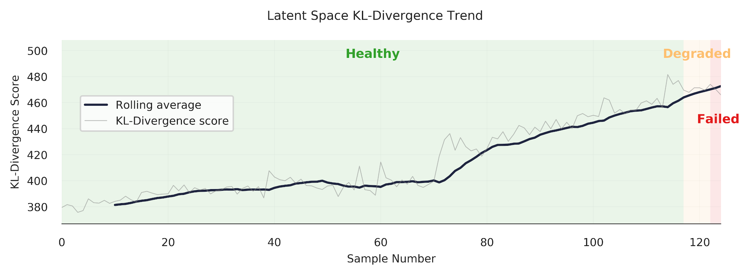
## Trend the KL-Divergence Scores
The KL-divergence scores can be trended sequentially to see how our anomaly detection model works. This is my favourite chart -- it's pretty, and gives good insight. Note: you can also trend the input space reconstruction errors, but we won't do that here (check out the [other github repository](https://github.com/tvhahn/ml-tool-wear) to see it being done -- it's pretty simple).
First, let's do some quick exploration to see how these trends will look.
We need a function to sort the sub-cuts sequentially:
```python
def sorted_x(X, dfy, case):
"""Function that sorts the sub-cuts based on case no. and a dfy dataframe"""
index_keep = dfy[dfy["case"] == case].sort_values(by=["counter"].copy()).index
X_sorted = X[index_keep]
y_sorted = np.array(
dfy[dfy["case"] == case].sort_values(by=["counter"])["class"].copy()
)
return X_sorted, y_sorted
```
Now do a quick plot of the trend.
```python
# try the same, as above, but in the latent space
X_sort, y_sort = sorted_x(X, dfy_val, 13)
kls = build_kls_scores(encoder, X_sort)
plt.plot(kls)
```
We now have all we need to create a plot that trends the KL-divergence score over time.
```python
def plot_one_signal_sequentially(
scores,
y_sort,
case_no,
avg_window_size=10,
dpi=150,
opacity_color=0.10,
opacity_grid=0.10,
caption="Latent Space KL-Divergence Trend",
y_label="KL-Divergence Score",
legend_label="KL-Divergence",
save_fig=False
):
"""
Make a trend of the reconstruction or KL-divergence score.
"""
# plot parameters
colors = ["#33a02c", "#fdbf6f", "#e31a1c"] # green, orange, red
failed_reg = ["Healthy", "Degraded", "Failed"]
pad_size = 0
x_min = -pad_size
# create pallette for color of trend lines
pal = sns.cubehelix_palette(6, rot=-0.25, light=0.7)
# get the parameters based on the case number
# and append to the caption
if case_no in [1, 2, 3, 4, 9, 10, 11, 12]:
material = 'cast iron'
else:
material = 'steel'
if case_no in [1, 2, 5, 8, 9, 12, 14, 16]:
feed_rate = 'fast speed'
else:
feed_rate = 'slow speed'
if case_no in [1, 4, 5, 6, 9, 10, 15, 16]:
cut_depth = 'deep cut'
else:
cut_depth = 'shallow cut'
# set the title of the plot
caption = f'{caption} for Case {case_no} ({material}, {feed_rate}, {cut_depth})'
# identify where the tool class changes (from healthy, to degraded, to failed)
tool_class_change_index = np.where(y_sort[:-1] != y_sort[1:])[0] - avg_window_size
# need the index to start at zero. Concatenate on a zero
tool_class_change_index = np.concatenate(
([0], tool_class_change_index, [np.shape(y_sort)[0] - avg_window_size + 1])
)
indexer = (
np.arange(2)[None, :]
+ np.arange(np.shape(tool_class_change_index)[0] - 1)[:, None]
)
# establish shaded region
shade_reg = tool_class_change_index[indexer]
x_max = len(y_sort) - avg_window_size + pad_size
# define colour palette and seaborn style for plot
sns.set(style="white", context="notebook")
fig, axes = plt.subplots(
1, 1, dpi=150, figsize=(7, 2.5), sharex=True, constrained_layout=True,
)
# moving average function
def moving_average(a, n=3):
# from https://stackoverflow.com/a/14314054
ret = np.cumsum(a, dtype=float)
ret[n:] = ret[n:] - ret[:-n]
return ret[n - 1 :] / n
x = moving_average(scores, n=1)
x2 = moving_average(scores, n=avg_window_size)
y_avg = np.array([i for i in range(len(x2))]) + avg_window_size
axes.plot(y_avg, x2, linewidth=1.5, alpha=1, color=pal[5], label="Rolling average")
axes.plot(x, linewidth=0.5, alpha=0.5, color="grey", label=legend_label)
y_min = np.min(x)
y_max = np.max(x)
y_pad = (np.abs(y_min) + np.abs(y_max)) * 0.02
# remove all spines except bottom
axes.spines["top"].set_visible(False)
axes.spines["right"].set_visible(False)
axes.spines["left"].set_visible(False)
axes.spines["bottom"].set_visible(True)
# set bottom spine width
axes.spines["bottom"].set_linewidth(0.5)
# very light gridlines
axes.grid(alpha=opacity_grid, linewidth=0.5)
# set label size for ticks
axes.tick_params(axis="x", labelsize=7.5)
axes.tick_params(axis="y", labelsize=7.5)
# colors
axes.set_ylim(y_min - y_pad, y_max + y_pad)
axes.set_xlim(x_min, x_max)
for region in range(len(shade_reg)):
f = failed_reg[region % 3]
c = colors[region % 3]
axes.fill_between(
x=shade_reg[region],
y1=y_min - y_pad,
y2=y_max + y_pad,
color=c,
alpha=opacity_color,
linewidth=0,
zorder=1,
)
# for text
axes.text(
x=(
shade_reg[region][0] + (shade_reg[region][1] - shade_reg[region][0]) / 2
),
y=y_max + y_pad - y_max * 0.1,
s=f,
horizontalalignment="center",
verticalalignment="center",
size=8.5,
color=c,
rotation="horizontal",
weight="semibold",
alpha=1,
)
# axis label
axes.set_xlabel("Sample Number", fontsize=7.5)
axes.set_ylabel(y_label, fontsize=7.5)
fig.suptitle(caption, fontsize=8.5)
plt.legend(
loc="center left", bbox_to_anchor=(0.02, 0.6), fontsize=7.5,
)
if save_fig:
plt.savefig(f'{caption}.svg',dpi=300, bbox_inches="tight")
plt.show()
```
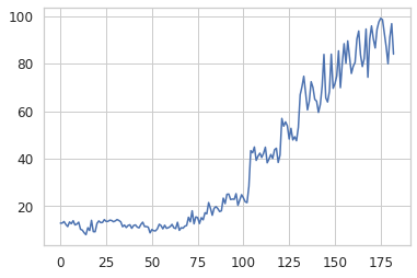
We'll trend case 13, which is performed on steel, at slow speed, and is a shallow cut.
```python
case = 13
X_sort, y_sort = sorted_x(X, dfy, case)
kls = build_kls_scores(encoder, X_sort)
plot_one_signal_sequentially(kls, y_sort, case, save_fig=False)
```

Looks good! The model produces a nice clear trend. However, as we've seen in the previous section, our anomaly detection model does have some difficulty in discerning when a tool is abnormal (failed/unhealthy/worn) under certain cutting conditions. Let's look at another example -- case 11.
```python
case = 11
X_sort, y_sort = sorted_x(X, dfy, case)
kls = build_kls_scores(encoder, X_sort)
plot_one_signal_sequentially(kls, y_sort, case, save_fig=False)
```

You can see how the trend increases through the "degraded" area, but then promptly drops off when it reaches the red "failed" area. Why? Well, I don't know exactly. It could be that the samples at the end of the trend are more similar to healthy samples.
There is much more analysis that could be done... which I'll leave up to you. Change the case number and see what you get.
## Further Ideas
What we've gone through is a method to do anomaly detection, on an industrial data set, using a VAE. I have no doubt that these methods can be improved upon, and that other interesting areas can be explored. I hope that some industrious researcher or student can use this as a spring-board to do some really interesting things! Here are some things I'd be interested in doing further:
* As I mentioned above, an ensemble of models may produce significantly better results.
* The $\beta$ in the VAE makes this a disentangled-variational-autoencoder. It would be interesting to see how the codings change with different cutting parameters, and if the codings do represent certain cutting parameters.
* I used the TCN in the VAE, but I think a regular convolutional neural network, with dilations, would work well too (that's my hunch). This would make the model training simpler.
* If I were to start over again, I would integrate in more model tests. These model tests (like unit tests) would check the model's performance against the different cutting parameters. This would make it easier to find which models generalize well across cutting parameters.
## Conclusion
In this post we've explored the performance of our trained VAE model. We found that using the latent space for anomaly detection, using KL-divergence, was more effective than the input space anomaly detection. The principals demonstrated here can be used across many domains where anomaly detection is used.
I hope you've enjoyed this series, and perhaps, have learned something new. If you found this useful, and are an academic researcher, feel free to cite the work ([preprint of the IJHM paper here](https://www.researchgate.net/publication/350842309_Self-supervised_learning_for_tool_wear_monitoring_with_a_disentangled-variational-autoencoder)). And give me a follow on Twitter!
## Appendix - Real-World Data
What!? There's an appendix? Yes, indeed!
If you look at the [IJHM paper](https://www.researchgate.net/publication/350842309_Self-supervised_learning_for_tool_wear_monitoring_with_a_disentangled-variational-autoencoder) you'll also see that I tested the method on a real-world CNC industrial data set. In short, the results weren't as good as I would have wanted, but that is applied ML for you.
The CNC data set contained cuts made under was highly dynamic conditions (many parameters constantly changing), there were labeling issues, and the data set was extremely imbalanced (only 2.7% of the tools samples were form a worn or unhealthy state). This led to results that were not nearly as good as with the UC Berkeley milling data sets.
The best thing that could be done to improve those results would be to collect much more data and curate the data set further. Unfortunately, this was not possible for me since I was working with an off-site industrial partner.
It's a good reminder for all us data scientists and researchers working on applied ML problems -- often, improving the data set will yield the largest performance gains. Francois Chollet sums it up well in this tweet:
Here are some of the highlights from the results on the CNC industrial data set.
The precision-recall curve, when looking at all the data at once, is below. The best anomaly detection model outperforms the "no-skill" model, but I wouldn't want to put this model into production (again, the data set is extremely imbalanced).

However, when we look at certain portions of each cut (look at individual sub-cuts), the results improve somewhat. Sub-cut 5 achieves a PR-AUC score of 0.406, as shown below. This is better! With more data, we could probably improve things much more.

Finally, we are able to get some nice "trends." Always satisfying to make a pretty plot.
## References
[^an2015variational]: An, Jinwon, and Sungzoon Cho. "[Variational autoencoder based anomaly detection using reconstruction probability](http://dm.snu.ac.kr/static/docs/TR/SNUDM-TR-2015-03.pdf)." Special Lecture on IE 2.1 (2015): 1-18.
[^davis2006relationship]: Davis, Jesse, and Mark Goadrich. "[The relationship between Precision-Recall and ROC curves](https://dl.acm.org/doi/pdf/10.1145/1143844.1143874?casa_token=CSQzAhypHQ0AAAAA:WqAGJXokpttfPIStrcXb_2tXdufgXdDu085FVIBhtQA1hLgXZrJGVHThaTBx4tzGUky8KTRuMJqidg)." Proceedings of the 23rd international conference on Machine learning. 2006.
[^saito2015precision]: Saito, Takaya, and Marc Rehmsmeier. "[The precision-recall plot is more informative than the ROC plot when evaluating binary classifiers on imbalanced datasets](https://journals.plos.org/plosone/article?id=10.1371/journal.pone.0118432)." PloS one 10.3 (2015): e0118432.
---
# Beautiful Plots: The Lollipop
- **Author:** Tim
- **Date:** 2021-05-14T09:20:01+08:00
- **URL:** https://www.tvhahn.com/posts/beautiful-plots-lollipop
- **License:** CC BY 4.0
- **Tags:** Matplotlib, Lollipop Chart, Data Visualization, Cleveland Plot, Beautiful Plots, Dot Plot

> The lollipop chart is great at visualizing differences in variables along a single axis. In this post, we create an elegant lollipop chart, in Matplotlib, to show the differences in model performance.
>
> You can run the Colab notebook [here](https://colab.research.google.com/github/tvhahn/Beautiful-Plots/blob/master/Lollipop/lollipop.ipynb), or visit my [github](https://github.com/tvhahn/Beautiful-Plots/tree/master/Lollipop).
As a data scientist, I am often looking for ways to explain results. It's always fun, then, when I discover a type of data visualization that I was not familiar with. Even better when the visualization solves a potential need! That's what happened when I came across the Lollipop chart -- also called a Cleveland plot, or dot plot.
I was looking to represent model performance after having trained several classification models through [k-fold cross-validation](https://en.wikipedia.org/wiki/Cross-validation_(statistics)#k-fold_cross-validation). Essentially, I training classical ML models to detect tool wear on a CNC machine. The data set was highly imbalanced, with very few examples of worn tools. This led to a larger divergence in the results across the different k-folds. I wanted to represent this difference, and the lollipop chart was just the tool!
Here's what the original plot looks like from my thesis. (by the way, you can be one of the *few* people to read my thesis, [here](https://qspace.library.queensu.ca/handle/1974/28150). lol)

*The original lolipop chart from my thesis.*
Not bad. Not bad. But this series is titled *Beautiful Plots*, so I figured I'd beautify it some more... to get this:

*The improved lolipop chart.*
I like the plot. It's easy on the eye and draws the viewers attention to the important parts first. In the following sections I'll highlight some of the important parts of the above lollipop chart, show you how I built it in Matplotlib, and detail some of the sources of inspiration I found when creating the chart. Cheers!
## Anatomy of the Plot
I took much inspiration of the above lollipop chart from the [UC Business Analytics R Programming Guide](http://uc-r.github.io/cleveland-dot-plots), and specifically, this plot:
*(Image from [UC Business Analytics R Programming Guide](http://uc-r.github.io/cleveland-dot-plots))*
--> -->
Here are some of the key features that were needed to build my lollipop chart:
### Scatter Points
I used the standard Matplotlib `ax.scatter` to plot the scatter dots. Here's a code snip:
```python
ax.scatter(x=df['auc_avg'], y=df['clf_name'],s=DOT_SIZE, alpha=1, label='Average', color=lightblue, edgecolors='white')
```
* The `x` and `y` are inputs from the data, in a Pandas dataframe
* A simple white "edge" around each dot adds a nice definition between the dot and the horizontal line.
* I think the color scheme is important -- it shouldn't be too jarring on the eye. I used blue color scheme which I found on this [seaborn plot](https://seaborn.pydata.org/examples/kde_ridgeplot.html). Here's the code snippet to get the hex values.
```python
import seaborn as sns
pal = sns.cubehelix_palette(6, rot=-0.25, light=0.7)
print(pal.as_hex())
pal
```
['#90c1c6', '#72a5b4', '#58849f', '#446485', '#324465', '#1f253f']

The grey horizontal line was implemented using the Matplotlibe `ax.hlines` function.
```python
ax.hlines(y=df['clf_name'], xmin=df['auc_min'], xmax=df['auc_max'], color='grey', alpha=0.4, lw=4,zorder=0)
```
* The grey line should be at the "back" of the chart, so set the zorder to 0.
### Leading Line

I like how the narrow "leading line" draws the viewer's eye to the model label. Some white-space between the dots and the leading line is a nice aesthetic. To get that I had to forgo grid lines. Instead, each leading line is a line plot item.
```python
ax.plot([df['auc_max'][i]+0.02, 0.6], [i, i], linewidth=1, color='grey', alpha=0.4, zorder=0)
```
### Score Values

Placing the score, either the average, minimum, or maximum, at the dot makes it easy for the viewer to result. Generally, this is a must do for any data visualization. Don't make the reader go on a scavenger hunt trying to find what value the dot, or bar, or line, etc. corresponds to!
### Title
I found the title and chart description harder to get right than I would have thought! I wound up using Python's [textwrap module](https://docs.python.org/3/library/textwrap.html), which is in the standard library. You learn something new every day!
For example, here is the description for the chart:
```python
plt_desc = ("The top performing models in the feature engineering approach, "
"as sorted by the precision-recall area-under-curve (PR-AUC) score. "
"The average PR-AUC score for the k-folds-cross-validiation is shown, "
"along with the minimum and maximum scores in the cross-validation. The baseline"
" of a naive/random classifier is demonstated by a dotted line.")
```
Feeding the `plt_desc` string into the `textwrap.fill` function produces a single string, with a `\n` new line marker at every *n* characters. Let's try it:
```python
import textwrap
s=textwrap.fill(plt_desc, 90) # put a line break every 90 characters
s
```
```
'The top performing models in the feature engineering approach, as sorted by the precision-
\nrecall area-under-curve (PR-AUC) score. The average PR-AUC score for the k-folds-cross-
\nvalidiation is shown, along with the minimum and maximum scores in the cross-validation.
\nThe baseline of a naive/random classifier is demonstated by a dotted line.'
```
## Putting it All Together
We have everything we need to make the lollipop chart. First, we'll import the packages we need.
[](https://colab.research.google.com/github/tvhahn/Beautiful-Plots/blob/master/Lollipop/lollipop.ipynb)
```python
import pandas as pd
import matplotlib.pyplot as plt
# use textwrap from python standard lib to help manage how the description
# text shows up
import textwrap
```
We'll load the cross-validation results from a csv.
```python
# load best results
df = pd.read_csv('best_results.csv')
df.head()
```
| | clf_name | auc_max | auc_min | auc_avg | auc_std |
|---:|:-------------------------|----------:|----------:|----------:|----------:|
| 0 | random_forest_classifier | 0.543597 | 0.25877 | 0.405869 | 0.116469 |
| 1 | knn_classifier | 0.455862 | 0.315555 | 0.387766 | 0.0573539 |
| 2 | xgboost_classifier | 0.394797 | 0.307394 | 0.348822 | 0.0358267 |
| 3 | gaussian_nb_classifier | 0.412911 | 0.21463 | 0.309264 | 0.0811983 |
| 4 | ridge_classifier | 0.364039 | 0.250909 | 0.309224 | 0.0462515 |
```python
# sort the dataframe
df = df.sort_values(by='auc_avg', ascending=True).reset_index(drop=True)
df.head()
```
| | clf_name | auc_max | auc_min | auc_avg | auc_std |
|---:|:-----------------------|----------:|----------:|----------:|----------:|
| 0 | sgd_classifier | 0.284995 | 0.22221 | 0.263574 | 0.0292549 |
| 1 | ridge_classifier | 0.364039 | 0.250909 | 0.309224 | 0.0462515 |
| 2 | gaussian_nb_classifier | 0.412911 | 0.21463 | 0.309264 | 0.0811983 |
| 3 | xgboost_classifier | 0.394797 | 0.307394 | 0.348822 | 0.0358267 |
| 4 | knn_classifier | 0.455862 | 0.315555 | 0.387766 | 0.0573539 |
... and plot the chart! Hopefully there are enough comments in code block below (expand to view) to help you if you're stuck.
```python
plt.style.use("seaborn-whitegrid") # set style because it looks nice
fig, ax = plt.subplots(1, 1, figsize=(10, 8),)
# color palette to choose from
darkblue = "#1f253f"
lightblue = "#58849f"
redish = "#d73027"
DOT_SIZE = 150
# create the various dots
# avg dot
ax.scatter(
x=df["auc_avg"],
y=df["clf_name"],
s=DOT_SIZE,
alpha=1,
label="Average",
color=lightblue,
edgecolors="white",
)
# min dot
ax.scatter(
x=df["auc_min"],
y=df["clf_name"],
s=DOT_SIZE,
alpha=1,
color=darkblue,
label="Min/Max",
edgecolors="white",
)
# max dot
ax.scatter(
x=df["auc_max"],
y=df["clf_name"],
s=DOT_SIZE,
alpha=1,
color=darkblue,
edgecolors="white",
)
# create the horizontal line
# between min and max vals
ax.hlines(
y=df["clf_name"],
xmin=df["auc_min"],
xmax=df["auc_max"],
color="grey",
alpha=0.4,
lw=4, # line-width
zorder=0, # make sure line at back
)
x_min, x_max = ax.get_xlim()
y_min, y_max = ax.get_ylim()
# plot the line that shows how a naive classifier performs
# plot two lines, one white, so that there is a gap between grid lines
# from https://stackoverflow.com/a/12731750/9214620
ax.plot([0.023, 0.023], [y_min, y_max], linestyle="-", color="white", linewidth=14)
ax.plot([0.023, 0.023], [y_min, y_max], linestyle="--", color=redish, alpha=0.4)
# dictionary used to map the column labels from df to a readable name
label_dict = {
"sgd_classifier": "SGD Linear",
"xgboost_classifier": "XGBoost",
"random_forest_classifier": "Random Forest",
"knn_classifier": "KNN",
"gaussian_nb_classifier": "Naive Bayes",
"ridge_classifier": "Ridge Regression",
}
# iterate through each result and apply the text
# df should already be sorted
for i in range(0, df.shape[0]):
# avg auc score
ax.text(
x=df["auc_avg"][i],
y=i + 0.15,
s="{:.2f}".format(df["auc_avg"][i]),
horizontalalignment="center",
verticalalignment="bottom",
size="x-large",
color="dimgrey",
weight="medium",
)
# min auc score
ax.text(
x=df["auc_min"][i],
y=i - 0.15,
s="{:.2f}".format(df["auc_min"][i]),
horizontalalignment="right",
verticalalignment="top",
size="x-large",
color="dimgrey",
weight="medium",
)
# max auc score
ax.text(
x=df["auc_max"][i],
y=i - 0.15,
s="{:.2f}".format(df["auc_max"][i]),
horizontalalignment="left",
verticalalignment="top",
size="x-large",
color="dimgrey",
weight="medium",
)
# add thin leading lines towards classifier names
# to the right of max dot
ax.plot(
[df["auc_max"][i] + 0.02, 0.6],
[i, i],
linewidth=1,
color="grey",
alpha=0.4,
zorder=0,
)
# to the left of min dot
ax.plot(
[-0.05, df["auc_min"][i] - 0.02],
[i, i],
linewidth=1,
color="grey",
alpha=0.4,
zorder=0,
)
# add classifier name text
clf_name = label_dict[df["clf_name"][i]]
ax.text(
x=-0.059,
y=i,
s=clf_name,
horizontalalignment="right",
verticalalignment="center",
size="x-large",
color="dimgrey",
weight="normal",
)
# add text for the naive classifier
ax.text(
x=0.023 + 0.01,
y=(y_min),
s="Naive Classifier",
horizontalalignment="right",
verticalalignment="bottom",
size="large",
color=redish,
rotation="vertical",
backgroundcolor="white",
alpha=0.4,
)
# remove the y ticks
ax.set_yticks([])
# drop the gridlines (inherited from 'seaborn-whitegrid' style)
# and drop all the spines
ax.grid(False)
ax.spines["top"].set_visible(False)
ax.spines["bottom"].set_visible(False)
ax.spines["right"].set_visible(False)
ax.spines["left"].set_visible(False)
# custom set the xticks since this looks better
ax.set_xticks([0.0, 0.2, 0.4, 0.6])
# set properties of xtick labels
# https://matplotlib.org/stable/api/_as_gen/matplotlib.axes.Axes.tick_params.html#matplotlib.axes.Axes.tick_params
ax.tick_params(axis="x", pad=20, labelsize="x-large", labelcolor="dimgrey")
# Add plot title and then description underneath it
plt_title = "Top Performing Models by PR-AUC Score"
plt_desc = (
"The top performing models in the feature engineering approach, "
"as sorted by the precision-recall area-under-curve (PR-AUC) score. "
"The average PR-AUC score for the k-folds-cross-validiation is shown, "
"along with the minimum and maximum scores in the cross-validation. The baseline"
" of a naive/random classifier is demonstated by a dotted line."
)
# set the plot description
# use the textwrap.fill (from textwrap std. lib.) to
# get the text to wrap after a certain number of characters
PLT_DESC_LOC = 6.8
ax.text(
x=-0.05,
y=PLT_DESC_LOC,
s=textwrap.fill(plt_desc, 90),
horizontalalignment="left",
verticalalignment="top",
size="large",
color="dimgrey",
weight="normal",
wrap=True,
)
ax.text(
x=-0.05,
y=PLT_DESC_LOC + 0.1,
s=plt_title,
horizontalalignment="left",
verticalalignment="bottom",
size=16,
color="dimgrey",
weight="semibold",
wrap=True,
)
# create legend
ax.legend(
frameon=False,
bbox_to_anchor=(0.6, 1.05),
ncol=2,
fontsize="x-large",
labelcolor="dimgrey",
)
# plt.savefig('best_results.svg',dpi=150, bbox_inches = "tight")
plt.show()
```

## More Inspiration
I've found a couple other good example of lollipop charts, with code, that you might find interesting too. Let me know if you find other good examples (tweet or DM me at [@timothyvh](https://twitter.com/timothyvh)) and I'll add them to the list.
* This lollipop chart is from [Graipher on StackExchange](https://stats.stackexchange.com/a/423861).

* Pierre Haessig has a great [blog post](https://pierreh.eu/tag/matplotlib/) where he creates dot plots to visualize French power system data over time. The Jupyter Notebooks are on his github, [here](https://github.com/pierre-haessig/french-elec2/blob/master/Dotplots_Powersys.ipynb).
## Conclusion
There you have it! I hope you learned something, and feel free to share and modify the images/code however you like. I'm not sure where I'll go next with the series, so if you have any ideas, let me know on Twitter!
And with that, I'll leave you with this:

---
# Beautiful Plots: The Decision Boundary
- **Author:** Tim
- **Date:** 2021-04-24T10:05:00+08:00
- **URL:** https://www.tvhahn.com/posts/beautiful-plots-decision-boundary
- **License:** CC BY 4.0
- **Tags:** Matplotlib, KNN, Data Visualization, Decision Boundary, Beautiful Plots
> How can we communicate complex concepts using data visualization tools? In this first post -- in a series titled "Beautiful Plots" -- we build an elegant chart demonstrating the decision boundary from a KNN classifier.
*"Brevity is the soul of wit" -- Polonius in Hamlet*
Communicating ideas through plots and charts -- the process of data visualization -- is not always easy. Oftentimes, the ideas being communicated are complex, subtle, and deep. Constructing a good data visualization requires thought, and a bit of art. Ideally, the end product should communicate ideas with minimal effort requested from the reader.
I like creating beautiful data visualizations. Perhaps it's like the artist or the musician -- there is some intrinic drive within me to make data look beautiful! I guess I've developed a "taste" over the years. As such, I've decided to start a new series called "Beautiful Plots."
In this series, I'll create beautiful plots, often in Python and Matplotlib. I'll explore interesting creations from others. I'll look at data visualization concepts. Really, I'll go wherever the wind blows... so, in advance, thanks for coming along.
## The Decision Boundary Plot
Machine learning is filled with many complex topics. During my thesis writing, I was trying to explain the concept of the decision boundary. Naturally, I looked for ways to explain the concept with a data visualization. Then, I came upon this stackoverflow post: [Recreating decision-boundary plot in python with scikit-learn and matplotlib](https://stackoverflow.com/questions/41138706/recreating-decision-boundary-plot-in-python-with-scikit-learn-and-matplotlib). In the post, Rachel asks how to recreate the below plot in Matplotlib.
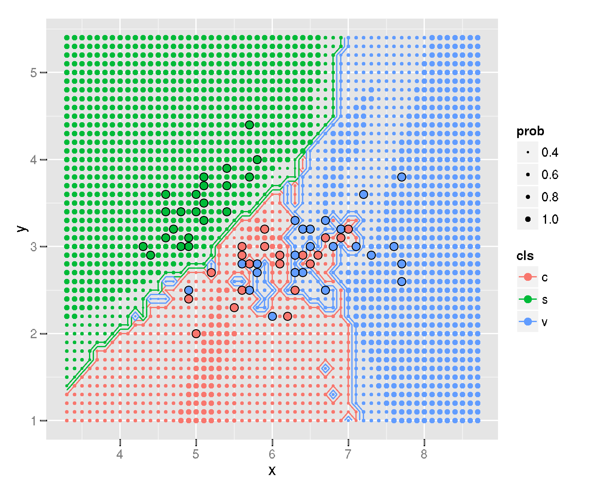
*The KNN decision boundary plot on the Iris data set. Originally created in R with ggplot (Image from [Igautier](https://stackoverflow.com/a/31236327/9214620) on stackoverflow*
I like the plot. It communicates two ideas well. First, it shows where the [decision boundary](https://en.wikipedia.org/wiki/Decision_boundary) is between the different classes. Second, the plot conveys the likelihood of a new data point being classified in one class or the other. It does this by varrying the size of the array of dots. This, in my opinion, is where this plot truly shines.
Below is my rendition of the plot (and I did answer Rachel's questions -- see the [updated stackoverflow](https://stackoverflow.com/a/67245995/9214620)). I'll now walk you, the reader, through the creation of the plot. Of course, you can run the whole thing in [Google Colab](https://colab.research.google.com/github/tvhahn/Beautiful-Plots/blob/master/Decision%20Boundary/decision-boundary.ipynb) too. You can also visit [the "Beautiful-Plots" repo on github](https://github.com/tvhahn/Beautiful-Plots).
[](https://colab.research.google.com/github/tvhahn/Beautiful-Plots/blob/master/Decision%20Boundary/decision-boundary.ipynb)
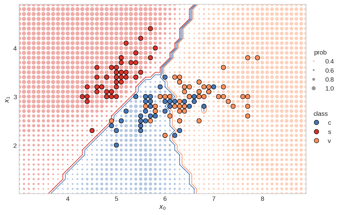
*The KNN decision boundary plot on the Iris data set, as created by me, in Matplotlib. (Image from author)*
## Creating the Plot
[Matplotlib](https://matplotlib.org/) is an amazing, open source, visualization tool for Python. It is powerful, so can sometimes be confusing for the unenitiated. Fortunately, Matplotlib has great documentation (check out their [cheat-sheet](https://github.com/matplotlib/cheatsheets#cheatsheets)), and because Matplotlib is so widely used, you can find examples *everywhere*.
I've broken down the code into several sections. First, we'll start with loading the data.
### Load the Data
We need Numpy, Matplotlib, and scikit-learn for this plot, so we'll load those modules. We'll also be using the Iris data set, which comes conveniently with sklearn.
```python
import numpy as np
import matplotlib.pyplot as plt
from sklearn import datasets
from sklearn import neighbors
```
We'll only be using the first two features from the Iris data set (makes sense, since we're plotting a 2D chart). We'll call the features `x_0` and `x_1`. Each feature comes with an associated class, `y`, representing the type of flower.
```python
iris = datasets.load_iris()
x = iris.data[:,0:2]
y = iris.target
# print the shape of the data to
# better understand it
print('x.shape:', x.shape)
print('y.shape', y.shape)
# create the x0, x1 feature
x0 = x[:,0]
x1 = x[:,1]
```
x.shape: (150, 2)
y.shape (150,)
To quickly visualize the data, let's plot the `x_0` and `x_1` features, and color them based on their class.
```python
plt.scatter(x0, x1, c=y)
plt.show()
```
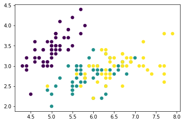
### Train the Classifier
Next, we'll train the KNN classifier using scikit-learn.
Set the number of neighbors:
```python
# set main parameters for KNN plot
N_NEIGHBORS = 15 # KNN number of neighbors
```
Implement and fit the KNN classifier:
```python
clf = neighbors.KNeighborsClassifier(N_NEIGHBORS, weights='uniform')
clf.fit(x, y)
```
KNeighborsClassifier(n_neighbors=15)
### Define the Plot-Bounds and the Meshgrid
We need to define the min/max values for the plot. In addition, we'll create the mesh-grid, which will be used to show the probability of the class at a specific point.
Find the min/max points for both the `x0` and `x1` features. These will be used to set the bounds for the plot.
```python
PAD = 1.0 # how much to "pad" around the min/max values. helps in setting bounds of plot
x0_min, x0_max = np.round(x0.min())-PAD, np.round(x0.max()+PAD)
x1_min, x1_max = np.round(x1.min())-PAD, np.round(x1.max()+PAD)
```
Create the 1D arrays representing the range of probability data points on both the axes:
```python
H = 0.1 # mesh stepsize
x0_axis_range = np.arange(x0_min,x0_max, H)
x1_axis_range = np.arange(x1_min,x1_max, H)
```
Create the meshgrid:
```python
xx0, xx1 = np.meshgrid(x0_axis_range, x1_axis_range)
# check the shape of the meshgrid
print('xx0.shape:', xx0.shape)
print('xx1.shape:', xx1.shape)
```
xx0.shape: (40, 60)
xx1.shape: (40, 60)
Meshgrid can be confusing -- read this [stackoverflow explanation](https://stackoverflow.com/a/36014586/9214620) for a good summary. Essentially, to create a rectangular gride, we need every combination of the `x0` and `x1` points.
We can plot the two outputs, `xx0` and `xx1`, together to visualize the grid
```python
plt.scatter(xx0, xx1, s=0.5)
plt.show()
```
I like to have the shape of the meshgrid (the `xx`'s) put into the same dimensional format as the original `x`. The shape will then be: `[no_dots, no_dimensions]`
```python
xx = np.reshape(np.stack((xx0.ravel(),xx1.ravel()),axis=1),(-1,2))
print('xx.shape:', xx.shape)
```
xx.shape: (2400, 2)
### Making Predictions
We can now make predictions for all the little dots. The `yy_size` will be used to create the size of the dots.
```python
# prediction of all the little dots
yy_hat = clf.predict(xx)
# probability of each dot beingthe predicted color
yy_prob = clf.predict_proba(xx)
# the size of each probability dot
yy_size = np.max(yy_prob, axis=1)
```
### Produce the Figure
We can make the figure!
We'll define some of the basic parameter variables:
```python
PROB_DOT_SCALE = 40 # modifier to scale the probability dots
PROB_DOT_SCALE_POWER = 3 # exponential used to increase/decrease size of prob dots
TRUE_DOT_SIZE = 50 # size of the true labels
```
... and plot! I've extensively commented this code, so I won't be providing anymore commentary.
```python
from matplotlib.ticker import MaxNLocator # needed for integer only on axis
from matplotlib.lines import Line2D # for creating the custom legend
# make figure
plt.style.use('seaborn-whitegrid') # set style because it looks nice
fig, ax = plt.subplots(nrows=1, ncols=1, figsize=(8,6), dpi=150)
# establish colors and colormap
# * color blind colors, from https://bit.ly/3qJ6LYL
redish = '#d73027'
orangeish = '#fc8d59'
yellowish = '#fee090'
blueish = '#4575b4'
colormap = np.array([redish,blueish,orangeish])
# plot all the little dots, position defined by the xx values, color
# defined by the knn predictions (yy_hat), and size defined by the
# probability of that color (yy_prob)
# * because the yy_hat values are either 0, 1, 2, we can use
# these as values to index into the colormap array
# * size of dots (the probability) increases exponentially (^3), so that there is
# a nice difference between different probabilities. I'm sure there is a more
# elegant way to do this though...
# * linewidths=0 so that there are no "edges" around the dots
ax.scatter(xx[:,0], xx[:,1], c=colormap[yy_hat], alpha=0.4,
s=PROB_DOT_SCALE*yy_size**PROB_DOT_SCALE_POWER, linewidths=0,)
# plot the contours
# * we have to reshape the yy_hat to get it into a
# 2D dimensional format, representing both the x0
# and x1 axis
# * the number of levels and color scheme was manually tuned
# to make sense for this data. Would probably change, for
# instance, if there were 4, or 5 (etc.) classes
ax.contour(x0_axis_range, x1_axis_range,
np.reshape(yy_hat,(xx0.shape[0],-1)),
levels=3, linewidths=1,
colors=[redish,blueish, blueish,orangeish,])
# plot the original x values.
# * zorder is 3 so that the dots appear above all the other dots
ax.scatter(x[:,0], x[:,1], c=colormap[y], s=TRUE_DOT_SIZE, zorder=3,
linewidths=0.7, edgecolor='k')
# create legends
x_min, x_max = ax.get_xlim()
y_min, y_max = ax.get_ylim()
ax.set_ylabel(r"$x_1$")
ax.set_xlabel(r"$x_0$")
# create class legend
# Line2D properties: https://matplotlib.org/stable/api/_as_gen/matplotlib.lines.Line2D.html
# about size of scatter plot points: https://stackoverflow.com/a/47403507/9214620
legend_class = []
for flower_class, color in zip(['c', 's', 'v'], [blueish, redish, orangeish]):
legend_class.append(Line2D([0], [0], marker='o', label=flower_class,ls='None',
markerfacecolor=color, markersize=np.sqrt(TRUE_DOT_SIZE),
markeredgecolor='k', markeredgewidth=0.7))
# iterate over each of the probabilities to create prob legend
prob_values = [0.4, 0.6, 0.8, 1.0]
legend_prob = []
for prob in prob_values:
legend_prob.append(Line2D([0], [0], marker='o', label=prob, ls='None', alpha=0.8,
markerfacecolor='grey',
markersize=np.sqrt(PROB_DOT_SCALE*prob**PROB_DOT_SCALE_POWER),
markeredgecolor='k', markeredgewidth=0))
legend1 = ax.legend(handles=legend_class, loc='center',
bbox_to_anchor=(1.05, 0.35),
frameon=False, title='class')
legend2 = ax.legend(handles=legend_prob, loc='center',
bbox_to_anchor=(1.05, 0.65),
frameon=False, title='prob', )
ax.add_artist(legend1) # add legend back after it disappears
ax.set_yticks(np.arange(x1_min,x1_max, 1)) # I don't like the decimals
ax.grid(False) # remove gridlines (inherited from 'seaborn-whitegrid' style)
# only use integers for axis tick labels
# from: https://stackoverflow.com/a/34880501/9214620
ax.xaxis.set_major_locator(MaxNLocator(integer=True))
ax.yaxis.set_major_locator(MaxNLocator(integer=True))
# remove first ticks from axis labels, for looks
# from: https://stackoverflow.com/a/19503828/9214620
ax.set_xticks(ax.get_xticks()[1:-1])
ax.set_yticks(np.arange(x1_min,x1_max, 1)[1:])
# set the aspect ratio to 1, for looks
ax.set_aspect(1)
# plt.savefig('knn.svg',dpi=300,format='svg', bbox_inches = "tight")
# plt.savefig('knn.png',dpi=150,bbox_inches = "tight")
plt.show()
```

## Putting it All Together
For compactness, here's the whole thing in a nice function, courtesy of Patrick Herber (thanks Patrick!). Expand the code block if you want to see the whole thing, or rou can see the Google colab that he made [here](https://colab.research.google.com/drive/1LvImQffF-8V5scgLpr3OQQ-MUfKi2WRC?usp=sharing). Here's Patrick's [twitter](https://twitter.com/phrbert) and [github](https://github.com/pherber3?tab=overview&from=2021-04-01&to=2021-04-26) accounts.
```python
import warnings
def plot_decision_boundary2D(clf, X: np.ndarray, y: np.ndarray, classes: list, colormap: np.ndarray,
step: float = 0.1, prob_dot_scale: int = 40, prob_dot_scale_power: int = 3,
true_dot_size: int = 50, pad: float = 1.0,
prob_values: list = [0.4, 0.6, 0.8, 1.0]) -> None:
"""
Original work by @timothyvh on Twitter.
Recreating an R ggplot decision boundary plotting in python using matplotlib.
Note that this only works for 2D plotting. The goal of this function is to present a
classifier's decision boundary in an easy to read, digestible way to ease
communication and visualization of results.
Arguments:
clf - the classifier we want to visualize the decision boundary for. This should work for any kind of relevant model.
X - our data we want to plot. Note that since this is a 2D array, X should be 2-dimensional.
y - the target labels for the data we want to plot
classes - the names of the classes you are trying to identify, should be same shape as colormap
colormap - the colors you want to use to indicate your different classes, should be same shape as classes
step - mesh stepsize
prob_dot_scale - modifier to scale the probability dots
prob_dot_scale_power - exponential used to increase/decrease size of prob dots
true_dot_size - size of the true labels
pad - how much to "pad" around the true labels
prob_values - list of probabilities to map the meshgrid predictions to
Returns:
None - This function will simply output a graph of the decision boundary
"""
# Handling X data dimension issues. If X doesn't have enough dimensions, throw error. Too many, use first two dimensions.
X_dim = X.shape[1]
if X_dim < 2:
raise Exception("Error: Not enough dimensions in input data. Data must be at least 2-dimensional.")
elif X_dim > 2:
warnings.warn(f"Warning: input data was {X_dim} dimensional. Expected 2. Using first 2 dimensions provided.")
# Change colormap to a numpy array if it isn't already (necessary to prevent scalar error)
if not isinstance(colormap, np.ndarray):
colormap = np.array(colormap)
# create the x0, x1 feature. This is only a 2D plot after all.
x0 = X[:,0]
x1 = X[:,1]
# create 1D arrays representing the range of probability data points
x0_min, x0_max = np.round(x0.min())-pad, np.round(x0.max()+pad)
x1_min, x1_max = np.round(x1.min())-pad, np.round(x1.max()+pad)
x0_axis_range = np.arange(x0_min,x0_max, step)
x1_axis_range = np.arange(x1_min,x1_max, step)
# create meshgrid between the two axis ranges
xx0, xx1 = np.meshgrid(x0_axis_range, x1_axis_range)
# put the xx in the same dimensional format as the original X
xx = np.reshape(np.stack((xx0.ravel(),xx1.ravel()),axis=1),(-1,2))
yy_hat = clf.predict(xx) # prediction of all the little dots
yy_prob = clf.predict_proba(xx) # probability of each dot being
# the predicted color
yy_size = np.max(yy_prob, axis=1)
# make figure
plt.style.use('seaborn-whitegrid') # set style because it looks nice
fig, ax = plt.subplots(nrows=1, ncols=1, figsize=(8,6), dpi=150)
# plot all the little dots
ax.scatter(xx[:,0], xx[:,1], c=colormap[yy_hat], alpha=0.4, s=prob_dot_scale*yy_size**prob_dot_scale_power, linewidths=0,)
# plot the contours
ax.contour(x0_axis_range, x1_axis_range,
np.reshape(yy_hat,(xx0.shape[0],-1)),
levels=3, linewidths=1,
colors=[colormap[0],colormap[1], colormap[1], colormap[2],])
# plot the original x values.
ax.scatter(x0, x1, c=colormap[y], s=true_dot_size, zorder=3, linewidths=0.7, edgecolor='k')
# create legends - Not sure if these serve a purpose but I left them in just in case
x_min, x_max = ax.get_xlim()
y_min, y_max = ax.get_ylim()
ax.set_ylabel(r"$x_1$")
ax.set_xlabel(r"$x_0$")
# set the aspect ratio to 1, for looks
ax.set_aspect(1)
# create class legend
legend_class = []
for class_id, color in zip(classes, colormap):
legend_class.append(Line2D([0], [0], marker='o', label=class_id,ls='None',
markerfacecolor=color, markersize=np.sqrt(true_dot_size),
markeredgecolor='k', markeredgewidth=0.7))
# iterate over each of the probabilities to create prob legend
legend_prob = []
for prob in prob_values:
legend_prob.append(Line2D([0], [0], marker='o', label=prob, ls='None', alpha=0.8,
markerfacecolor='grey',
markersize=np.sqrt(prob_dot_scale*prob**prob_dot_scale_power),
markeredgecolor='k', markeredgewidth=0))
legend1 = ax.legend(handles=legend_class, loc='center',
bbox_to_anchor=(1.05, 0.35),
frameon=False, title='class')
legend2 = ax.legend(handles=legend_prob, loc='center',
bbox_to_anchor=(1.05, 0.65),
frameon=False, title='prob', )
ax.add_artist(legend1) # add legend back after it disappears
ax.set_yticks(np.arange(x1_min,x1_max, 1)) # I don't like the decimals
ax.grid(False) # remove gridlines (inherited from 'seaborn-whitegrid' style)
# only use integers for axis tick labels
ax.xaxis.set_major_locator(MaxNLocator(integer=True))
ax.yaxis.set_major_locator(MaxNLocator(integer=True))
# remove first ticks from axis labels, for looks
ax.set_xticks(ax.get_xticks()[1:-1])
ax.set_yticks(np.arange(x1_min,x1_max, 1)[1:])
plt.show()
```
Execute the above with these settings:
```python
# set main parameters for KNN plot
N_NEIGHBORS = 15 # KNN number of neighbors
H = 0.1 # mesh stepsize
PROB_DOT_SCALE = 40 # modifier to scale the probability dots
PROB_DOT_SCALE_POWER = 3 # exponential used to increase/decrease size of prob dots
TRUE_DOT_SIZE = 50 # size of the true labels
PAD = 1.0 # how much to "pad" around the true labels
# establish colors and colormap
redish = '#d73027'
orangeish = '#fc8d59'
blueish = '#4575b4'
colormap = np.array([redish,blueish,orangeish])
#establish classes
classes = ['c','s','v']
# load data again
iris = datasets.load_iris()
x = iris.data[:,0:2]
y = iris.target
clf = neighbors.KNeighborsClassifier(N_NEIGHBORS, weights='uniform')
clf.fit(x, y)
# use function
plot_decision_boundary2D(clf, x, y.copy(), classes, colormap,
step=H,
prob_dot_scale=PROB_DOT_SCALE,
prob_dot_scale_power=PROB_DOT_SCALE_POWER,
true_dot_size=TRUE_DOT_SIZE,
pad=PAD,)
```

Voila!
# Conclusion
I hope you've found this little blog post useful. As I come across other beautiful plots, I'll post them here. With that:
---
# Building a Variational Autoencoder - Advances in Condition Monitoring, Pt VI
- **Author:** Tim
- **Date:** 2021-03-12
- **URL:** https://www.tvhahn.com/posts/building-vae
- **License:** CC BY 4.0
- **Tags:** Machine Learning, Condition Monitoring, Variational Autoencoder, TensorFlow, Anomaly Detection, Milling

> In this post, we'll explore the variational autoencoder (VAE) and see how we can build one for use on the UC Berkeley milling data set. A variational autoencoder is more expressive than a regular autoencoder, and this feature can be exploited for anomaly detection.
We’ve explored the UC Berkeley milling data set – now it’s time for us to build some models! In part IV of this series, we discussed how an autoencoder can be used for anomaly detection. However, we’ll use a variant of the autoencoder – a variational autoencoder (VAE) – to conduct the anomaly detection.
In this post, we'll see how the VAE is similar, and different, from a traditional autoencoder. We'll learn how to implement the VAE and train it. The next post, Part VI, will use the trained VAEs in the anomaly detection process.
## The Variational Autoencoder
The variational autoencoder was introduced in 2013 and today is widely used in machine learning applications. The VAE is different from traditional autoencoders in that the VAE is both probabilistic and generative. What does that mean? Well, the VAE creates outputs that are partly random (even after training) and can also generate new data that is like the data it is trained on.
Again, there are excellent explanations of the VAE online – I'll direct you to Alfredo Canziani’s deep learning course (video below from Youtube).
[YouTube video](https://www.youtube.com/watch?v=PpcN-F7ovK0)
But here is my attempt at an explanation:
At a high level, the VAE has a similar structure to a traditional autoencoder. However, the encoder learns different codings; namely, the VAE learns mean codings, $\boldsymbol{\mu}$, and standard deviation codings, $\boldsymbol{\sigma}$. The VAE then samples randomly from a Gaussian distribution, with the same mean and standard deviation created by the encoder, to generate the latent variables, $\boldsymbol{z}$. These latent variables are then “decoded” to reconstruct the input. The figure below demonstrates how a signal is reconstructed using the VAE.

*A variational autoencoder architecture (top), and an example of a data sample going through the VAE (bottom). Data is compressed in the encoder to create mean and standard deviation codings. The coding is then created, with the addition of Gaussian noise, from the mean and standard deviation codings. The decoder uses the codings (or latent variables) to reconstruct the input. (Image from author, based on graphic from Aurélien Geron)*
During training, the VAE works to minimize its reconstruction loss (in our case we use binary cross entropy), and at the same time, force a Gaussian structure using a latent loss. The structure is achieved through the Kullback-Leibler (KL) divergence, with detailed derivations for the losses in the original VAE paper.[^kingma2013auto] The latent loss is as follows:
$$\mathcal{L} = - \frac{\beta}{2}\sum_{i=1}^{K} 1 + \log(\sigma_i^2) - \sigma_i^2 - \mu_i^2$$
where $K$ is the number of latent variables, and $\beta$ is an adjustable hyper-parameter introduced by Higgens et al.[^higgins2016beta]
> **Edit:** In the original article I had an incorrect equation for the latent loss -- I had $\log\sigma_i$ instead of $\log\sigma_i^2$ -- and the reconstruction loss was absolute error instead of binary cross entropy. In addition, the notation I used is different from that of Alfredo Canziani -- Alfredo's is very consistent, so watch his videos!
A VAE learns factors, embedded in the codings, that can be used to generate new data. As an example of these factors, a VAE may be trained to recognize shapes in an image. One factor may encode information on how pointy the shape is, while another factor may look at how round it is. However, in a VAE, the factors are often entangled together across the codings (the latent variables). Tuning the hyper-parameter $\beta$, to a value larger than one, can enable the factors to disentangle such that each coding only represents one factor at a time. Thus, greater interpretability of the model can be obtained. A VAE with a tunable beta is often called a disentangled-variational-autoencoder, or simply, a $\beta$-VAE.
## Data Preparation
Before going any further, we need to prepare the data. Ultimately, we'll be using the VAE to detect "abnormal" tool conditions, which correspond to when the tool is in a worn. But first we need to label the data.
As shown in the last post, each cut has an associated amount of wear, measured at the end of the cut. We'll label each cut as either healthy, degraded, or failed according to the amount of wear on the tool. Here's the schema:
| State | Label | Flank Wear (mm) |
| -------- | ----: | --------------: |
| Healthy | 0 | 0 ~ 0.2 |
| Degraded | 1 | 0.2 ~ 0.7 |
| Failed | 2 | > 0.7 |
I've created a data prep class that takes the raw matlab files, a labelled CSV (each cut is labelled with the associated flank wear), and spits out the training/validation/and testing data (you can see the entire data_prep.py in the github repository). However, I want to highlight one function in the class that is important; that is, the create_tensor function.
[](https://colab.research.google.com/github/tvhahn/Manufacturing-Data-Science-with-Python/blob/master/Metal%20Machining/1.B_building-vae.ipynb)
```python
def create_tensor(self, data_sample, signal_names, start, end, window_size, stride=8):
"""Create a tensor from a cut sample. Final tensor will have shape:
[# samples, # sample len, # features/sample]
Parameters
===========
data_sample : ndarray
single data sample (individual cut) containing all the signals
signal_names : tuple
tuple of all the signals that will be added into the tensor
start : int
starting index (e.g. the first 2000 "samples" in the cut may be from
when the tool is not up to speed, so should be ignored)
end : int
ending index
window_size : int
size of the window to be used to make the sub-cuts
stride : int
length to move the window at each iteration
Returns
===========
c : ndarray
array of the sub-cuts
"""
s = signal_names[::-1] # only include the six signals, and reverse order
c = data_sample[s[0]].reshape((9000, 1))
for i in range(len(s)):
try:
a = data_sample[s[i + 1]].reshape((9000, 1)) # reshape to make sure
c = np.hstack((a, c)) # horizontal stack
except:
# reshape into [# samples, # sample len, # features/sample]
c = c[start:end]
c = np.reshape(c, (c.shape[0], -1))
dummy_array = []
# fit the strided windows into the dummy_array until the length
# of the window does not equal the proper length
for i in range(c.shape[0]):
windowed_signal = c[i * stride : i * stride + window_size]
if windowed_signal.shape == (window_size, 6):
dummy_array.append(windowed_signal)
else:
break
c = np.array(dummy_array)
return c
```
The create_tensor function takes an individual cut, breaks it up into chunks, and puts them into a single array. It breaks the cut signal up into chunks using a window of a fixed size (the window_size variable) and then "slides" the window along the signal. The window "slides" by a preditermined amount, set by the stride variable.
We'll take each of the 165 cuts (remember, two cuts from the original 167 are corrupted) and apply a window size of 64 and a stride of 64 (no overlap between windows). I've visually inspected each cut and selected when the "stable" cutting region occurs, which is usually five seconds or so after the signal begins collection, and a few seconds before the signal collection ends. This information is stored in the "labels_with_tool_class.csv" file.
With all that, we can then create the training/validation/testing data sets. Here is what the script looks like:
```python
import numpy as np
import pandas as pd
import matplotlib.pyplot as plt
from pathlib import Path
from sklearn.model_selection import train_test_split
import data_prep
data_file = Path("mill.mat")
# helper functions needed in the data processing
def scaler(x, min_val_array, max_val_array):
'''Scale an array across all dimensions'''
# get the shape of the array
s, _, sub_s = np.shape(x)
for i in range(s):
for j in range(sub_s):
x[i,:,j] = np.divide((x[i,:,j] - min_val_array[j]), np.abs(max_val_array[j] - min_val_array[j]))
return x
# min-max function
def get_min_max(x):
'''Get the minimum and maximum values for each
dimension in an array'''
# flatten the input array http://bit.ly/2MQuXZd
flat_vector = np.concatenate(x)
min_vals = np.min(flat_vector,axis=0)
max_vals = np.max(flat_vector,axis=0)
return min_vals, max_vals
# use the DataPrep module to load the data
prep = data_prep.DataPrep(data_file)
# load the labeled CSV (NaNs filled in by hand)
df_labels = pd.read_csv("labels_with_tool_class.csv")
# Save regular data set. The X_train, X_val, X_test will be used for anomaly detection
# discard certain cuts as they are strange
cuts_remove = [17, 94]
df_labels.drop(cuts_remove, inplace=True)
# use the return_xy function to take the milling data, select the stable cutting region,
# and apply the window/stride
X, y = prep.return_xy(df_labels, prep.data,prep.field_names[7:],window_size=64, stride=64)
# use sklearn train_test_split function
# use stratify to ensure that the distribution of classes is equal
# between each of the data sets
X_train, X_test, y_train, y_test = train_test_split(X, y, test_size=0.33, random_state=15, stratify=y)
X_val, X_test, y_val, y_test = train_test_split(X_test, y_test, test_size=0.50, random_state=10, stratify=y_test)
# get the min/max values from each dim in the X_train
min_vals, max_vals = get_min_max(X_train)
# scale the train/val/test with the above min/max values
X_train = scaler(X_train, min_vals, max_vals)
X_val = scaler(X_val, min_vals, max_vals)
X_test = scaler(X_test, min_vals, max_vals)
# training/validation of VAE is only done on healthy (class 0)
# data samples, so we must remove classes 1, 2 from the train/val
# data sets
X_train_slim, y_train_slim = prep.remove_classes(
[1,2], y_train, X_train
)
X_val_slim, y_val_slim = prep.remove_classes(
[1,2], y_val, X_val
)
```
The final distribution of the data is shown below. As noted in [Part IV](https://www.tvhahn.com/posts/anomaly-detection-with-autoencoders/) of this series, we'll be training the VAE on only the healthy data (class 0). However, checking the perfomance anomaly detection will be done using all the data. In other words, we'll be training our VAE on the "slim" data sets.
| Data Split | No. Sub-Cuts | Healthy % | Degraded % | Failed % |
| --------------- | :----------: | :-------: | :--------: | :------: |
| Training full | 11,570 | 36.5 | 56.2 | 7.3 |
| Training slim | 2,831 | 100 | - | - |
| Validation full | 1,909 | 36.5 | 56.2 | 7.3 |
| Validation slim | 697 | 100 | - | - |
| Testing full | 1,910 | 36.5 | 56.2 | 7.3 |
## Building the Model
We now understand what a variational autoencoder is and how the data is prepared. Time to build!
Our VAE will be made up of layers consisting of convolutions layers, batch normalization layers, and max pooling layers. The figure below shows what one of our VAE models could look like.

*Example model architecture used in the $\beta$-VAE. The input to the encoder is a milling data sample, with a window size of 64 for an input shape of [64, 6]. There are 3 convolutional layers, a filter size of 17, and a coding size of 18. (Image from author)*
I won't be going through all the details of the model -- you can look at the Jupyter notebook and read my code comments. However, here are some important points:
* I've used the temporal convolutional network as the basis for the convolutional layers. The implementation is from Philippe Remy -- thanks Philippe! You can find his github repo [here](https://github.com/philipperemy/keras-tcn).
* Aurélien Geron's book, ["Hands-On Machine Learning with Scikit-Learn, Keras, and TensorFlow"](https://www.amazon.com/Hands-Machine-Learning-Scikit-Learn-TensorFlow/dp/1492032646/ref=sr_1_1?dchild=1&keywords=Aur%C3%A9lien+Geron&qid=1614346360&sr=8-1), is great. In particular, his section on VAEs was incredibly helpful, and I've used some of his methods here. There is a Jupyter notebook from that section of his book on [his github](https://github.com/ageron/handson-ml2/blob/master/17_autoencoders_and_gans.ipynb). Thanks Aurélien! [^geron2019hands]
* I've used rounded accuracy to measure how the model performs during training, as suggested by Geron.
Here is, roughly, what the model function looks like. Note, I've also included the Sampling class and rounded accuracy function.
```python
import tensorflow as tf
from tensorflow import keras
from tcn import TCN
import numpy as np
import datetime
class Sampling(keras.layers.Layer):
'''Used to sample from a normal distribution when generating samples
Code from Geron, Apache License 2.0
https://github.com/ageron/handson-ml2/blob/master/17_autoencoders_and_gans.ipynb
'''
def call(self, inputs):
mean, log_var = inputs
return K.random_normal(tf.shape(log_var)) * K.exp(log_var / 2) + mean
def rounded_accuracy(y_true, y_pred):
'''Rounded accuracy metric used for comparing VAE output to true value'''
return keras.metrics.binary_accuracy(tf.round(y_true), tf.round(y_pred))
def model_fit(
X_train_slim,
X_val_slim,
beta_value=1.25,
codings_size=10,
dilations=[1, 2, 4],
conv_layers=1,
seed=31,
start_filter_no=32,
kernel_size_1=2,
epochs=10,
earlystop_patience=8,
verbose=0,
compile_model_only=False,
):
_, window_size, feat = X_train_slim.shape
# save the time model training began
# this way we can identify trained model at the end
date_time = datetime.datetime.now().strftime("%Y%m%d-%H%M%S")
# set random seeds so we can somewhat reproduce results
tf.random.set_seed(seed)
np.random.seed(seed)
end_filter_no = start_filter_no
inputs = keras.layers.Input(shape=[window_size, feat])
z = inputs
#### ENCODER ####
for i in range(0, conv_layers):
z = TCN(
nb_filters=start_filter_no,
kernel_size=kernel_size_1,
nb_stacks=1,
dilations=dilations,
padding="causal",
use_skip_connections=True,
dropout_rate=0.0,
return_sequences=True,
activation="selu",
kernel_initializer="he_normal",
use_batch_norm=False,
use_layer_norm=False,
)(z)
z = keras.layers.BatchNormalization()(z)
z = keras.layers.MaxPool1D(pool_size=2)(z)
z = keras.layers.Flatten()(z)
codings_mean = keras.layers.Dense(codings_size)(z)
codings_log_var = keras.layers.Dense(codings_size)(z)
codings = Sampling()([codings_mean, codings_log_var])
variational_encoder = keras.models.Model(
inputs=[inputs], outputs=[codings_mean, codings_log_var, codings]
)
#### DECODER ####
decoder_inputs = keras.layers.Input(shape=[codings_size])
x = keras.layers.Dense(start_filter_no * int((window_size / (2 ** conv_layers))), activation="selu")(decoder_inputs)
x = keras.layers.Reshape(target_shape=((int(window_size / (2 ** conv_layers))), end_filter_no))(x)
for i in range(0, conv_layers):
x = keras.layers.UpSampling1D(size=2)(x)
x = keras.layers.BatchNormalization()(x)
x = TCN(
nb_filters=start_filter_no,
kernel_size=kernel_size_1,
nb_stacks=1,
dilations=dilations,
padding="causal",
use_skip_connections=True,
dropout_rate=0.0,
return_sequences=True,
activation="selu",
kernel_initializer="he_normal",
use_batch_norm=False,
use_layer_norm=False,
)(x)
outputs = keras.layers.Conv1D(
feat, kernel_size=kernel_size_1, padding="same", activation="sigmoid"
)(x)
variational_decoder = keras.models.Model(inputs=[decoder_inputs], outputs=[outputs])
_, _, codings = variational_encoder(inputs)
reconstructions = variational_decoder(codings)
variational_ae_beta = keras.models.Model(inputs=[inputs], outputs=[reconstructions])
latent_loss = (
-0.5
* beta_value
* K.sum(
1 + codings_log_var - K.exp(codings_log_var) - K.square(codings_mean),
axis=-1,
)
)
variational_ae_beta.add_loss(K.mean(latent_loss) / (window_size * feat))
variational_ae_beta.compile(
loss="binary_crossentropy", optimizer="adam", metrics=[rounded_accuracy]
)
# count the number of parameters so we can look at this later
# when evaluating models
param_size = "{:0.2e}".format(
variational_encoder.count_params() + variational_decoder.count_params()
)
# Save the model name
# b : beta value used in model
# c : number of codings -- latent variables
# l : numer of convolutional layers in encoder (also decoder)
# f1 : the starting number of filters in the first convolution
# k1 : kernel size for the first convolution
# k2 : kernel size for the second convolution
# d : whether dropout is used when sampling the latent space (either True or False)
# p : number of parameters in the model (encoder + decoder params)
# eps : number of epochs
# pat : patience stopping number
model_name = (
"TBVAE-{}:_b={:.2f}_c={}_l={}_f1={}_k1={}_dil={}"
"_p={}_eps={}_pat={}".format(
date_time,
beta_value,
codings_size,
conv_layers,
start_filter_no,
kernel_size_1,
dilations,
param_size,
epochs,
earlystop_patience,
)
)
# use early stopping
# stop training model when validation error begins to increase
earlystop_callback = tf.keras.callbacks.EarlyStopping(
monitor="val_loss",
min_delta=0.0002,
patience=earlystop_patience,
restore_best_weights=True,
verbose=1,
)
# fit model
history = variational_ae_beta.fit(
X_train_slim,
X_train_slim,
epochs=epochs,
batch_size=256,
shuffle=True,
validation_data=(X_val_slim, X_val_slim),
callbacks=[earlystop_callback],
verbose=verbose,
)
return date_time, model_name, history, variational_ae_beta, variational_encoder
```
## Training the Model
Time to begin training some models. To select the hyperparameters, we'll be using a random search. Why a random search? Well, it's fairly simple to implement and has been shown to yield better results when compared to a grid search.[^bergstra2012random] Scikit-learn has some nice methods for implementing a random search, and that's what we'll use.
We'll be training a bunch of different VAEs, all with different parameters. After each VAE has been trained (trained to minimize reconstruction loss) and the model saved, we'll go through the VAE model and see how it performs in anomaly detection. Here's a diagram of the random search training process:
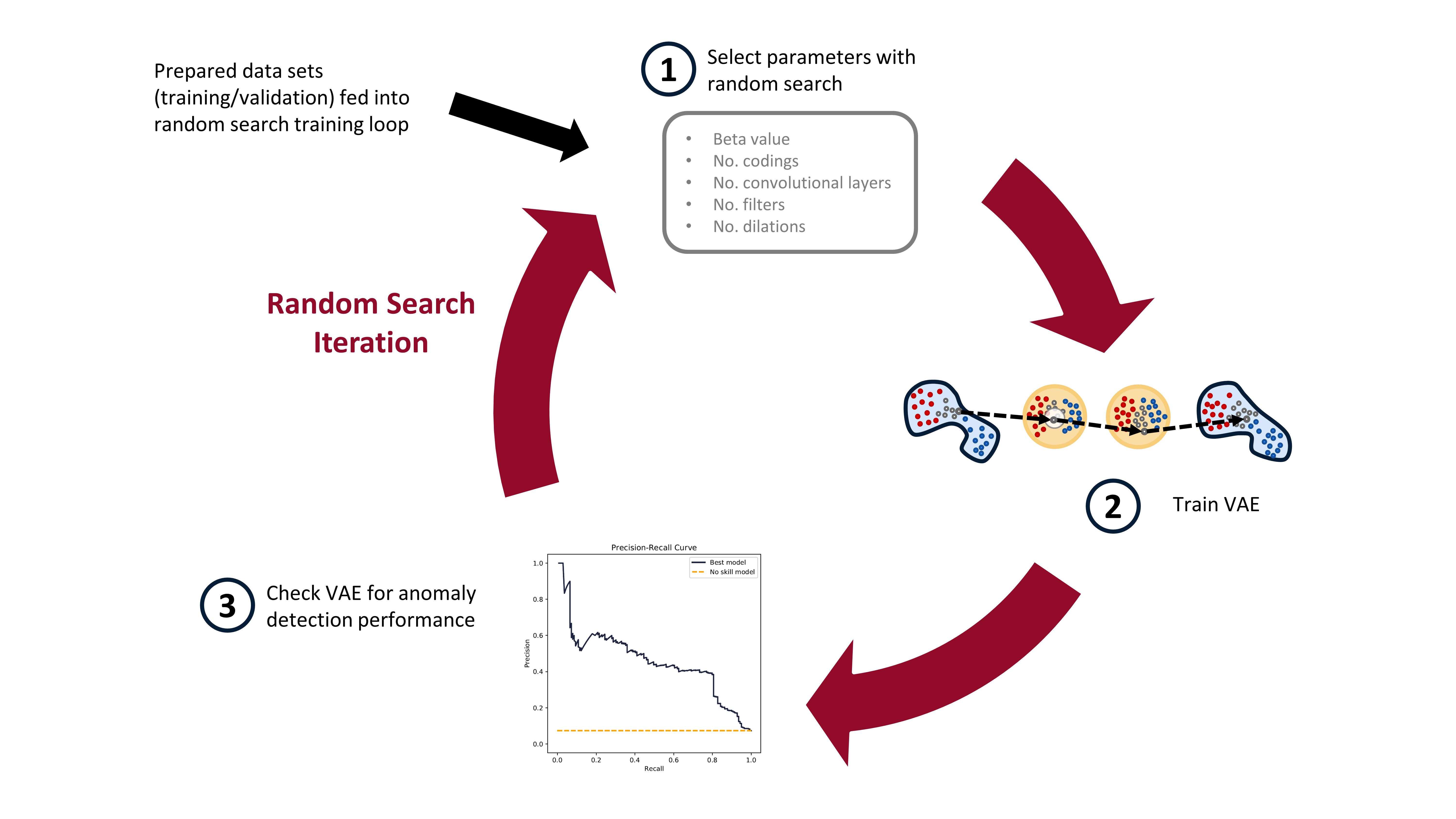
*The random search training process has three steps. First, randomly select the hyperparameters. Second, train the VAE with these parameters. Third, check the anomaly detection performance of the trained VAE. (Image from author)*
In practice, when I ran this experiment, I trained about 1000 VAE models on Google Colab (yay free GPUs!). After all 1000 models were trained, I moved them to my local computer, with a less powerful GPU, and then checked the models for anomaly detection performance. Google Colab has access to great GPUs, but your time with them is limited, so it makes sense to maximize the use of the GPUs on them this way. I'll detail how the trained models are checked for anomaly detection performance in the next blog post.
I'm not going to show the training loop code here. You can see it all in the [Google Colab notebook](https://colab.research.google.com/github/tvhahn/Manufacturing-Data-Science-with-Python/blob/master/Metal%20Machining/1.B_building-vae.ipynb), or on the [github](https://github.com/tvhahn/Manufacturing-Data-Science-with-Python/tree/master/Metal%20Machining).
## Conclusion
In this post we've learned about the VAE; prepared the milling data; and implemented the training of the VAE. Phew! Lots of work! In the next post, we'll evaluate the trained VAEs for anomaly detection performance. I'll also explain how we use the precision-recall curve, and we'll make some pretty graphics (my favourite!). Stay tuned!
## References
[^kingma2013auto]: Kingma, Diederik P., and Max Welling. "[Auto-encoding variational bayes.](https://arxiv.org/abs/1312.6114)" arXiv preprint arXiv:1312.6114 (2013).
[^higgins2016beta]: Higgins, Irina, et al. "[beta-vae: Learning basic visual concepts with a constrained variational framework.](https://openreview.net/forum?id=Sy2fzU9gl)" (2016).
[^geron2019hands]: Géron, Aurélien. [Hands-on machine learning with Scikit-Learn, Keras, and TensorFlow: Concepts, tools, and techniques to build intelligent systems.](https://www.amazon.com/Hands-Machine-Learning-Scikit-Learn-TensorFlow/dp/1492032646/ref=sr_1_1?dchild=1&keywords=Aur%C3%A9lien+Geron&qid=1614346360&sr=8-1) O'Reilly Media, 2019.
[^bergstra2012random]: Bergstra, James, and Yoshua Bengio. "[Random search for hyper-parameter optimization.](https://www.jmlr.org/papers/volume13/bergstra12a/bergstra12a)" The Journal of Machine Learning Research 13.1 (2012): 281-305.
---
# Data Exploration - Advances in Condition Monitoring, Pt V
- **Author:** Tim
- **Date:** 2020-11-30T08:05:01+08:00
- **URL:** https://www.tvhahn.com/posts/milling
- **License:** CC BY 4.0
- **Tags:** AI, Machine Learning, Condition Monitoring, Data Exploration, Data Visualization, Seaborn, Matplotlib
> Data exploration is an important first step in any new data science problem. In this post we introduce a metal machining data set that we'll use to test anomaly detection methods. We’ll explore the data set, see how it is structured, and do some data visualization.
Let’s pretend again, like in Part II of this series, that you're at a manufacturing company engaged in metal machining. However, this time you're an engineer working at this company, and the CEO has now tasked you to develop a system to detect tool wear. Where to start?
UC Berkeley created a milling data set in 2008, which you can download from the [NASA Prognostics Center of Excellence web page](https://ti.arc.nasa.gov/tech/dash/groups/pcoe/prognostic-data-repository/). We’ll use this data set to try out some ideas. In this post we’ll briefly cover what milling is before exploring and visualizing the data set. Feel free to follow along, as all the code is available and easily run in Google Colab (link [here](https://colab.research.google.com/github/tvhahn/Manufacturing-Data-Science-with-Python/blob/master/Metal%20Machining/1.A_milling-data-exploration.ipynb)).
## What is milling?
In milling, a rotary cutter removes material as it moves along a work piece. Most often, milling is performed on metal – it's metal machining – and that’s what is happening at the company you’re at.
The picture below demonstrates a face milling procedure. The cutter is progressed forward while rotating. As the cutter rotates, the tool inserts “bite” into the metal and remove it.

*A milling tool has serveral tool inserts on it. As the tool rotates, and is pushed forward, the inserts cut into the metal. (Image modified from [Wikipedia](https://commons.wikimedia.org/wiki/File:Fraisage_surfacage.svg#/media/File:Fraisage_surfacage.svg))*
Over time, the tool inserts wear. Specifically, the flank of the tool wears, as shown below. In the UC Berkeley milling data set the flank wear (VB) is measured as the tool wears.

*Flank wear on a tool insert (perspective and front view). *VB* is the measure of flank wear. (Image from author)*
--> -->
## Data Exploration
Data exploration is the first important step when tackling any new data science problem. Where to begin? The first step is understanding how the data is structured. How is the data stored? In a database? In an array? Where is the meta-data (things like labels and time-stamps)?
### Data Structure
First, we need to import the necessary modules.
[](https://colab.research.google.com/github/tvhahn/Manufacturing-Data-Science-with-Python/blob/master/Metal%20Machining/1.A_milling-data-exploration.ipynb)
```python
import numpy as np
import scipy.io as sio
from pathlib import Path
import pandas as pd
import matplotlib.pyplot as plt
import seaborn as sns
```
The UC Berkeley milling data set is contained in a structured MATLAB array. We can load the .mat file using the scipy.io module and the loadmat function.
```python
# load the data from the matlab file
m = sio.loadmat(folder_raw_data / 'mill.mat',struct_as_record=True)
```
The data is stored as a dictionary. Let's look to see what it is made of.
```python
# show some of the info from the matlab file
print('Keys in the matlab dict file: \n', m.keys(), '\n')
```
Keys in the matlab dict file:
dict_keys(['__header__', '__version__', '__globals__', 'mill'])
Only the 'mill' part of the dictionary contains useful information. We'll put that in a new numpy array called 'data.
```python
# check to see what m['mill'] is
print(type(m['mill']))
# store the 'mill' data in a seperate np array
data = m['mill']
```
```
```
We now want to see what the 'data' array is made up of.
```python
# store the field names in the data np array in a tuple, l
l = data.dtype.names
print('List of the field names:\n',l)
```
List of the field names:
('case', 'run', 'VB', 'time', 'DOC', 'feed', 'material', 'smcAC', 'smcDC', 'vib_table', 'vib_spindle', 'AE_table', 'AE_spindle')
### Meta-Data
The documentation with the UC Berkeley milling data set contains additional information, and highlights information about the meta-data. The data set is made of 16 cases of milling tools performing cuts in metal. Six cutting parameters were used in the creation of the data:
* the metal type (either cast iron or steel, labelled as 1 or 2 in the data set, respectively)
* the depth of cut (either 0.75 mm or 1.5 mm)
* the feed rate (either 0.25 mm/rev or 0.5 mm/rev)
Each of the 16 cases is a combination of the cutting parameters (for example, case one has a depth of cut of 1.5 mm, a feed rate of 0.5 mm/rev, and is performed on cast iron).
The cases are made up of individual cuts from when the tool is new to degraded or worn. There are 167 cuts (called 'runs' in the documentation) amongst all 16 cases. Many of the cuts are accompanied by a measure of flank wear (VB). We'll use this later to label the cuts as eigther healthy, degraded, or worn.
Finally, six signals were collected during each cut: acoustic emission (AE) signals from the spindle and table; vibration from the spindle and table; and AC/DC current from the spindle motor. The signals were collected at 250 Hz and each cut has 9000 sampling points, for a total signal length of 36 seconds.
We will extract the meta-data from the numpy array and store it as a pandas dataframe -- we'll call this dataframe `df_labels` since it contains the label information we'll be interested in. This is how we create the dataframe.
```python
# store the field names in the data np array in a tuple, l
l = data.dtype.names
# create empty dataframe for the labels
df_labels = pd.DataFrame()
# get the labels from the original .mat file and put in dataframe
for i in range(7):
# list for storing the label data for each field
x = []
# iterate through each of the unique cuts
for j in range(167):
x.append(data[0,j][i][0][0])
x = np.array(x)
df_labels[str(i)] = x
# add column names to the dataframe
df_labels.columns = l[0:7]
# create a column with the unique cut number
df_labels['cut_no'] = [i for i in range(167)]
print(df_labels.head())
```
| | case | run | VB | time | DOC | feed | material | cut_no |
|---:|-------:|------:|-------:|-------:|------:|-------:|-----------:|---------:|
| 0 | 1 | 1 | 0 | 2 | 1.5 | 0.5 | 1 | 0 |
| 1 | 1 | 2 | nan | 4 | 1.5 | 0.5 | 1 | 1 |
| 2 | 1 | 3 | nan | 6 | 1.5 | 0.5 | 1 | 2 |
| 3 | 1 | 4 | 0.11 | 7 | 1.5 | 0.5 | 1 | 3 |
| 4 | 1 | 5 | nan | 11 | 1.5 | 0.5 | 1 | 4 |
In the above table you can see how not all cuts are labelled with a flank wear (VB) value. Later, we'll be setting categories for the tool health -- ethier healthy, degraded, or worn. For categories without a flank wear value we can reliabily select the tool health category based on preceeding and forward looking cuts with flank wear values.
### Data Visualization
Visuallizing a new data set is a great way to get an understanding of what is going on, and detect any strange things going on. I also love data visualization, so we'll create a beautiful graphic using Seaborn and Matplotlib.
There are only 167 cuts in this data set, which isn't a huge amount. Thus, we can visually inspect each cut to find abnormalities. Fortunately, I've already done that for you.... Below is a highlight.
First, we'll look at a fairly "normal" cut -- cut number 167.
```python
# look at cut number 167 (index 166)
cut_no = 166
fig, ax = plt.subplots()
ax.plot(data[0,cut_no]['smcAC'], label='smcAC')
ax.plot(data[0,cut_no]['smcDC'], label='smcDC')
ax.plot(data[0,cut_no]['vib_table'], label='vib_table')
ax.plot(data[0,cut_no]['vib_spindle'], label='vib_spindle')
ax.plot(data[0,cut_no]['AE_table'], label='AE_table')
ax.plot(data[0,cut_no]['AE_spindle'], label='AE_spindle')
plt.legend()
plt.show()
```
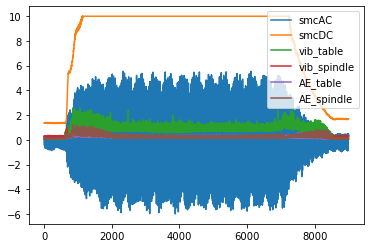
However, if you look at all the cuts, you'll find that cuts 18 and 95 (index 17 and 94) are off -- they will need to be discarded when we start building our anomaly detection model.
```python
# plot cut no. 18 (index 17). Only plot current signals for simplicity.
cut_no = 17
fig, ax = plt.subplots()
ax.plot(data[0,cut_no]['smcAC'], label='smcAC')
ax.plot(data[0,cut_no]['smcDC'], label='smcDC')
plt.legend()
plt.show()
```
```python
# plot cut no. 95 (index 94). Only plot current signals for simplicity.
cut_no = 17
fig, ax = plt.subplots()
ax.plot(data[0,94]['smcAC'], label='smcAC')
ax.plot(data[0,94]['smcDC'], label='smcDC')
plt.legend()
plt.show()
```
Cut 106 is also weird...
```python
fig, ax = plt.subplots()
ax.plot(data[0,105]['smcAC'], label='smcAC')
ax.plot(data[0,105]['smcDC'], label='smcDC')
plt.legend()
plt.show()
```
Finally, we'll create a beautiful plot that nicely visualizes each of the six signals together.
```python
def plot_cut(cut_signal, signals_trend, cut_no):
# define colour palette and seaborn style
pal = sns.cubehelix_palette(6, rot=-0.25, light=0.7)
sns.set(style="white", context="notebook")
fig, axes = plt.subplots(
6, 1, dpi=150, figsize=(5, 6), sharex=True, constrained_layout=True,
)
# the "revised" signal names so it looks good on the chart
signal_names_revised = [
"AE Spindle",
"AE Table",
"Vibe Spindle",
"Vibe Table",
"DC Current",
"AC Current",
]
# go through each of the signals
for i in range(6):
# plot the signal
# note, we take the length of the signal (9000 data point)
# and divide it by the frequency (250 Hz) to get the x-axis
# into seconds
axes[i].plot(np.arange(0,9000)/250.0,
cut_signal[signals_trend[i]],
color=pal[i],
linewidth=0.5,
alpha=1)
axis_label = signal_names_revised[i]
axes[i].set_ylabel(
axis_label, fontsize=7,
)
# if it's not the last signal on the plot
# we don't want to show the subplot outlines
if i != 5:
axes[i].spines["top"].set_visible(False)
axes[i].spines["right"].set_visible(False)
axes[i].spines["left"].set_visible(False)
axes[i].spines["bottom"].set_visible(False)
axes[i].set_yticks([]) # also remove the y-ticks, cause ugly
# for the last signal we will show the x-axis labels
# which are the length (in seconds) of the signal
else:
axes[i].spines["top"].set_visible(False)
axes[i].spines["right"].set_visible(False)
axes[i].spines["left"].set_visible(False)
axes[i].spines["bottom"].set_visible(False)
axes[i].set_yticks([])
axes[i].tick_params(axis="x", labelsize=7)
axes[i].set_xlabel('Seconds', size=5)
signals_trend = list(l[7:]) # there are 6 types of signals, smcAC to AE_spindle
signals_trend = signals_trend[::-1] # reverse the signal order so that it is matching other charts
# we'll plot signal 146 (index 145)
cut_signal = data[0, 145]
plot_cut(cut_signal, signals_trend, "cut_146")
# plt.savefig('six_signals.png',format='png') # save the figure, if you want
plt.show()
```
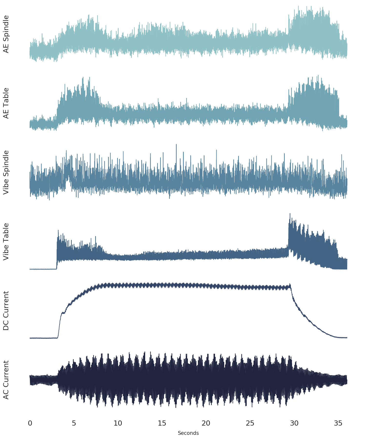
*The six signals from the UC Berkeley milling data set (from cut number 146).*
# Conclusion
In this post we've explained what metal machining is in the context of milling. We've also explored the UC Berkely milling data set, which we'll use in future posts to test anomaly detection techniques using autoencoders. Finally, we've demonstrated some methods that are usefull in the important data exploration step, from understanding the data structure, to visualizing the data.
---
# Anomaly Detection - Advances in Condition Monitoring, Pt IV
- **Author:** Tim
- **Date:** 2020-11-10
- **URL:** https://www.tvhahn.com/posts/anomaly-detection-with-autoencoders
- **License:** CC BY 4.0
- **Tags:** AI, Machine Learning, Condition Monitoring, Autoencoders, Anomaly Detection

> Machines fail, and anomaly detection can be used to identify failures that have never been seen before. In this post, we explore the use of a simple autoencoder and see how it can be used for anomaly detection in industrial environments.
Equipment fails. And if you’ve ever worked in an industrial environment, you’ll know that equipment can fail in any number of weird and wonderful ways. Detecting the strange behaviour in the machinery, early enough, is one way to help prevent these costly failures. Anomaly detection can be used to identify these warning signs before they become a serious issue.
The classic definition of an anomaly was given by Douglas Hawkins: “an [anomaly] is an observation which deviates so much from other observations as to arouse suspicions that it was generated by a different mechanism.” [^hawkins1980identification] Sometimes, anomalies are clearly identified, and a data scientist can pick them out using straightforward methods. In reality, though, noise in the data makes anomaly detection difficult. Discriminating between the noise and the anomalies becomes the central challenge, as shown below in Figure 1.
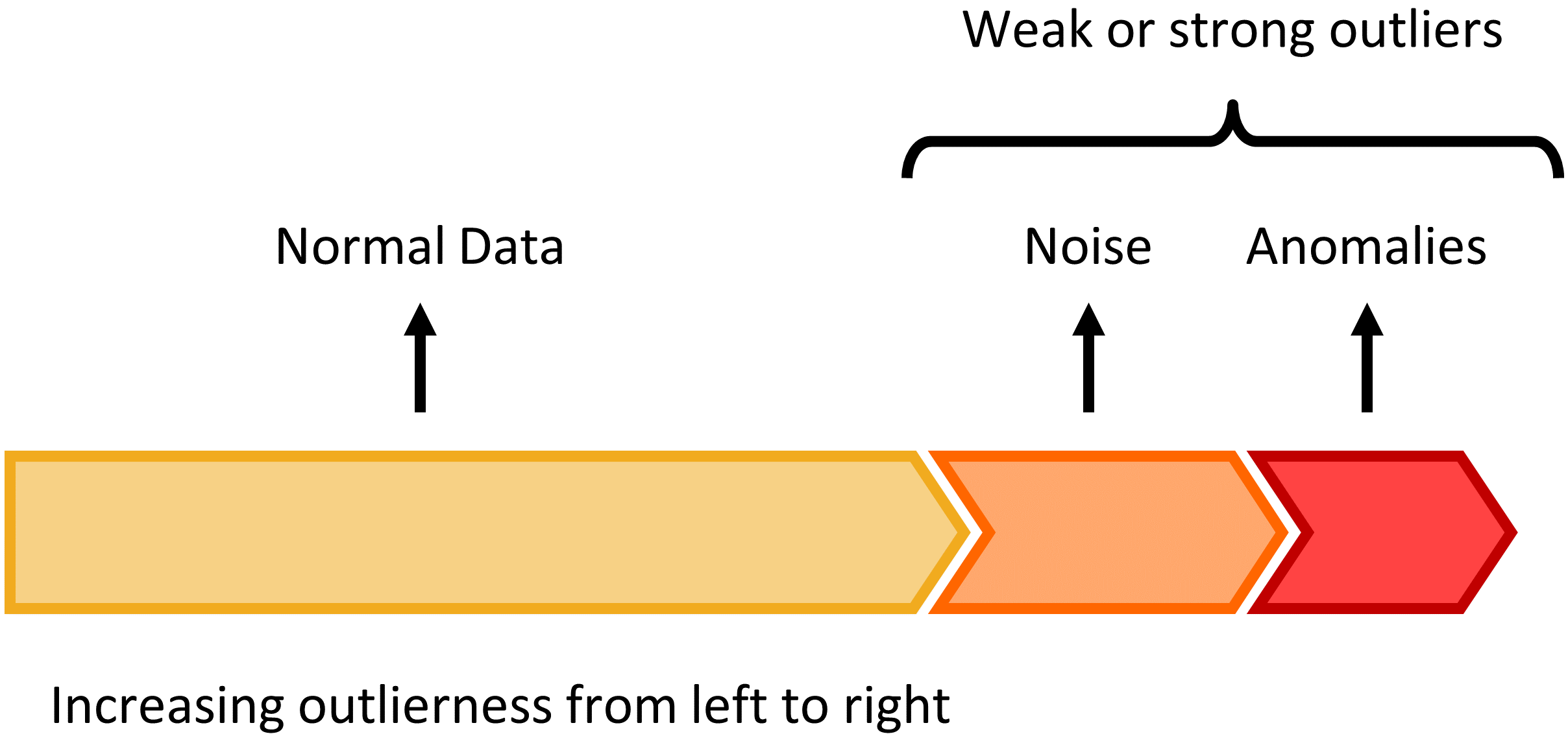
*Figure 1: The continuum between normal data, noise, and anomalies. The challenge is differentiating between noise in the data and anomalies. (Figure made by author, modified from Charu C. Aggarwal in Outlier Analysis)*
There are many ways to perform anomaly detection. For an excellent overview, I recommend the book [Outlier Analysis](https://www.amazon.com/dp/3319475770/ref=cm_sw_r_tw_dp_x_KPGMFbXJ1ZFXA) by Aggarwal. But in the next few posts we’ll be looking at anomaly detection technique using an autoencoder, and specifically, a variational autoencoder.
## The Autoencoder
An autoencoder is a neural network that learns to reconstruct its input. It was first introduced, back in the 80’s, by Hinton and Salakhutdinov.[^hinton2006reducing] Today, the autoencoder is widely used in machine learning applications.
Below, in Figure 2, is a picture of a simple autoencoder. This autoencoder has an input vector, $\boldsymbol{x}$, of five units. The output, $\boldsymbol{x'}$, has the same dimension as the input $\boldsymbol{x}$ -- also five units. The encoder takes the input and maps it to the hidden layer, $\boldsymbol{z}$, consisting of three latent variables, or hidden units. This is represented by:
$$\boldsymbol{z} = \sigma(\boldsymbol{Wx}+\boldsymbol{b}) $$
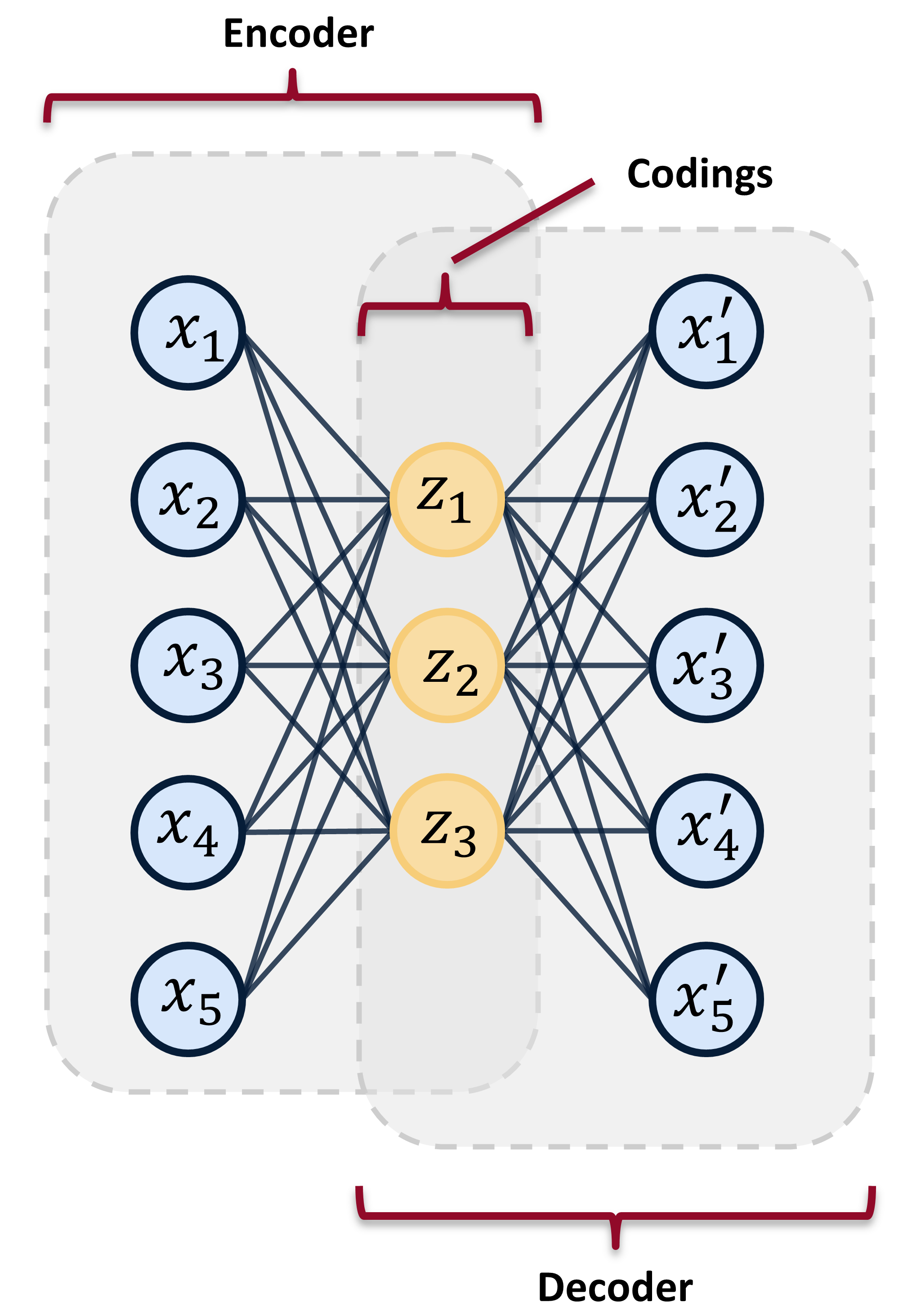
*Figure 2: A simple autoencoder having one input layer, one output layer, and a hidden layer. The hidden units are commonly called codings or latent variables. The hidden units are in the latent space. (Image from by author)*
Here, $\sigma $ is the activation function (such as a sigmoid or rectified linear unit). $\boldsymbol{W} $ is the weight matrix, and $\boldsymbol{b} $ is the bias vector.
The decoder then takes the latent variables, $\boldsymbol{z}$ and maps them to the output space, represented by:
$$\boldsymbol{x'} = \sigma'(\boldsymbol{W'z}+\boldsymbol{b'})$$
Like above, the $\sigma'$, $\boldsymbol{W'}$, and $\boldsymbol{b'}$ are the unique activation function, weight matrix, and biases for the decoder, respectively.
The autoencoder is trained to minimize reconstruction error, often using mean-square-error, and is trained through back propagation.
The power of the autoencoder lies in its ability to learn in a self-supervised way. Yann Lecun described the strength self-supervised learning in his Turing Award address: self-supervised learning allows models to “learn about the world without training it for a particular task.” [^lecun_turing] This allows large swaths of data to be used in the training of the model – data that would not be available in supervised learning techniques. This power of self-supervised learning makes it attractive for use in manufacturing and industrial environments where much of the data is not properly labeled, and/or it would be too costly to label. Ultimately, self-supervised learning has led to dramatic advances in other fields, such as natural language processing and speech recognition.
Finally, if you're all confused by the talk of "activation functions", "weights", and "biases", I recommend you watch the stellar explanation by 3Blue1Brown on YouTube. YouTube university is better than any college course...
[YouTube video](https://www.youtube.com/watch?v=aircAruvnKk)
## Anomaly Detection with Autoencoders
Autoencoders learn to reconstruct their inputs. However, the reconstruction will never be perfect. Feeding data into an autoencoder that is very different from what the autoencoder was trained on will produce a large reconstruction error. Feeding similar data will produce a lower reconstruction error. As such, this error in the reconstruction can be used as a proxy for how abnormal data is. A threshold can be set on this reconstruction error, whereby data producing a reconstruction error above the threshold is considered an anomaly. This is called input space anomaly detection.
Most autoencoders, used for anomaly detection on industrial data, are first trained on healthy machinery data. Once trained, the autoencoder can be shown regular machinery data, containing both “healthy” and “unhealthy” data. Ideally, the autoencoder will have difficulty reconstructing the data from when the machinery is in an unhealthy state. Of course, there is much more nuance to this. Real-world industrial data is often noisy and messy.
There are multiple examples of input space anomaly detection, using autoencoders, in condition monitoring. The method has been used to detect problems in aircraft hydraulic actuators.[^reddy2016anomaly] A [LSTM](https://en.wikipedia.org/wiki/Long_short-term_memory) (long short-term memory) autoencoder was used to detect anomalies in hydraulic pumps used in large industrial metal presses.[^lindemann2019anomaly] One group of researchers used a simple autoencoder on wind turbine control system data to identify 35% of all failures.[^lutz2020evaluation]
## Conclusion
Hopefully you have a sense of what an autoencoder is, and how it can be used for anomaly detection in industrial environments. In the next post we'll introduce a milling data set that we'll use to experiment with anomaly detection.
## References
[^hawkins1980identification]: Hawkins, Douglas M. [Identification of outliers](https://www.amazon.com/Identification-Outliers-Monographs-Statistics-Probability/dp/041221900X/ref=sr_1_1?dchild=1&keywords=Identification+of+Outliers+hawkins&qid=1605018126&sr=8-1). Vol. 11. London: Chapman and Hall, 1980.
[^hinton2006reducing]: Hinton, Geoffrey E., and Ruslan R. Salakhutdinov. "[Reducing the dimensionality of data with neural networks](https://science.sciencemag.org/content/313/5786/504.full)." science 313.5786 (2006): 504-507.
[^lecun_turing]: Geoffrey Hinton and Yann LeCun, 2018 ACM A.M. Turing Award Lecture “The Deep Learning Revolution” - YouTube. [https://youtu.be/VsnQf7exv5I](https://youtu.be/VsnQf7exv5I). Accessed 29 Oct. 2020.
[^reddy2016anomaly]: Reddy, Kishore K., et al. "[Anomaly detection and fault disambiguation in large flight data: A multi-modal deep auto-encoder approach](http://www.phmsociety.org/sites/phmsociety.org/files/phm_submission/2016/phmc_16_026.pdf)." Annual Conference of the Prognostics and Health Management Society. Vol. 2016. 2016.
[^lindemann2019anomaly]: Lindemann, Benjamin, et al. "[Anomaly detection in discrete manufacturing using self-learning approaches](https://doi.org/10.1016/j.procir.2019.02.073)." Procedia CIRP 79 (2019): 313-318.
[^lutz2020evaluation]: Lutz, Marc-Alexander, et al. "[Evaluation of Anomaly Detection of an Autoencoder Based on Maintenace Information and Scada-Data](https://doi.org/10.3390/en13051063)." Energies 13.5 (2020): 1063.
---
# The Case for Feature Engineering - Advances in Condition Monitoring, Pt III
- **Author:** Tim
- **Date:** 2020-10-11T15:14:56-04:00
- **URL:** https://www.tvhahn.com/posts/feature-engineering-examples
- **License:** CC BY 4.0
- **Tags:** Machine Learning, Condition Monitoring, Feature Engineering, Total Harmonic Distortion, Signal Processing, Logistic Regression, Mining Industry, Mobile Equipment

> Feature engineering can be powerful tool, but it doesn't have to be complicated. Often, the simple solution is best.
In part two of this series, we went over the differences between the feature engineering approach and the end-to-end deep learning approach. The feature engineering approach can be labor intensive. But, I don't want to discourage you. Feature engineering can be a great choice for many applications within the condition monitoring space. In fact, if you have a problem that can be elegantly solved using straightforward feature design and a simple model, then you should use that first. As noted by Daniel Kahneman in his book *[Thinking Fast and Slow](https://www.amazon.com/dp/0374533555/ref=cm_sw_r_tw_dp_x_dJFGFb0YHDJEV)*, simple statistical rules regularly outperform more complex models. What would some of these simple applications look like? Here are a couple of examples.
## Frequency Domain Technique for Combustion Engines
The first application we'll look at is more of a feature engineering technique. In this example, [total harmonic distortion](https://en.wikipedia.org/wiki/Total_harmonic_distortion) (THD) is used to detect abnormalities on reciprocating machinery -- machinery like internal combustion engines or reciprocating compressors. The application comes from a [patent](https://patents.google.com/patent/US9791343B2/en) by Jeffrey Bizub of GE.[^bizub2017methods] I don't usually appreciate reading patents, but this one was clear, and I like the simplicity of this idea.
The patent describes how an internal combustion engine produces a characteristic vibration pattern while in operation. The vibration signal is a superposition of many waveforms. Each component in the engine will have a primary vibration waveform (called its fundamental waveform) and then subsequent smaller waveforms belonging to that component (called harmonic waveforms).
When looking in the frequency domain, the fundamental waveform for a specific component will be represented by a large peak, and the harmonic waveforms will be represented by smaller peaks. The fundamental waveform vibrates at the fundamental frequency (or the natural frequency). The harmonic waveforms vibrate at frequencies that are at integral multiples of the fundamental frequency. The figure below, taken from the patent, shows a frequency domain representation of a signal, with the fundamental and harmonic frequencies labelled.
*The fundamental and harmonic frequencies. Figure from the patent by Jeffrey Bizub.*
The vibration signals will distort as components in the engine wear and the harmonics of these components become more dominant. This change in the waveform of the component can be measured by the total harmonic distortion, expressed as:
$$\text{THD} = \frac{\sqrt{(f_2^2+f_3^2+f_4^2+ \cdots + f_n^2)}}{f_1} \times 100 $$
where $f_2$, $f_3$, ... $f_n$ are the amplitudes of the $n$ harmonic frequencies, and $f_1$ is the amplitude of the fundamental frequency.
The THD value can be trended over time, and a threshold value set to indicate when the engine component is in an unhealthy condition. The THD feature is used in other data-driven condition monitoring applications as well, from detecting faults in electric motors[^f1993ieee], to assessing the health of fuel cells[^thomas2014online]. I worked THD into some of my work using data-driven condition monitoring and will be looking at it more in the future, perhaps in another post.
## Classifying Mining Truck Oil Samples

Maintenance on mining haul trucks is an expensive affair. But sudden failures are even more expensive -- costs can easily exceed $100,000 per failure. As such, regular oil samples are taken to monitor the health of these big trucks -- think of it like a occasional blood sample you get taken from the doctor. Once the oil samples are taken, though, someone needs to review the results to identify if there are significant concerns. In the research presented [here](https://doi.org/10.1016/j.ymssp.2014.12.020), the authors discuss how classifying the results, by hand, is time consuming. A model would go a long way in speeding up the review.[^phillips2015classifying]
The researchers used 400,000 hand-labelled oil sample results from large haul-truck diesel engines in Australia. They then selected six of the best variables from the results, variables like the amount of iron in the sample, to use in the model training. The authors trained both a logistic regression model and a support vector machine (SVM) model to either classify the oil sample from a healthy, or unhealthy, engine.
The logistic regression model outperformed the SVM model. The authors also make an interesting point about the explanatory power of the simpler logistic regression model, which I also find compelling:
"...the logistic regression model was simple to explain, there were no difficulties in explaining the method, and they could reconcile the weights of the explanatory variables with their understanding of failure modes for these engines."
I like this example for its simplicity. No complicated feature engineering is needed. Rather, experts are asked to select the variable -- the features -- that are most indicative of engine health. No complicated model is used. Rather, a straightforward logistic regression is implemented. And finally, the authors are cognizant of how the results will be perceived by the customer. Trust is gained, between them and the end-user, by using model that can be interpreted.
## References
[^bizub2017methods]: Bizub, Jeffrey Jacob. "[Methods and systems to derive engine component health using total harmonic distortion in a knock sensor signal](https://patents.google.com/patent/US9791343B2/en)." U. S. Patent No. 9, 791, 343. 17 Oct. 2017.
[^f1993ieee]: F II, I. "[IEEE recommended practices and requirements for harmonic control in electrical power systems](http://www.coe.ufrj.br/~richard/Acionamentos/IEEE519.pdf)." New York, NY, USA (1993): 1-1.
[^thomas2014online]: Thomas, Sobi, et al. "[Online health monitoring of a fuel cell using total harmonic distortion analysis](https://doi.org/10.1016/j.ijhydene.2013.12.180)." international journal of hydrogen energy 39.9 (2014): 4558-4565.
[^phillips2015classifying]: Phillips, J., et al. "[Classifying machinery condition using oil samples and binary logistic regression](https://doi.org/10.1016/j.ymssp.2014.12.020)." Mechanical Systems and Signal Processing 60 (2015): 316-325.
---
# Data-Driven Methods - Advances in Condition Monitoring, Pt II
- **Author:** Tim
- **Date:** 2020-10-07
- **URL:** https://www.tvhahn.com/posts/data-driven-methods
- **License:** CC BY 4.0
- **Tags:** Manufacturing, Machine Learning, Condition Monitoring, Feature Engineering, End-to-End Deep Learning, Deep Learning, Tool Wear
> In part two, we give an overview of the two data-driven approaches in condition monitoring; that is, feature engineering and end-to-end deep learning. Which approach should you use? Well, it all depends...
Imagine you're the CEO of a manufacturing company. You make small components out of metal, manufactured on CNC machines. One important jobs you have is to improve the productivity of your operation. If you don't, well, you'll slowly see your company's profits eaten away by the competition. Not good. What can you do as an enterprising CEO to prevent this? Use data-driven condition monitoring methods! You can use those methods to predict when a CNC tool is worn and needs replacing. Ultimately, it will free up the time of your operators and reduce waste.
There are two dominant data-driven approaches in condition monitoring; that is, feature engineering, the classical approach, and end-to-end deep learning, the newer approach. As CEO, you and your underlings will have to decide on which approach to use. We'll be exploring these approaches, along with things to consider, and a bit of my opinion, in the remainder of this post.
# Feature Engineering Approach
Condition monitoring involves the collection of numerous parameters -- such as vibration waveforms, electrical current signals, speed signals, etc. -- in order to detect faults in machinery. But what happens after these signals are collected? In feature engineering, an expert uses the signals to design features. The features will ideally contain "information" that is indicative of the health of the machinery. The best features can then be used by machine learning models to make predictions on the health of the machinery. The figure below shows the complete feature engineering approach, from collecting the data to using the final model for prediction.

*The feature engineering approach relies on manually designed features (signal processing or statistical features are common in condition monitoring). Following feature selection, various machine learning models can be used to make predictions.*
There are a wide variety of methods for designing features, but the creation of statistical features is the simplest approach. In this method, statitics, such as root-mean-square, kurtosis, or standard deviation, to name a few, are calculated directly on the signals from the machinery.
Many advanced feature design methods come from the field of [signal processing](https://en.wikipedia.org/wiki/Signal_processing), and the [Fast Fourier Transform](https://en.wikipedia.org/wiki/Fast_Fourier_transform) (FFT) is one such method. The FFT transforms the signal from the time domain to the frequency domain. Useful features can then be extracted from the frequency domain, such as the peak freaquency, the average value, or the natural frequency. The process of applying a FFT on a current signal is demonstrated in the code snippet below. And if you want a wonderful explanation of the Fourier transform you must watch [3Blue1Brown's video](https://youtu.be/spUNpyF58BY) on Youtube.
[](https://colab.research.google.com/github/tvhahn/blog-snips/blob/main/2020.10.07_data_driven_methods/fft.ipynb)
```python
import numpy as np
import matplotlib.pyplot as plt
import pandas as pd
from scipy import signal, fftpack
import seaborn as sns
# load the current data from a csv
df = pd.read_csv("current.csv", index_col=False)
y = df["current"].to_numpy(dtype="float64") # convert to a numpy array
# setup the seaborn plot
sns.set(font_scale=1.0, style="whitegrid")
fig, axes = plt.subplots(2, 1, figsize=(12, 8), sharex=False, sharey=False, dpi=600)
fig.tight_layout(pad=5.0)
pal = sns.cubehelix_palette(6, rot=-0.25, light=0.7) # pick nice color for plot
# parameters for plot
T = 1.0 / 1000.0 # sample spacing
N = len(y) # number of sample points
x = np.linspace(0.0, N * T, N)
# plot time domain signal
axes[0].plot(x, y, marker="", label="Best model", color=pal[3], linewidth=0.8)
axes[0].set_title("Time Domain", fontdict={"fontweight": "normal"})
axes[0].set_xlabel("Time (seconds)")
axes[0].set_ylabel("Current")
axes[0].set_yticklabels([])
# do some preprocessing of the current signal
y = signal.detrend(y, type == "constant") # detrended signal
y *= np.hamming(N) # apply a hamming window. Why? https://dsp.stackexchange.com/a/11323
# FFT on time domain signal
yf = fftpack.rfft(y)
yf = 2.0 / N * np.abs(yf[: int(N / 2.0)])
xf = np.linspace(0.0, 1.0 / (2.0 * T), N // 2)
# plot the frequency domain signal
axes[1].plot(xf, yf, marker="", label="Best model", color=pal[3], linewidth=0.8)
axes[1].set_title("Frequency Domain", fontdict={"fontweight": "normal"})
axes[1].set_xlabel("Frequency (Hz)")
axes[1].set_ylabel("Current Magnitude")
# clean up the sub-plots to make everything pretty
for ax in axes.flatten():
ax.yaxis.set_tick_params(labelleft=True, which="major")
ax.grid(False)
plt.show()
```

*Time domain versus frequency domain for a current signal.*
After feature design, the best features can be selected using a number of techniques. [Pricipal component analysis](https://en.wikipedia.org/wiki/Principal_component_analysis) (PCA) can be used to represent the features in a lower dimensional space that hopefully including the most useful information. A random search can be used to randomly features for model building. Or you can select the features that have the least correlation between each other using the [Pearson correlation coefficient](https://en.wikipedia.org/wiki/Pearson_correlation_coefficient). There are many other techniques, and we'll have to explore some of these methods in future posts...
The next step in the process is model training. Depending on your methodology, you may train several types of machine learning models and see which one performs best. And as always, data science best practices must be used, such as splitting your data set into a training, validation, and testing sets, or using k-fold cross-validation.
Finally, once you've trained your models and selected the best one, you can use it for prediction. You now have a model that you can deploy in your manufacturing process!
# End-to-End Deep Learning Approach
A deep learning system is a neural network with many layers. Neural networks, trained with [backpropagation](https://en.wikipedia.org/wiki/Backpropagation), have been used since the 1980s.[^rumelhart1985learning] However, not until the early 2010s, with the exponential increase in computational power and large data sets, did neural networks, stacked in many layers (hence the "deep" in deep learning), show their full potential. These deep neural networks can learn complex non-linear relationships in the data that are unobservable to humans.
Manually designing features can be time-consuming. Yet, this was the primary method of creating data-driven condition monitoring applications before the emergence of deep learning. In the textbook [Deep Learning](https://www.deeplearningbook.org/), the authors note how an entire research community can spend decades developing the best manually designed features only to have a deep learning approach achieve superior results in a matter of months, as was the case in computer vision and natural language processing. As a result, deep learning methods are of increased interest for condition monitoring applicatoins.[^zhao2019deep] The focus has changed from designing features to designing neural network architectures.
Many of the deep learning applications within condition monitoring utilize a data preprocessing step. This is done to make the "learning" easier for the neural network. Often, the preprocessing step involves transforming the data from the time domain to the frequency domain, or by using some other advanced feature engineering techniques to extract useful information. However, advances in other fields, such speech recognition, have shown that deep learning networks can work directly on raw waveforms in an end-to-end fashion. As a result, much data-driven condition monitoring research now uses this end-to-end deep learning approach, which is illustrated below.

*The end-to-end deep learning approach works directly on the raw signals from the monitored machine, thus removing the need for feature engineering.*
# Advantages and Disadvantages
Now that we have a better understanding of the two approaches, which ones should you use? It all depends, as each approach has its advantages and disadvantages. The below graphic gives a quick summary of the pros and cons for each approach.

*The pros and cons for feature engineering and end-to-end deep learning.*
Feature engineering can be extremely labor intensive, and that is its biggest drawback. However, there can be benefits to using this approach in industrial applications. The decisions made by models that use feature engineering are often more interpretable than those decisions made from the end-to-end deep learning approach. As an example of this interpretability, a data scientists can easily understand which features were most useful to a random forest model. However, an end-to-end deep learning model creates features through its many layers of neurons, and the complex non-linearities in the neural network makes the interpretability of the network challenging. Understanding how a model makes its predictions can be beneficial when those predictions carry significant economic impact, as can be the case in industrial and manufacturing environments.
In addition to the interpretability, the feature engineering approach can generally operate on less data and computational power than an end-to-end deep learning approach. A simple linear model may require a few parameters and yield acceptable results for many different applications. Thus, less data will be needed to train the model -- hundreds to thousands of data samples. However, an end-to-end deep learning model may include millions of parameters, and as a result much more data will be required to train the model -- tens-of-thousands to millions of data samples.
# Opinion
Feature engineering leans into the expertise of the human. End-to-end deep learning -- and deep learning in general -- leans into the data and computational power present in today's world. The need for large amounts of data can be a drawback for the end-to-end deep learning approach. But from my personal experience, collecting enough data in industrial and manufacturing environments is *not* the constraint. Rather, it's the temptation to use the less general feature engineering approach, as opposed to the more general end-to-end deep learning approach.
Feature engineering doesn't require as much data, and one can seemingly iterate through ideas quicker, providing a satisfying taste of "progress". Deep learning, is opaque and is more reliant on having a robust infrastructure setup -- requiring a capital outlay -- to easily collect and label new data. However, the dominance of deep learning techniques in other fields, such as computer vision and speech recognition, should be a harbinger of things to come in the field of condition monitoring. General methods, powered by the exponential rise of computational power, seems to win-out each time when put up against the efforts of domain experts. Richard Sutton, a grandfather of reinforcement learning, calls this the "[bitter lesson](http://www.incompleteideas.net/IncIdeas/BitterLesson.html)".
# Conclusion
We've reviewed the two dominant data-driven approaches in condition monitoring. Feature engineering relies on an expert to manually design features, which can then be used by machine learning models to make decisions and predictions. End-to-end deep learning removes the need for advanced feature engineering expertise. Instead it relies on a deep neural network, the data, and computational power, to understand complicated problems. There are times to use feature engineering (I'll explore some applications in a future post) and times to use deep learning. But if one thing can be said, it's this: we live in a time of abundant computational power. Embrace it.
# References
[^rumelhart1985learning]: Rumelhart, David E., Geoffrey E. Hinton, and Ronald J. Williams. *[Learning internal representations by error propagation](https://apps.dtic.mil/dtic/tr/fulltext/u2/a164453.pdf)*. No. ICS-8506. California Univ San Diego La Jolla Inst for Cognitive Science, 1985.
[^zhao2019deep]: Zhao, Rui, et al. "[Deep learning and its applications to machine health monitoring](https://doi.org/10.1016/j.ymssp.2018.05.050)." *Mechanical Systems and Signal Processing* 115 (2019): 213-237.
---
# The Business Case - Advances in Condition Monitoring, Pt I
- **Author:** Tim
- **Date:** 2020-09-29T21:29:01+08:00
- **URL:** https://www.tvhahn.com/posts/business-case
- **License:** CC BY 4.0
- **Tags:** Manufacturing, Machine Learning, Condition Monitoring
> Why care about data-driven condition monitoring techniques? In this post, we articulate the business case for using these advanced methods in an industrial environment. This is the first article in a series on advances in condition monitoring.
A critical 900 horsepower motor suddenly failed resulting in millions of dollars in lost revenue, and it happened on my watch. In reality, the failure wasn't attributed to any one person -- it was a system failure. But the missed "signals" along the way, those signals indicated a severe problem, were perhaps the worst part of the failure. A gut punch. The temperature probe on the thrust bearing showed multiple large spikes weeks before the failure. However, we were not equipped -- I was not equipped -- to identify those spikes amidst the vast quantity of data that was being collected across thousands of pieces of equipment. It was akin to finding a needle in a haystack.
You may have a similar story of equipment failure that has cost your business immense grief, both in terms of money and effort. [Condition monitoring](https://en.wikipedia.org/wiki/Condition_monitoring) is a method that measures the parameters of machines -- such as temperatures, vibrations, pressures, etc. -- in order to detect faults in the machinery. However, yesterday's implementation of condition monitoring, using only vibration routes and/or high-level alarms, is ill equipped to manage the deluge of data that is being produced in today's modern industrial environment. To find those valuable "needles" in a haystack one must use more advanced methods.

*Several parameters that can be used in condition monitoring. (Image from author)*
This series will explore the advanced data-driven techniques that can make use of this data deluge. We will give an overview of the two predominant approaches in condition monitoring; that is, feature engineering, and end-to-end deep learning. As an illustration, we will investigate the problem of detecting worn tools in metal machining. We will approach this problem using end-to-end deep learning. All the code will be provided, so if you are so inclined, you can follow along too.
A [McKinsey study](https://www.mckinsey.com/business-functions/operations/our-insights/manufacturing-analytics-unleashes-productivity-and-profitability) estimated that the appropriate use of data-driven techniques by process manufacturers "typically reduces machine downtime by 30 to 50 percent and increases machine life by 20 to 40 percent". And believe it or not, an industrial environment is one of the best places to make use of these new "artificial intelligence" techniques (as [recently illustrated in the Economist](https://www.economist.com/technology-quarterly/2020/06/11/businesses-are-finding-ai-hard-to-adopt)). The sheer availability of data in industrial environments, and the clear match of theory to application, make the business case for advanced condition monitoring techniques compelling. It is here, at the intersection of traditional industry and machine learning, that we unlock incredible value.
Buckle up!
---
# What is School For?
- **Author:** Tim
- **Date:** 2019-02-07T15:14:56-04:00
- **URL:** https://www.tvhahn.com/posts/what-is-school-for
- **License:** CC BY 4.0
- **Tags:** Personal, Education Reform, Passion

Seth Godin, in a recent [series on his podcasts](https://www.akimbo.link/blog/s-3-e-9-stop-stealing-dreams), discusses our education system and how -- in many ways -- it is not meeting the needs of today’s world. Rather than our education system helping people “connect the dots”, our system is focused on having people “memorize the dots.” Today, school is often about teaching obedience, conformity, and “academic success”. Seth challenges us to think, fundamentally, what school is for?
I recently went back to University after seven years in the workforce. I had left my mechanical engineering job in Edmonton so that I could be with my wife in Kingston. After a month or so of relaxation, I began considering my options -- find a job or maybe, just maybe, go back to school?
In my undergrad I regularly took courses that I did not care for (like chemistry). But why did I take them? The main reason was that I was told to -- it was a requirement. To be honest, most of my courses felt like a “box to check.” There was no passion in taking them. One professor even confessed to us -- an engineering degree is primarily a “ticket to the dance.” Then why, now seven years later, would I go back to school if it was not that satisfying the first time around?
In my previous role I had been responsible for monitoring the health of industrial equipment -- turbines, compressors, or big pressure vessels -- in a large industrial complex. However, I was often frustrated by my inability to detect problems with the equipment. There was amazing instrumentation on much of the equipment and large amount of data was being collected about them. Unfortunately, I did not have the tools, or knowledge, to make use of all the information we had.
Out of my frustration came my interest in using machine learning in a manufacturing environment. I began learning python and implementing simple machine learning models. I reached out to companies to see what solutions they could provide. I was engrossed, and excited, to be working on potential solutions to many of the problems I had. As such, when I had the opportunity, I decided to attend Queen’s University to work on a research-based masters focused on machinery health monitoring and machine learning.
My schooling, this time around, feels different. First, I do not feel the same pressure around grades. Having worked in industry, I know “good grades” aren’t as important. Second, I feel that I have already proven my value in the working world. Worst case, I can go back and get a similar job to what I had before. But the main reason why it feels different is that I’m working on “connecting the dots.” I am working on a problem, and project, that I am passionate about. Passion is not something that can be taught in an undergraduate degree or learned on a job -- it has to be discovered. I think I’m fortunate to have discovered it.
> Update: I graduated from my masters during the summer of 2020. It was an amazing experience, and I still have the passion! I'm currently hired as a researcher at Queen's University, exploring the intersection of manufacturing and machine learning.